Conference Badge Design: 7 Tips for Better Networking & Serious Brand Cred
Note: This article has been consolidated into our new, comprehensive 2025 guide. For the most up-to-date information and a complete look at event badge design, please see our new pillar page:
The Only Guide to Event Name Badge Design You’ll Ever Need →
This is a pretty indepth guide. If you’re short on time, check out How to Design Event Badges (that don’t suck) and explore our name tag tools.
Conference badge design is more than just slapping a name on a piece of paper – it’s about creating a memorable first impression that helps people connect. Whether you’re new to design or a seasoned pro, this comprehensive guide will walk you through everything you need to know about crafting badges that are readable, inclusive, creative, and sustainable. We’ll draw on expert design principles, accessibility standards, and event industry best practices to ensure your badges truly stand out.
We’ll also cover core components of conference badge design (like layout, fonts, and colours), advanced touches (think QR codes and NFC), and critical considerations for accessibility and sustainability. By the end, you’ll have the knowledge to create name badges that not only look great but also function flawlessly in the bustling environment of a conference or event.
(Spoiler: We’ve also included a handy checklist at the end so you won’t miss a thing.)
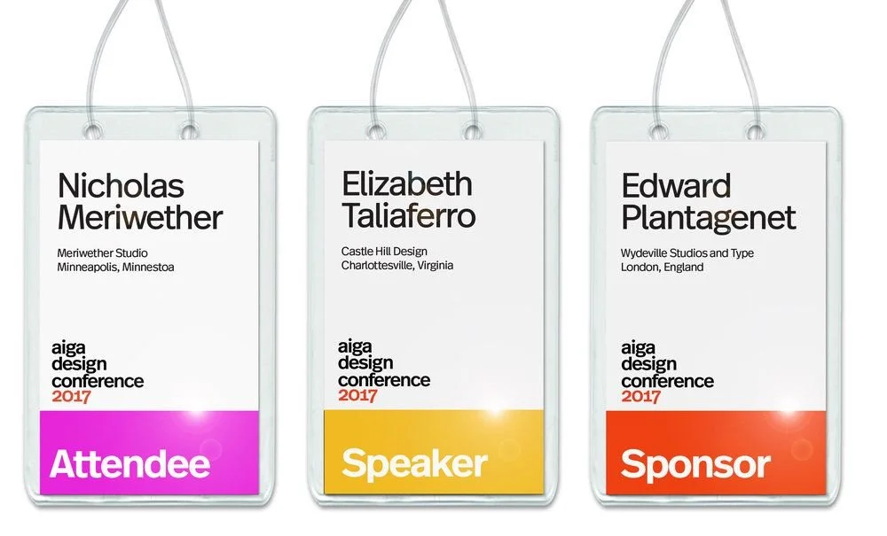
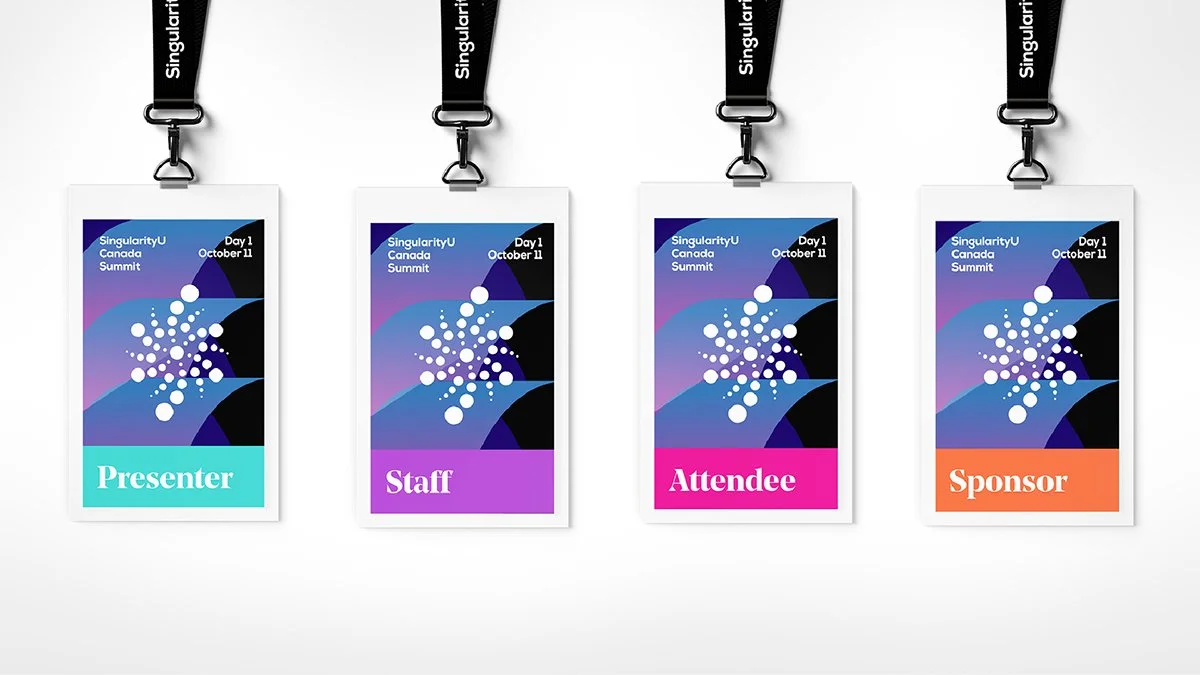
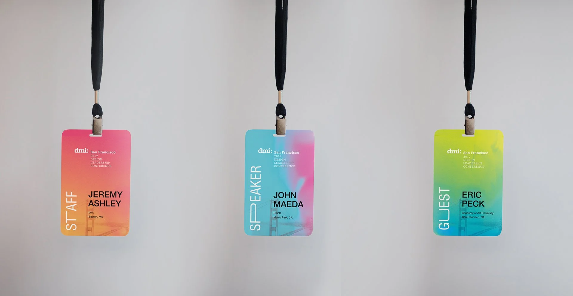
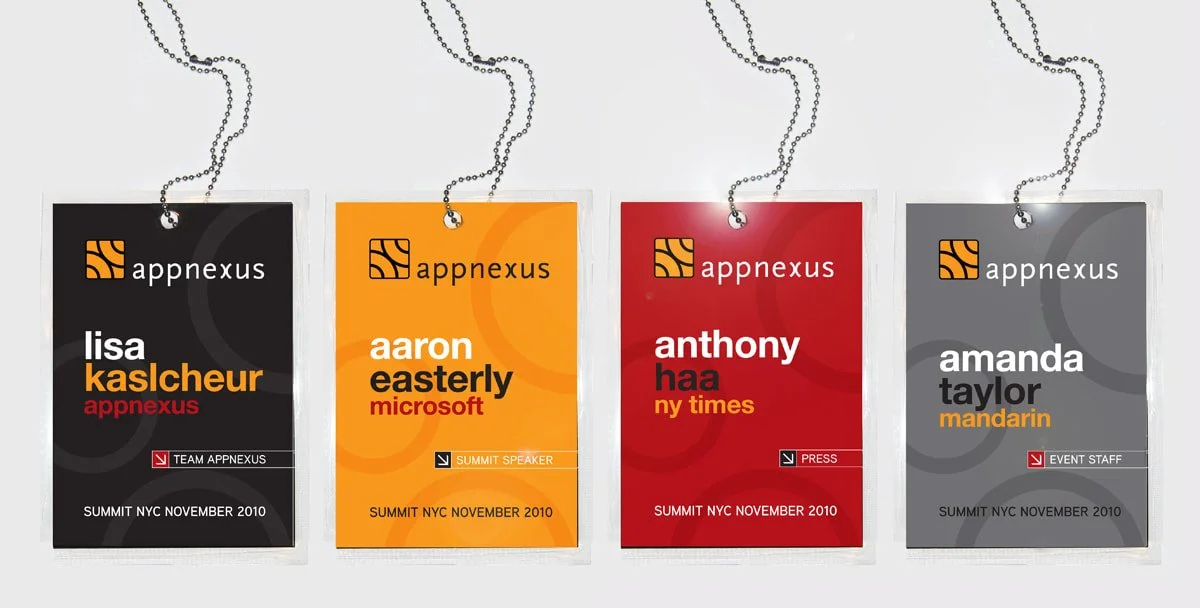
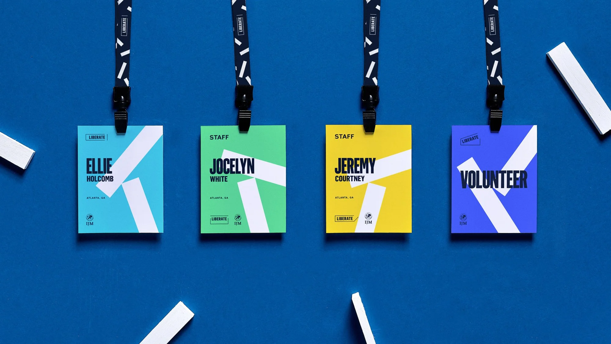
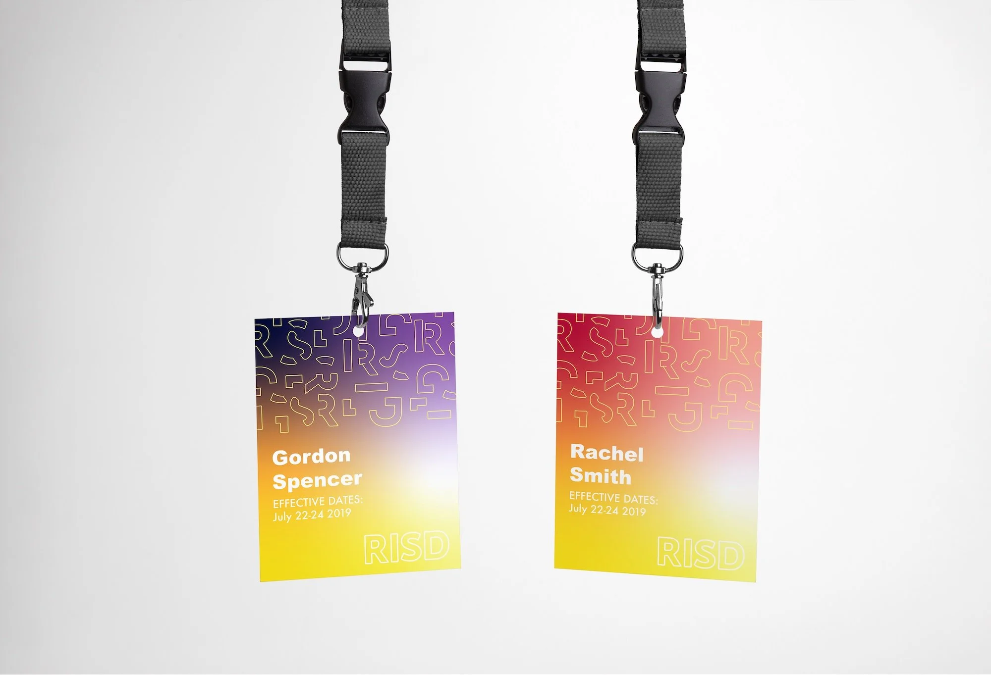
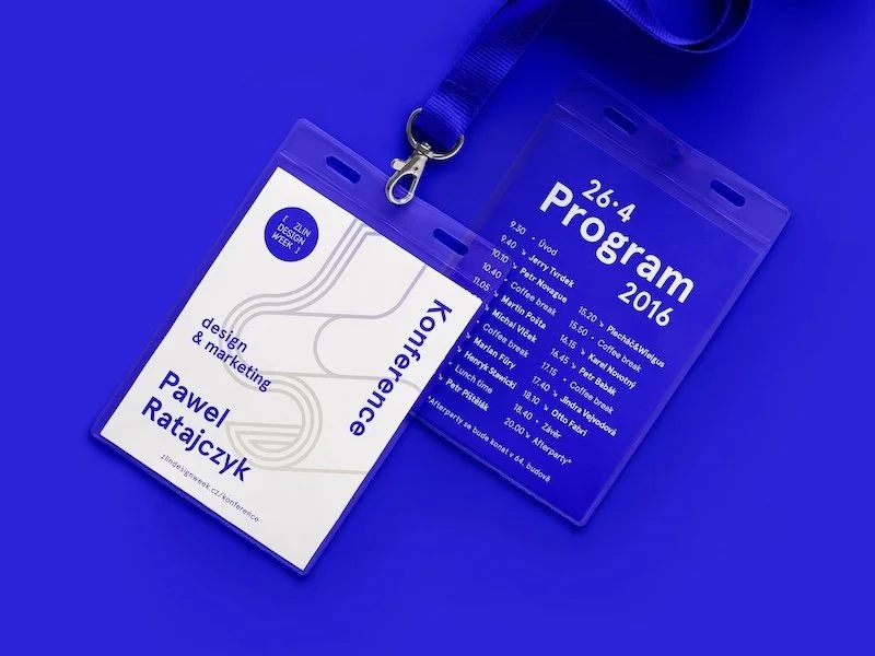
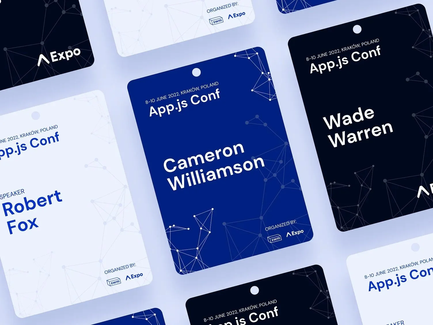
1) Conference Badge Design Essentials: The “Golden Trio”
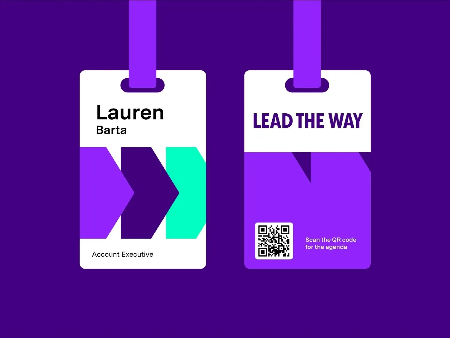
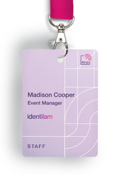
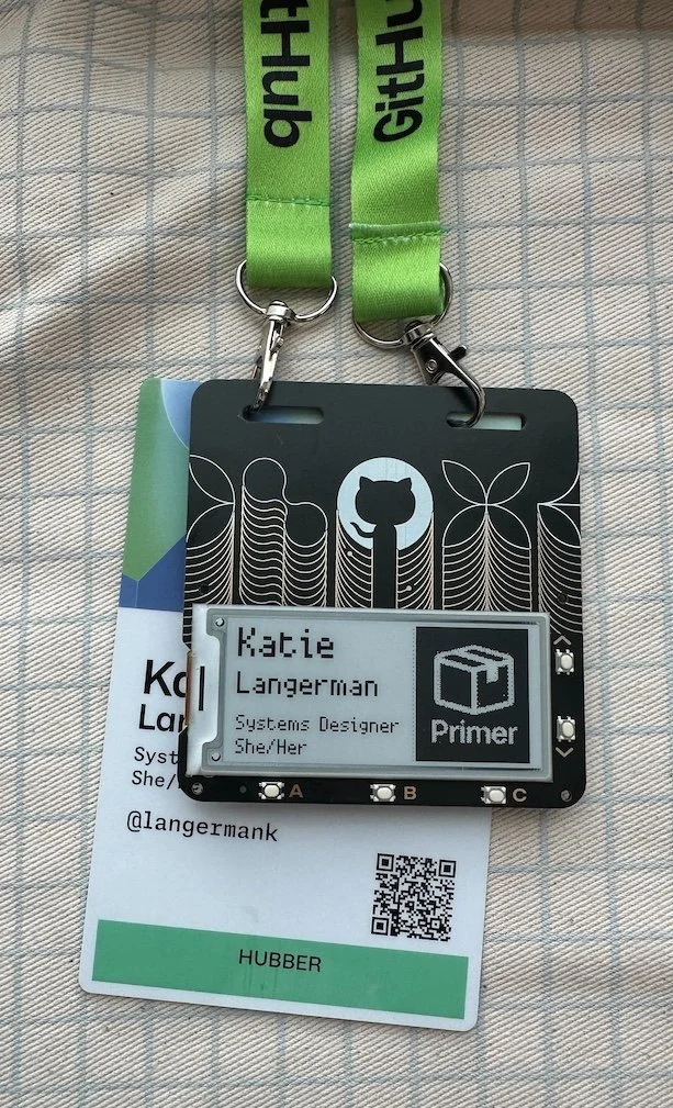
Every great name badge showcases what we’ll call the Golden Trio:
- Attendee’s name
- Affiliation (company or role)
- Event branding (logo or event name).
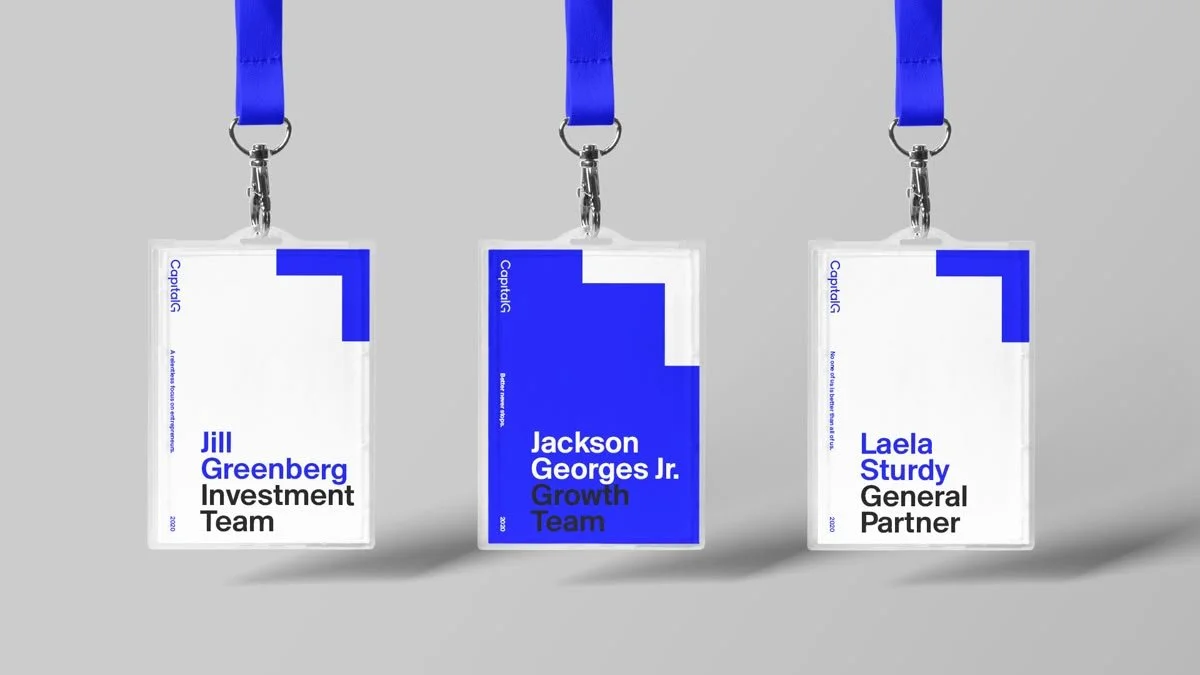
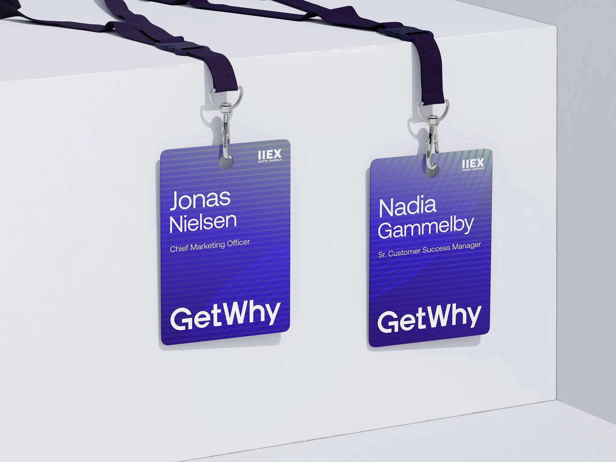
These three elements form the core identity of the badge and should be immediately visible. Think of it this way: your badge is a mini introduction that should answer “Who are you? Who do you represent? And what event is this?” at a single glance.
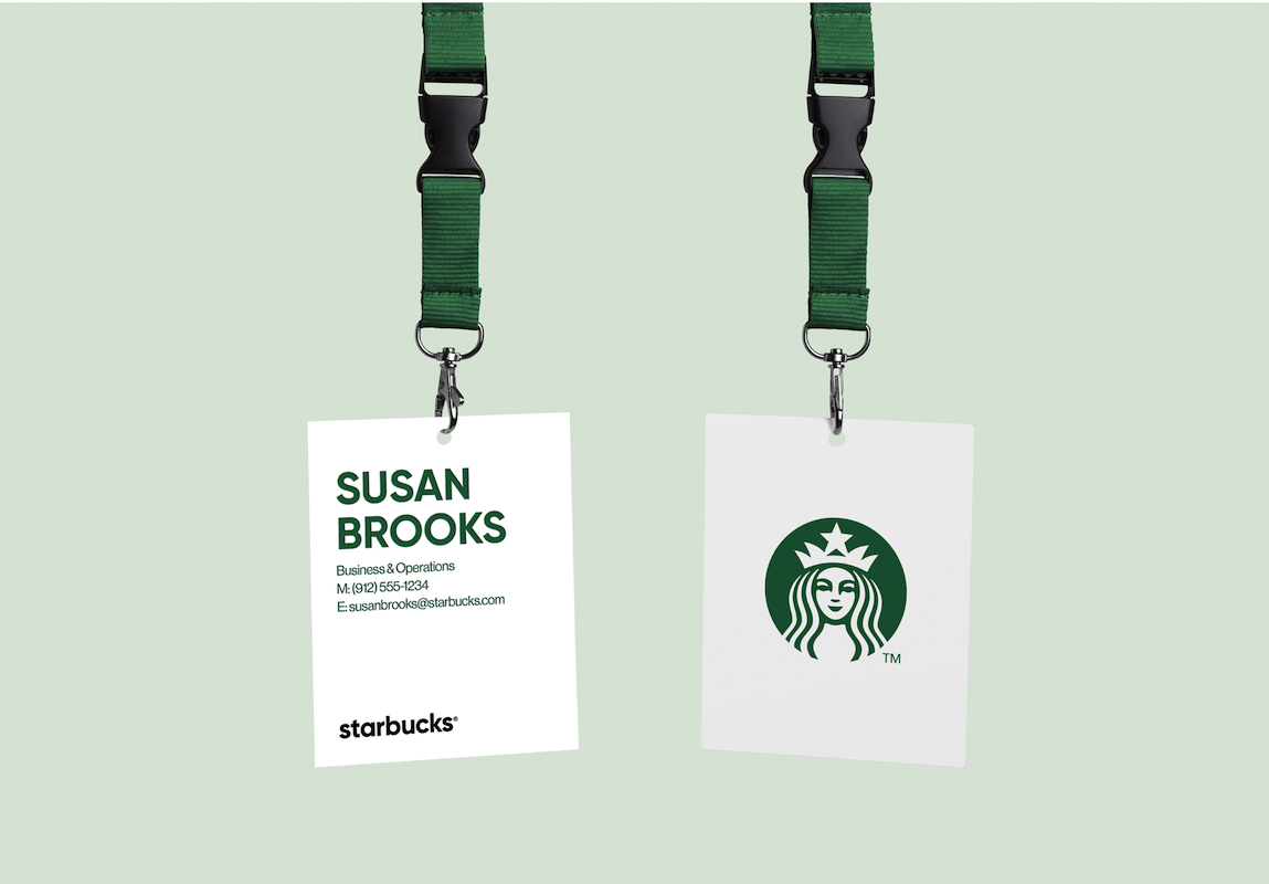
Attendee Name:
Make the first name the star of the show – it should be bold and large. In many cases, the first name alone can be prominent for a friendly, casual vibe. The last name can be slightly smaller if space requires. This helps others read the name quickly without visual clutter.
Job Title or Company:
This secondary info provides context (“Oh, you’re an engineer at TechCorp – nice to meet you!”). It should be in a smaller, supporting font beneath or alongside the name. Keep it concise; if the title or company name is lengthy, use a narrower font or consider just using a company logo.
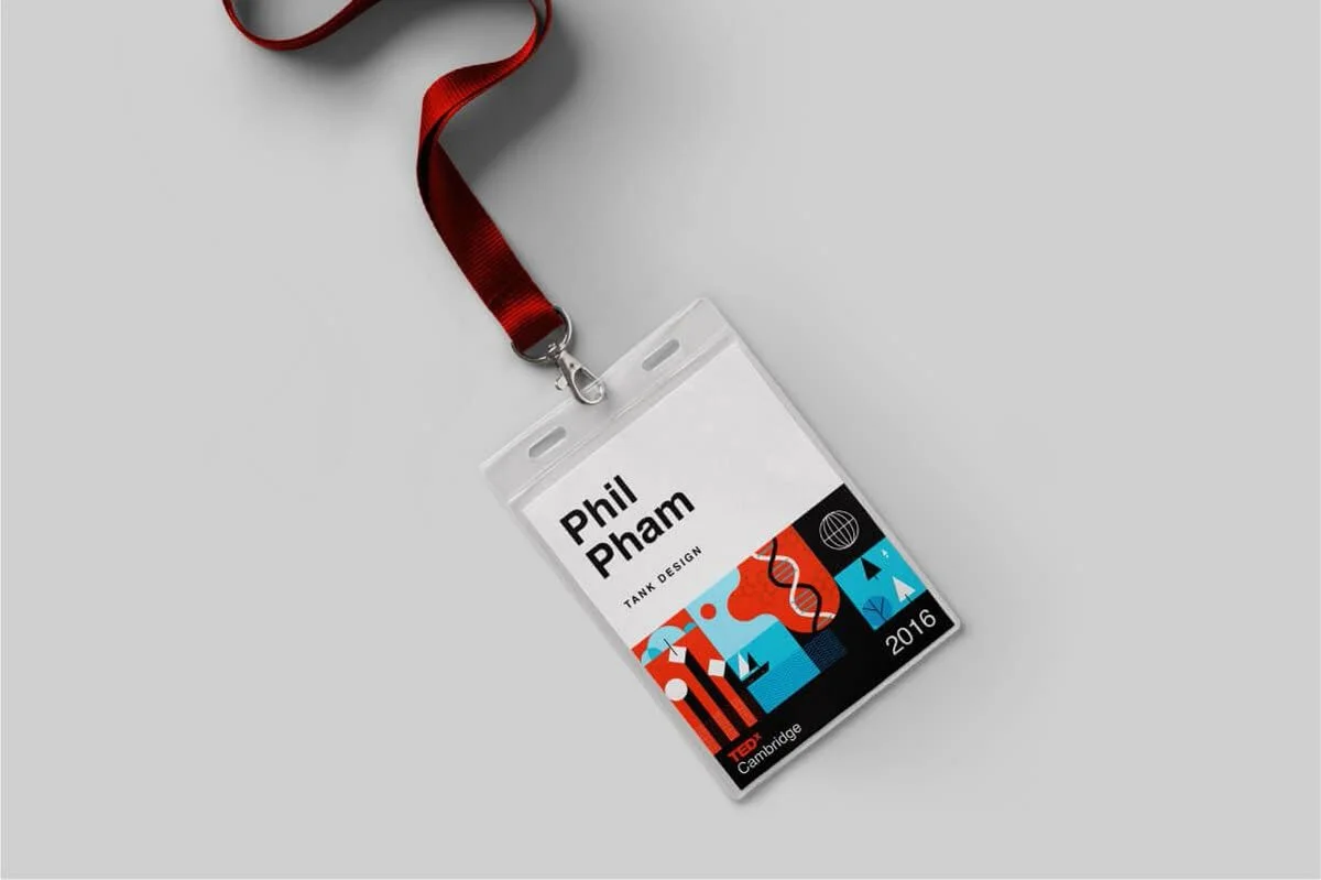
Event Logo/Name:
Including the event logo or name ties the badge to your conference’s identity. It’s usually placed at the top or bottom. Remember, the attendee isn’t likely to forget which event they’re at, so this element can be smaller than the attendee’s name. It serves more as branding and a memory keepsake.
By prioritising these three elements, you ensure the badge serves its primary purpose: identification and affiliation.
A quick look at a well-designed badge should tell someone the wearer’s name and company, and subtly reinforce the event branding in the background. Get the Golden Trio right, and you’re halfway to a fantastic badge.
2) Conference Badge Design Layout & Readability: No Squinting Required
A badge that isn’t readable from a reasonable distance might as well be a blank card. Good layout and readability are paramount – no one should have to squint or awkwardly stare at someone’s chest to decipher a name tag. Here’s how to layout your badge for maximum clarity.
Size and Orientation:
Common conference badge design sizes like A7 (74 × 105 mm) or A6 (105 × 148 mm) strike a balance between visibility and convenience. An A7 badge is smaller, while A6 gives you more room for info. Larger events often opt for A6 so names can be bigger and perhaps even print schedules on the back, whereas smaller meetups might use compact name tags. Choose a size that fits the amount of information you need without overwhelming the wearer. And always do a test print at actual size: can you read it from a couple of meters (3–5 metres)? If not, adjust your size or layout.
Hierarchy of Information:
Follow a clear hierarchy in conference badge design – typically the attendee’s name is the headline, affiliation/sub-text is the sub-headline, and everything else follows. Position the first name at the top portion of the badge, often centred, on its own. This makes it the first thing people see. The last name can go right below it in slightly smaller text (or on the same line if space demands, but only if it’s still legible). Below that, in even smaller text, you can list the person’s title or company. By structuring text in distinct layers, you guide the reader’s eye through the info in the right order.
White Space and Alignment:
Don’t feel compelled to fill every inch of the conference badge design with text or graphics. White space (empty space) is your friend – it prevents the badge from looking like a cluttered flyer. Ensure margins around text are sufficient. Elements should be aligned neatly (centre alignment often works for names, left alignment for lists of info can also be clean). A balanced layout, whether centred or using a grid, helps the badge look professional and digestible at a glance.
Distance Legibility:
As a rule of thumb, someone’s first name should be legible from at least 3 meters away. This typically means a font size for the first name in the range of ~36–48 points (we’ll cover fonts in the next section). If you can, test this: print a prototype badge, pin it on a colleague, and see how far away you can still read it. This ensures smooth networking; people can catch names at a glance during mingling, rather than awkwardly moving closer.
Double-Sided or Flip-Proof:
Ever been at an event where all you see is the blank back of someone’s name tag flipping around? To combat this, consider printing key info on both sides of the badge (especially the name). Alternatively, design the badge with dual attachment points (two lanyard clips at the corners) so it won’t rotate easily on a single. A well-thought-out layout isn’t just about visuals – it’s about practical use in a busy environment.
By paying attention to layout and readability in your conference badge design, you’ll create badges that perform as good as they look. Attendees (and organisers) will thank you when they can read names easily and focus on conversations, not struggling with badges that have teeny-tiny text or jumbled info.
3) Typography Tips: Fonts, Sizes, and Hierarchy
Go Sans-Serif for Names:
The consensus among event pros is to stick with clean, sans-serif fonts for the main text. Fonts like Arial, Helvetica, Open Sans, or Verdana are excellent choices. They’re designed for clarity and remain readable even at a distance or in dim lighting. Serif fonts can work for printed materials, but on a small badge, those tiny serifs can blur together. Save the decorative or cursive fonts for perhaps a themed event logo or a one-off decorative element – and even then, use sparingly.
Remember: Fancy fonts make it harder for attendees and staff to read the badges … stick with fonts like Arial or Open Sans in conference badge design to guarantee clarity.
Font Sizes – Be Generous:
Err on the side of too large rather than too small, especially for first names. As a starting point, consider ~48 pt for first names (roughly 16–18 mm tall text, or about 60 px on screen). Last names can be a bit smaller, say 30–36 pt, depending on length. Titles and company names often work at 16–24 pt range, since they’re secondary. These aren’t hard rules – the key is testing. Set the name in the largest size that fits well, then design the rest of the badge around that. Never go below 12 pt on anything on a badge.
Use Weight and Style for Hierarchy:
Bold your attendee names to make them stand out. Supporting text (like company or title) can be regular weight or even light, as long as it’s still legible. Avoid italics in your conference badge design – they can be harder to read. Instead, use size, weight, or colour to create contrast.
Case Matters:
Using Title Case or Upper/Lowercase for names is preferred over ALL CAPS. Mixed case is easier to recognise by word shape and aids fast scanning.
Avoid Text Crowding:
Give each bit of text breathing room. Break first and last name onto two lines if needed. Only include text that adds value for on-the-spot identification.
Readable typography is inclusive typography:
Choose clean fonts and proper sizes so everyone can engage. We recommend at least 48 pt for names (bigger for big venues) and high contrast colours.
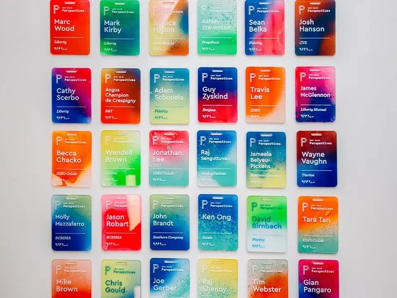
Use Brand/Event Colours Strategically:
Incorporate the event’s colour scheme to reinforce branding, but don’t go overboard. Keep text on neutral backgrounds and use brand colours as accents.
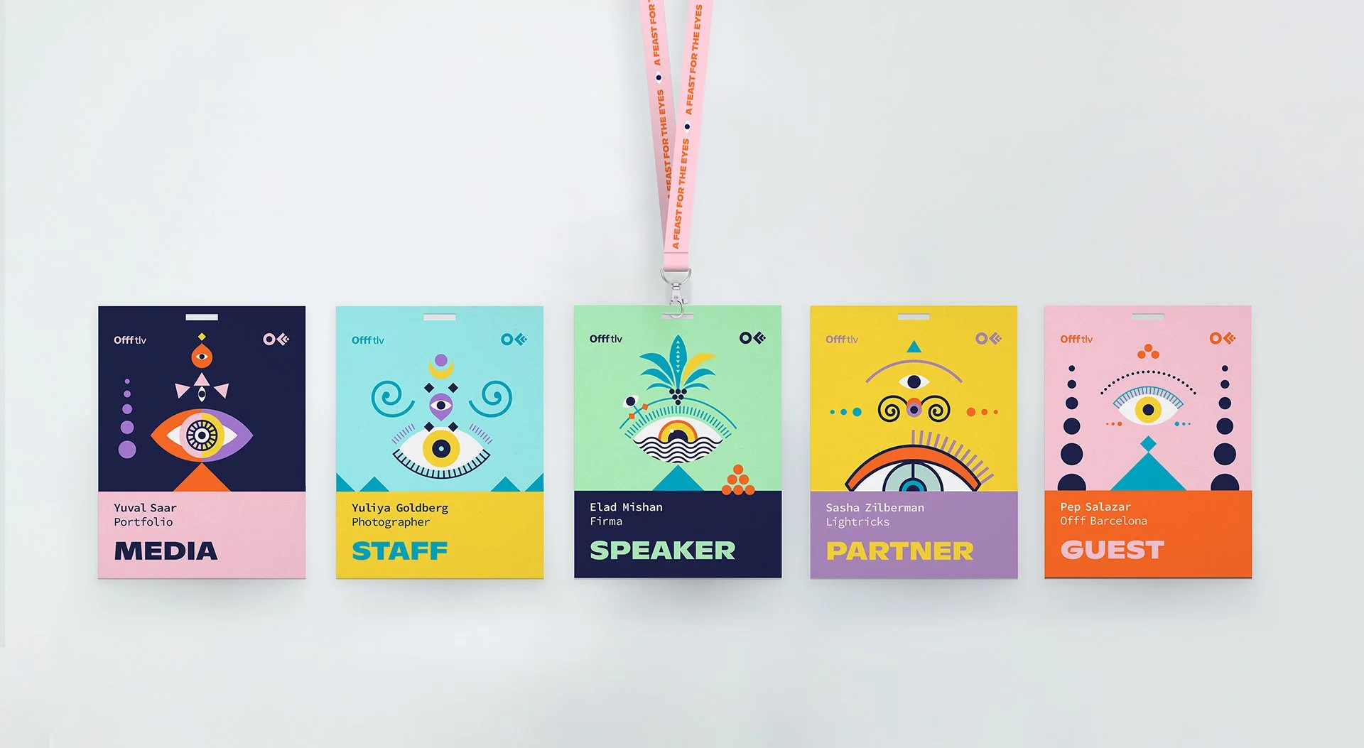
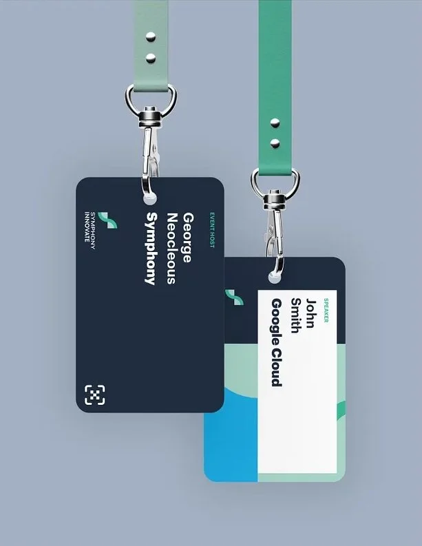
4) Branding and Logos: Balancing Event & Sponsors
Events often have multiple logos vying for space on the badge – the event logo itself, and perhaps sponsor logos. Badges are prime real estate for branding, but we need to strike a balance so that the attendee’s identity remains front and centre.
Event Branding:
Include your event logo or wordmark prominently but supportively. Place it smaller than the attendee’s name, top or bottom, so the person remains the hero.
Sponsor Logos:
Keep to one or two small marks. If many sponsors must appear, consolidate them on a bottom strip or move them to the back.
Logo Quality and Placement:
Use high-resolution assets and respect whitespace. Corners or bottom edges are less intrusive.
Integrating with Design:
Consider subtle patterns, accent borders, or colour blocks derived from the brand – always secondary to readability.
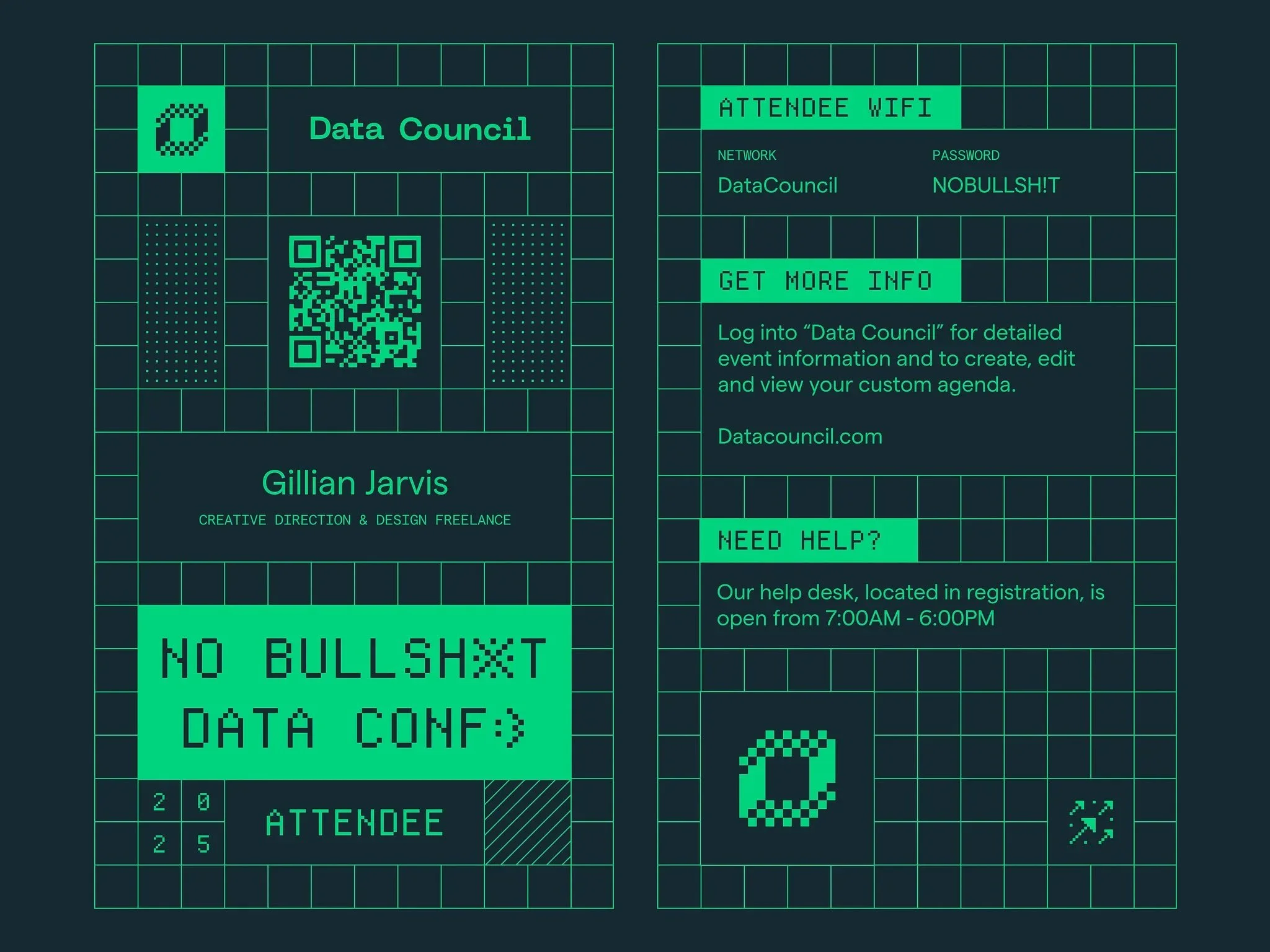
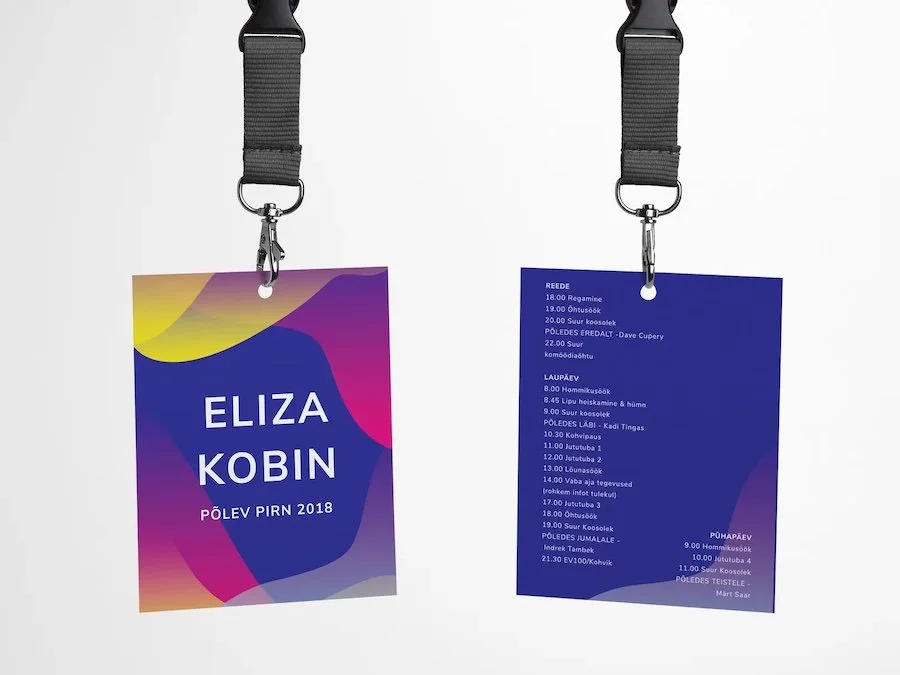
Double-Sided Opportunities:
If the front must stay clean, push sponsor stacks and extras to the back. Keep the wearer’s name dominant on the front.

Branding on a badge should be like seasoning: enough to add flavour, not to overpower the dish.
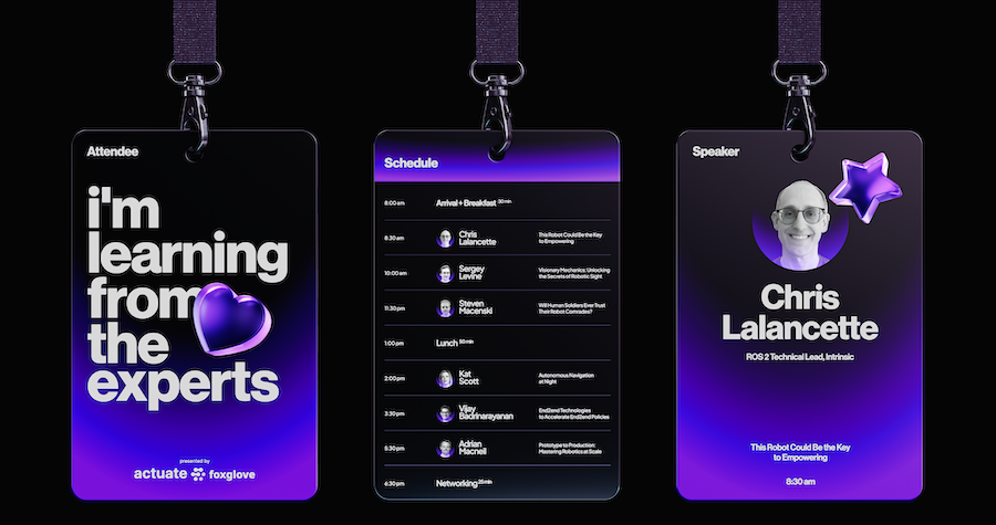
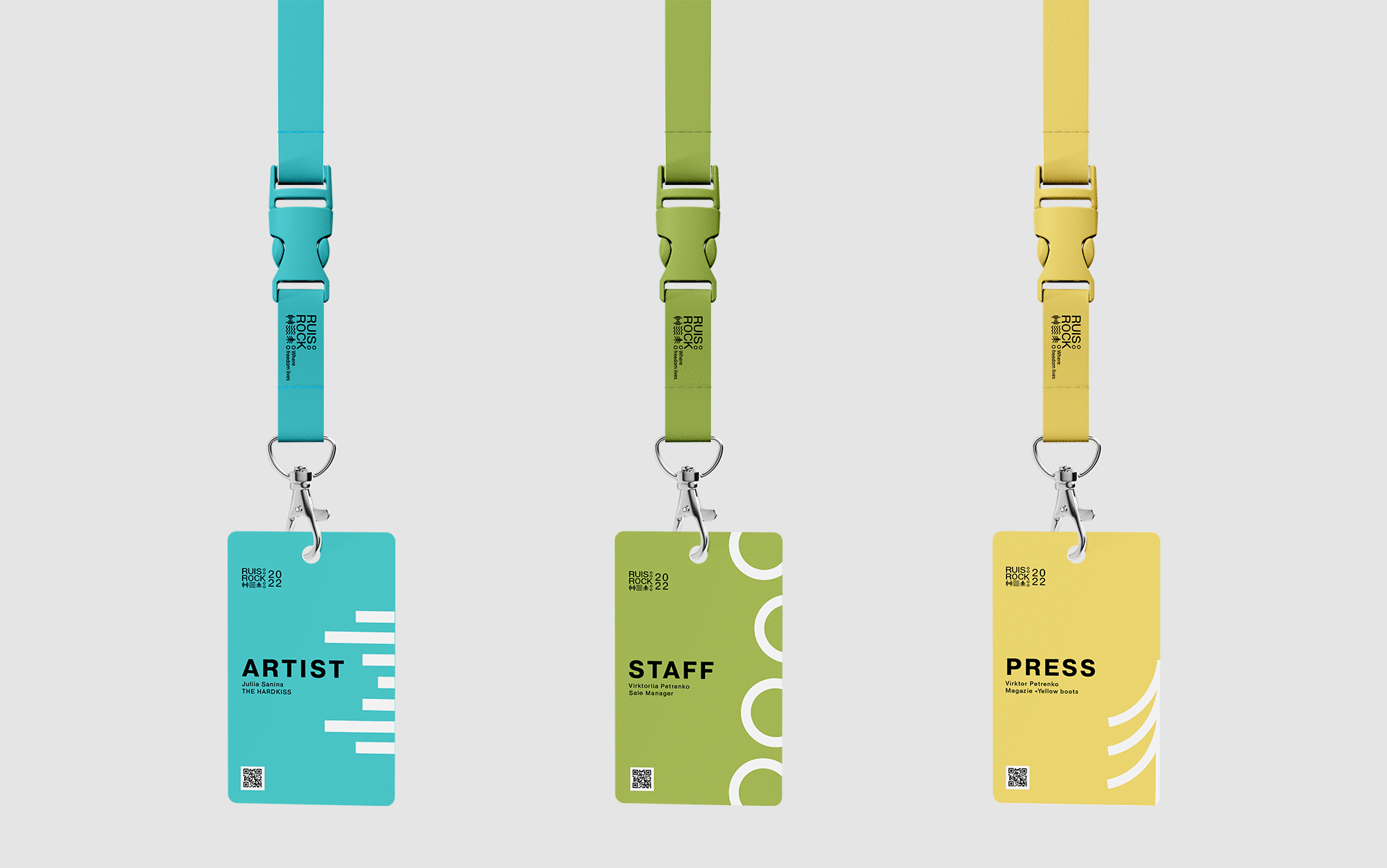
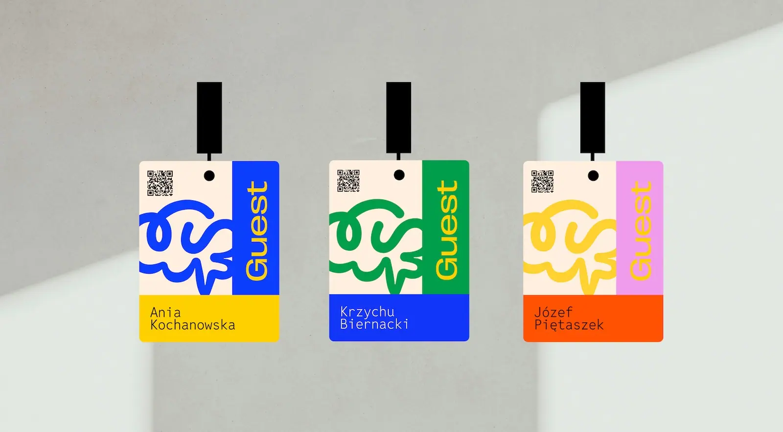
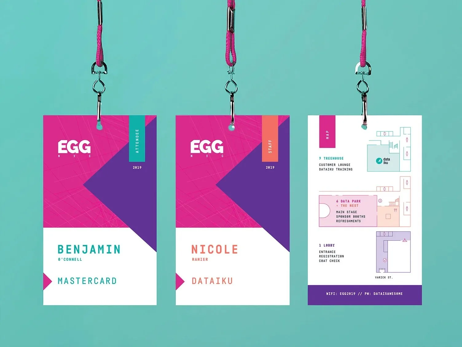
5) Creative Badge Ideas: Beyond the Basics
Unique Shapes or Die-Cuts:
Consider custom silhouettes that match the event theme, while keeping a stable, readable area for the name.
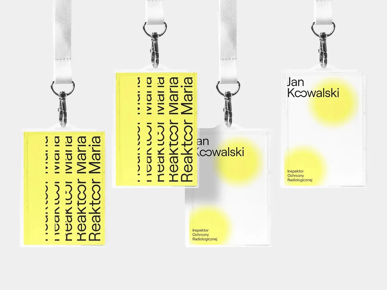
Thematic Graphics and Art:
Use illustrations and background art lightly so they never compete with the text.
Use the Back of the Badge:
Print schedules, maps, Wi-Fi, or icebreakers on the reverse so flips become useful, not annoying.
Personalisation and Photos:
Ideal for security-conscious multi-day events. Optional add-ons like hometowns or “Ask me about ___” prompts can kickstart conversations.
Interactive Elements:
Sticker zones, writable areas, or ribbons can add fun without sacrificing readability.
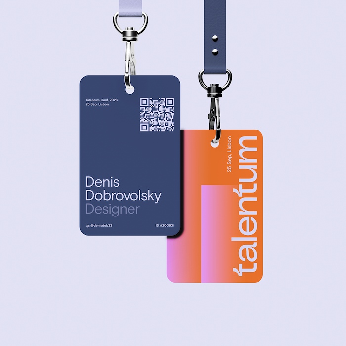
6) Tech Integration: QR Codes, NFC, and More
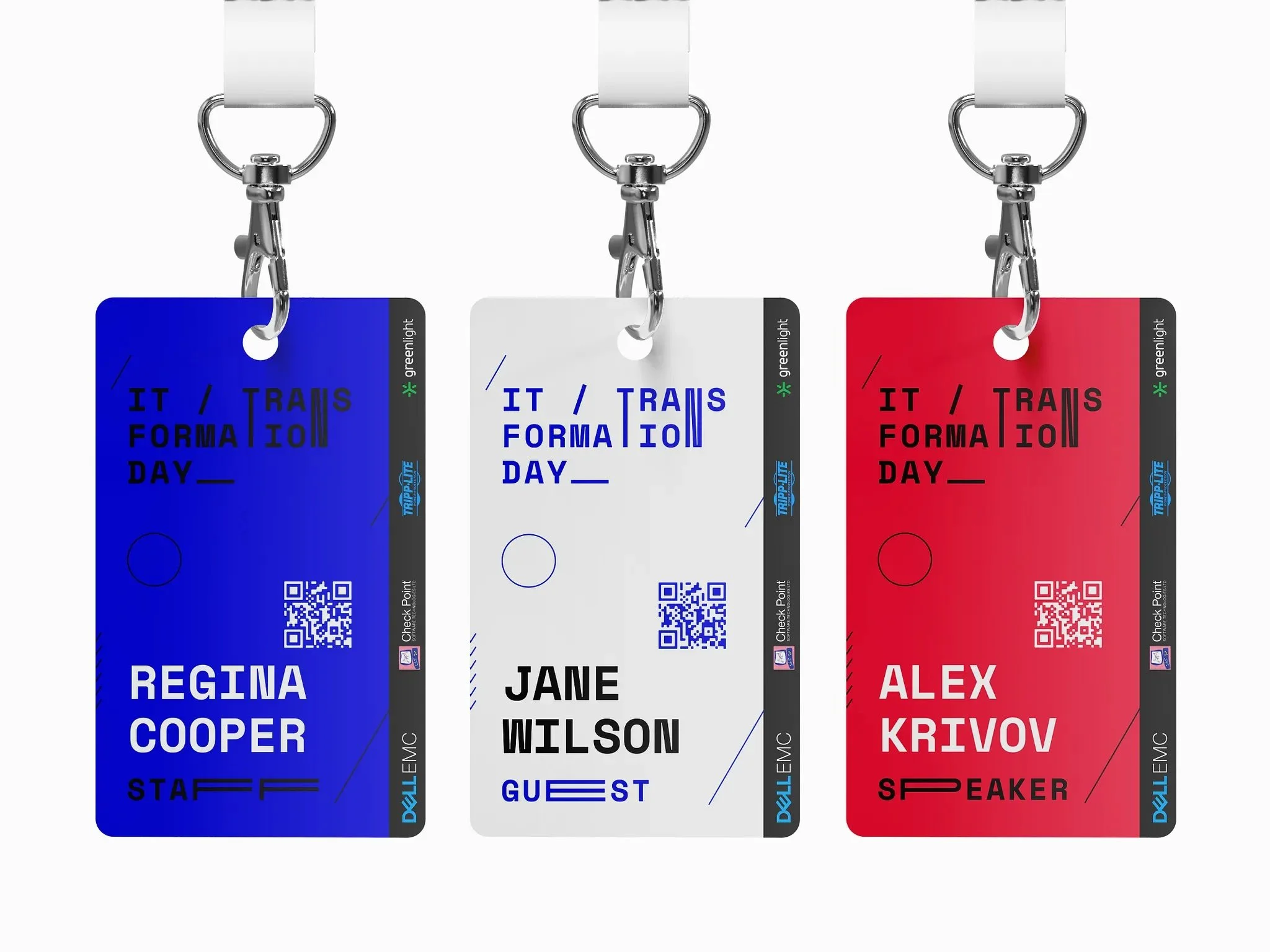
QR Codes for Instant Info:
Use a discreet QR that opens LinkedIn, schedules, maps, or digital business cards. Add a tiny prompt like “Scan for schedule”.
According to event tech experts, after the name, the QR code is arguably the next most important item on modern badges due to the wealth of functionality it unlocks – from attendance tracking to lead retrieval – so it’s worth considering.
NFC/RFID Chips:
Tap-to-check-in, exchange details, or enable payments. Implementation needs supporting systems; communicate privacy clearly.
Augmented Reality (AR) Badges:
Experimental but memorable; test thoroughly before use.
Security and Access Control:
Place scannable codes sensibly and provide visual fallbacks for access levels.
Privacy Considerations:
Tell attendees what data is stored and why, and offer opt-outs or non-tech alternatives where needed.
7) Accessibility & Inclusivity in Conference Badge Design
Large, Legible Text:
Offer an extra-large print option for low-vision attendees.
Pronouns and Preferred Names:
Collect “Name on Badge” at registration and optionally print pronouns, or offer stickers.
Pronunciation Aids:
Add phonetics in small type or link an audio clip via QR where helpful.
High Contrast & Colour Blind Friendly:
Don’t rely on colour alone for roles/access; pair with text labels or icons.
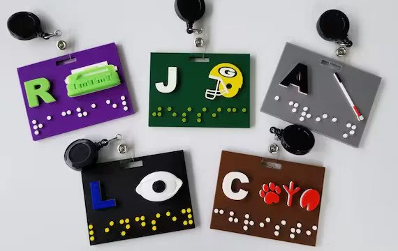
Braille or Tactile Features:
Add concise Braille labels (often first name) where relevant, or provide assistance on-site.
Multiple Attachment Options:
Offer lanyards, clips, or magnets (with non-magnetic alternatives for pacemakers).
Plain Language & Icons:
Use clear words and universal pictograms. Ask for accessibility needs ahead of time.
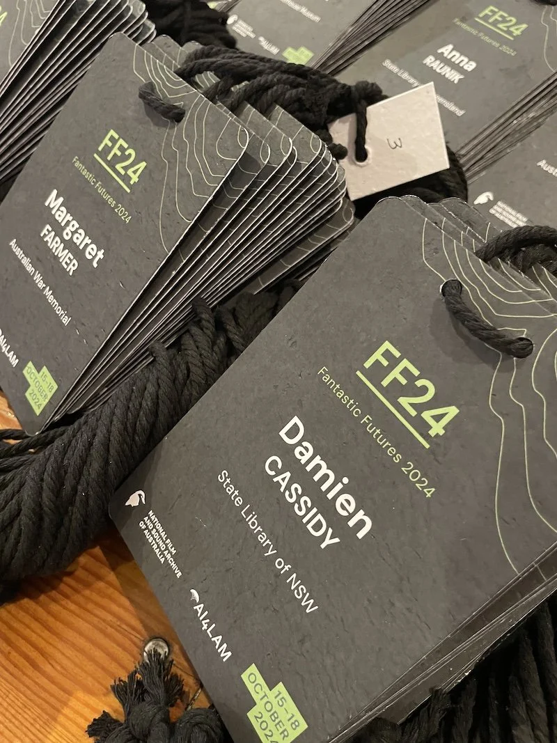
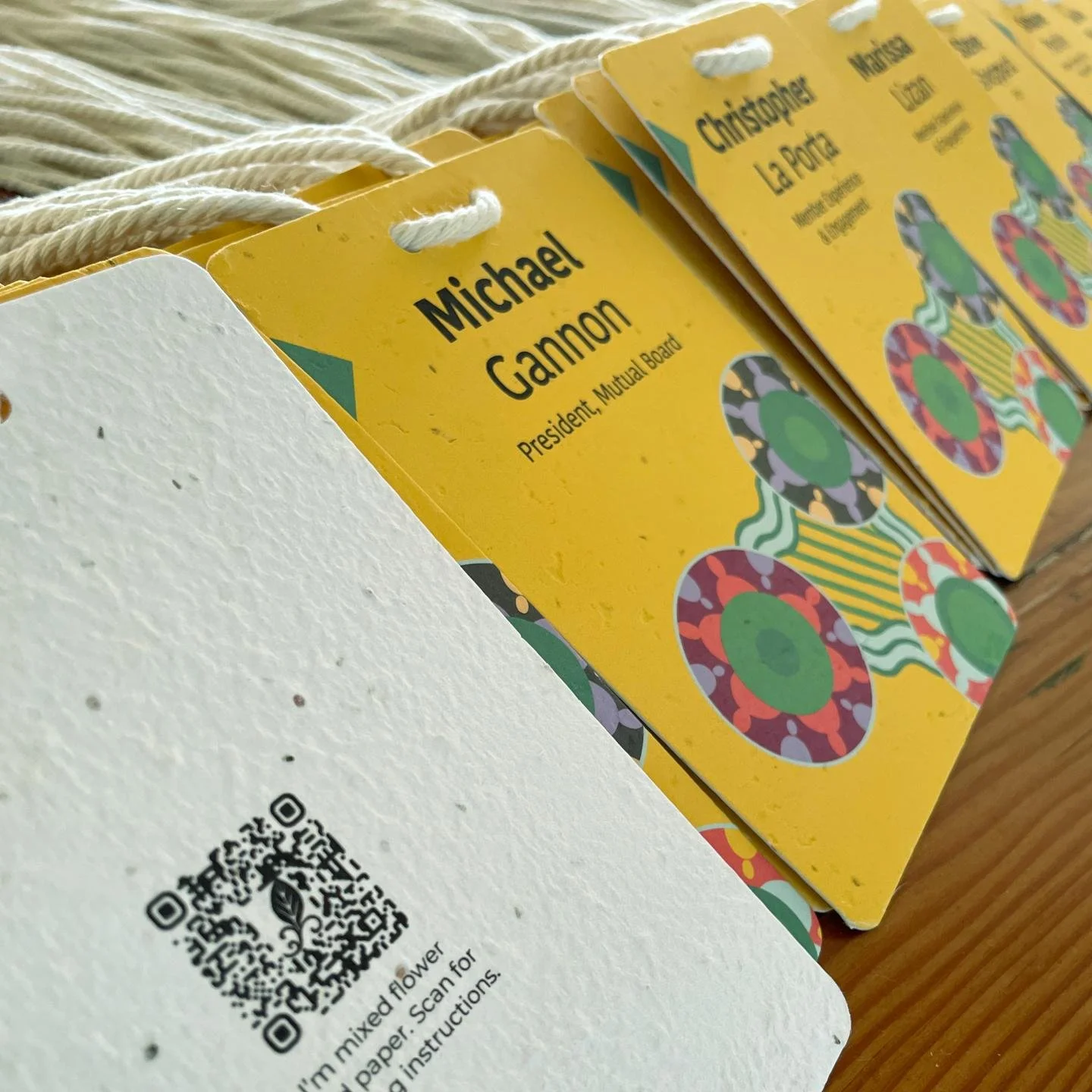
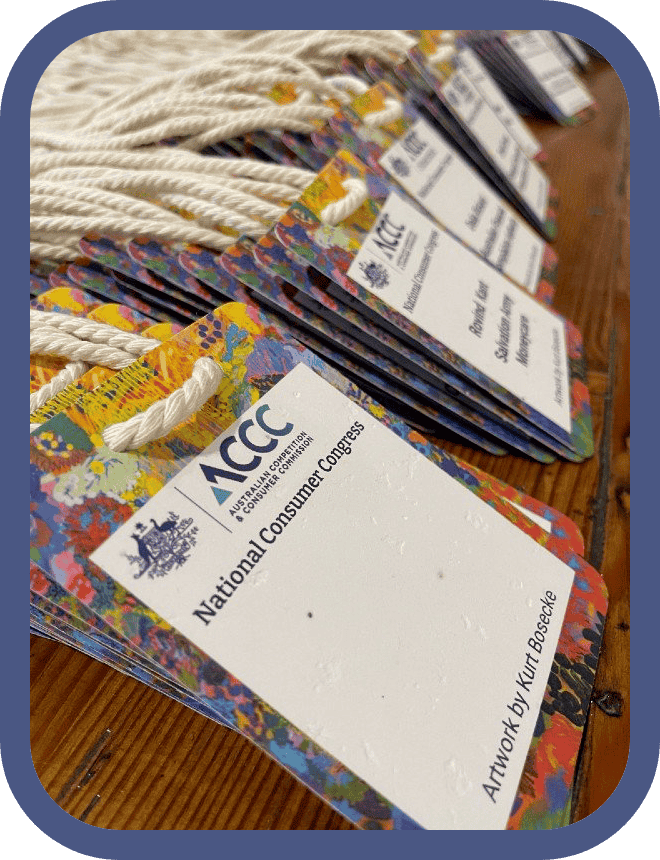
8) Materials & Sustainability: Eco-Friendly Badges
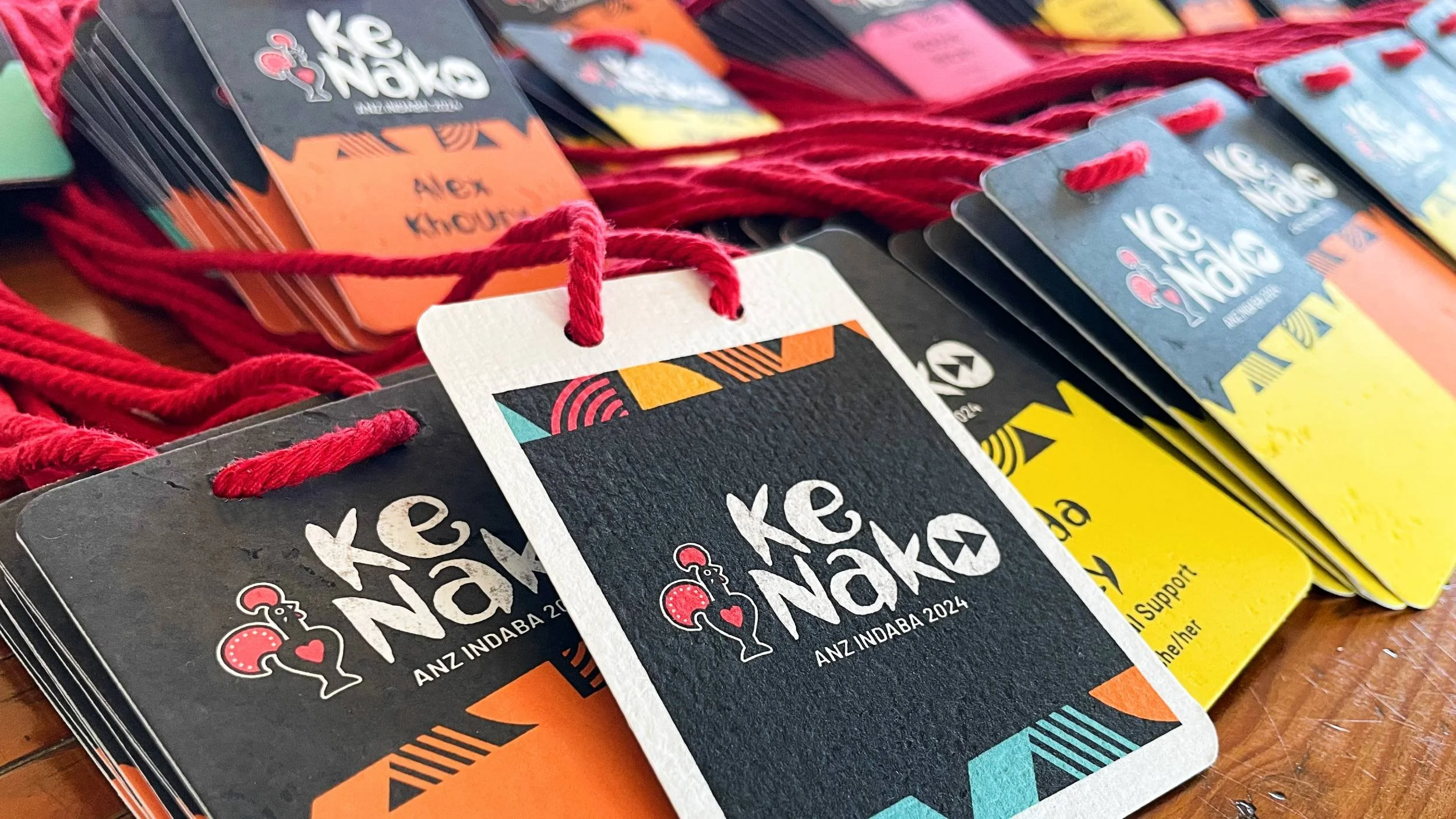
Choose Sustainable Materials:
Ditch PVC. Use recycled card, seed paper, bamboo, wood veneer, or PLA where appropriate. Plantable badges can be soaked and grown after events – a circular keepsake.
Eliminate Plastic Holders:
Print directly on sturdy stock. If holders are essential, opt for compostable or reusable sleeves.
Sustainable Printing:
Prefer vegetable-based inks, local printers, and on-demand runs to reduce waste and emissions.
Recycled Lanyards or Alternatives:
rPET, bamboo, or organic cotton lanyards partner well with eco badges; collect for reuse post-event.
No Unnecessary Extras:
Avoid lamination and redundant plastic components; thicker stock or eco coatings are better choices.
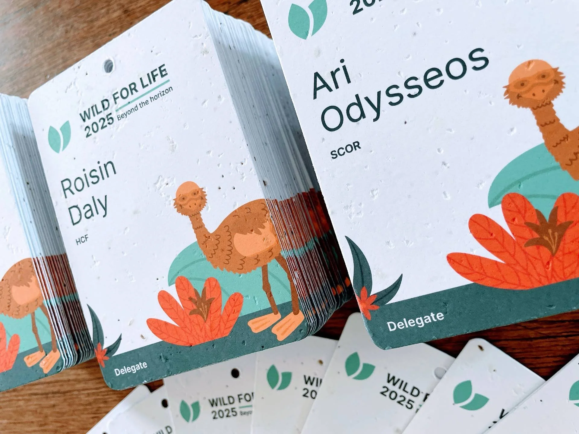
Sustainable Example:
Stacks of eco-friendly conference badges printed on seed-infused paper for a government event. Bold white text on terracotta, easy to read and on-brand. After the event, attendees can plant their badges and grow native wildflowers – stylish, readable, and zero-waste.
See our impact: Impact of Conference Name Tags
9) Lanyards & Holders: Comfort, Safety, and Reuse
Lanyard Material Matters:
Choose bamboo, organic cotton, or recycled PET for comfort and lower impact.
Attachment Types:
Bulldog clips and dual-clip lanyards reduce flipping; swivel hooks are easy to attach.
Breakaway Safety Feature:
Use breakaway clasps to prevent snags and reduce risk in crowded environments.
Badge Holders vs. Direct Printing:
Prefer sturdy card with a punched slot to avoid plastic sleeves; if using sleeves, choose biodegradable or reusable options.
Clips, Pins, or Stickers:
Offer choices; keep magnets optional for those with pacemakers.
Comfort and Length:
Consider adjustable lengths; wider straps often feel better across multi-day events.
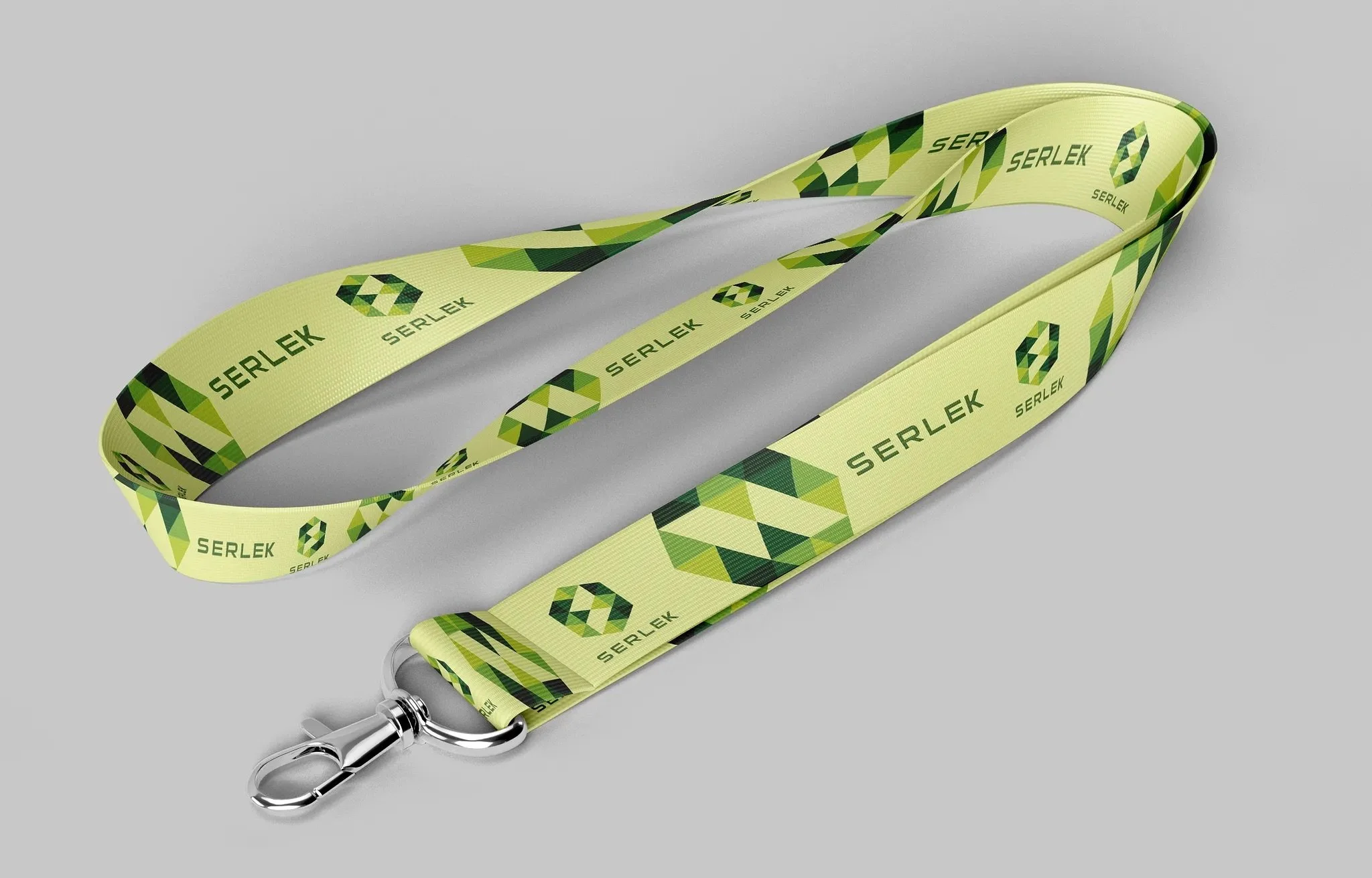
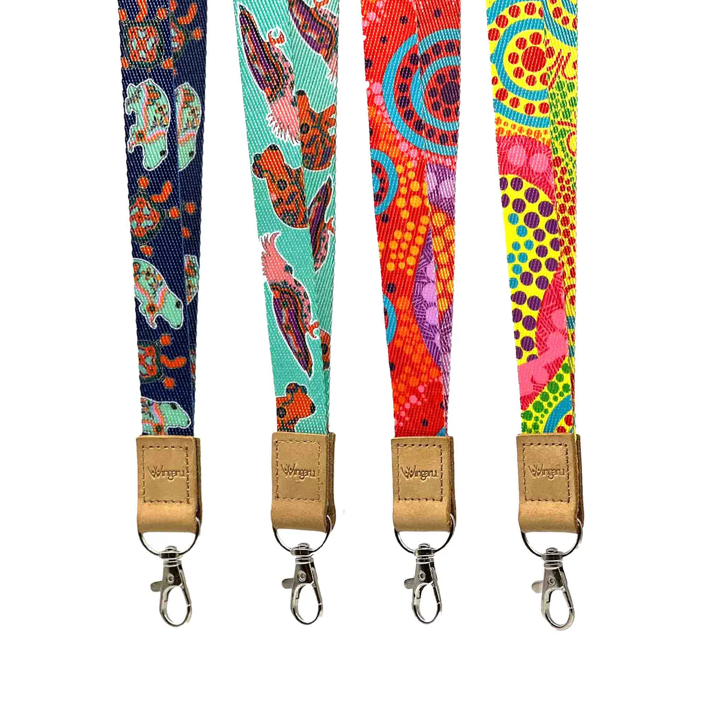
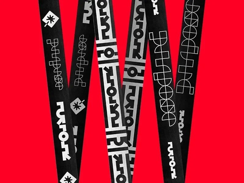
Branding on Lanyards:
Prime sponsorship real estate – keep colours harmonious with the conference badge design.
10) Printing & Finishing: Quality that Lasts
After all the careful conference badge design work, the final step is getting these badges printed and assembled perfectly. The best design can be ruined by poor print quality or a bad cut, so here are some tips on the production side to ensure your badges come out as awesome as they look on screen.
High Resolution Artwork
- Make sure all logos and graphics on your badge are in high resolution (at least 300 dpi for print) and use vector formats for logos whenever possible. This avoids any pixelation. Text, if you can, should be vector (which it will be if you send a PDF for print). Nothing says “amateur” like a fuzzy logo or a grainy photo on a badge.
Colour Accuracy
- If colour consistency is important (for example, your sponsor paid for their logo in exact company Pantone colour), talk to your printer about colour management. For small runs, digital printing (laser or inkjet) is common and usually fine for badges. If you have budget and need perfect colours, you might go offset and Pantone-match the critical colours. That is rare unless it is a prestige event. Do a test print or proof if you can, to catch colour issues or contrast problems. Also note that printing on different materials can change colours. For example, printing on brown kraft paper yields a different look than on white paper; white ink may be needed if you want bright colours on dark paper.
Paper Thickness & Durability
- Choose a paper stock that will hold up. We recommend at least 200–300 gsm weight cardstock for paper badges (roughly index card to postcard thickness). Many conference badges are even thicker, like 24–30 pt stock (600+ gsm) which feels almost like cardboard or a credit card. You want something that does not flop or curl easily. If you are using seed paper or other specialty material, get samples to ensure it is sturdy enough and that your printer can print on it. Seed paper is often handmade and can be irregular, though many digital presses handle it well. If weather or moisture might be a factor at outdoor events, consider waterproof or tear-resistant paper options that are still eco-friendly. Lamination makes paper waterproof but it is plastic, so avoid it unless absolutely needed.
Bleeds and Edges
- If your conference badge design has colour or images reaching the edge of the badge, set up a proper bleed (usually 3 mm or 1/8 inch beyond the edge) so you do not get white slivers when cutting. Use crop marks and ask the printer to trim to size. If doing DIY printing, be prepared to cut neatly. A stack cutter or at least a good craft cutter and guide will help achieve clean edges. If you have hundreds of badges, professional cutting is worth it.
Variable Data & Proofing
- If each badge is personalised, you will use either a mail-merge style print workflow or an online template tool. Double-check the data well before printing. Run a spell-check on the names list or have someone review for obvious errors. People hate having their name misspelt. Watch out for very long names or titles that might not fit your design. Have a plan, such as a slightly smaller font for those cases or truncated text. Print a few samples, including the longest name and title, to see how they look. Some event software flags overflow text or lets you adjust font size per badge dynamically. If you can, print one test badge for each different layout scenario and literally wear it for a bit to see if it holds up.
On-Site Printing vs Pre-Print
- Decide if you will print all badges in advance or use on-site printing. Pre-printing means you can use premium materials and assemble before the event, though you risk printing badges for no-shows or last-minute changes. On-site printing with thermal printers or quick digital setups is common for larger conferences. Attendees get their badge on demand at check-in, which is efficient and avoids waste, but you need reliable printers and usually simpler designs, often black and white or single colour due to printer limits. Some events use hybrids. For example, pre-print VIP or paid attendees on premium stock, and keep blank spares for walk-ins on simpler stock.
Finishing Touches
- After printing, plan finishing steps: collating with lanyards, alphabetising, and stuffing in holders. For large batches, print in the order you plan to distribute, such as by last name or company, to save sorting time. If using lanyards, decide whether to attach them ahead of time or stack separately. Pre-lanyarding speeds distribution although lanyards can tangle in transport. One trick is to hang badges on a board or clothes rack by lanyards in alphabetical sections. It makes pickup simple and looks tidy. If using pin or magnet badges, pre-affix the fasteners to the backs to avoid a mess at check-in.
Quality Check
- Inspect a batch of printed badges for smudges, cut errors, and similar issues. Better to catch a problem on ten badges and fix it than to discover it after five hundred are done. If badges will be written on, ensure the surface takes pen or marker. Some coatings resist ink. Test barcodes and QR codes with a phone app to confirm the print resolution keeps them scannable.
Spares and On-Demand Blanks
- Always print a few blanks or spares for each category. People will arrive unregistered or lose a badge. Having a dozen blank badges or a portable printer on hand lets you make replacements that match the rest. Even a neat “Hello, my name is ______” option is better than nothing, although matching the set is ideal.
Printing and production may not be the most glamorous part of badge design, yet it is where your vision becomes reality. With careful attention to print setup and finish, you will avoid last-minute hiccups and ensure every badge looks and feels professional. After all, these little pieces of paper or plastic will live on lapels and lanyards throughout your event. They should arrive looking crisp, vibrant, and ready to represent.
Pro tip: If you are ever in doubt, partner with a professional badge printing service. They live and breathe this work and can guide material choices and handle tricky printing. Knowing what you want, thanks to this conference badge design guide, ensures you get the best results.
11) Final Checks and Conference Badge Design Checklist
- ☑️ Readability & Layout: Is the attendee’s first name big and bold enough to read from a couple of meters away? Clear font, uncluttered layout, sufficient white space?
- ☑️ Contrast & Colours: High contrast; colour-coding backed by labels/icons.
- ☑️ Inclusivity: Pronouns optional, phonetics as needed, Braille where relevant.
- ☑️ Size & Format: A6/A7; consider double-siding and flip-proof attachments.
- ☑️ Materials: Recycled/plant-based; avoid unnecessary plastic.
- ☑️ Branding: Event visible, name dominant; sponsors subtle.
- ☑️ Creativity & Theme: On-brand flair that never hurts legibility.
- ☑️ Technology: QR/NFC tested; add tiny instruction; visual fallbacks in place.
- ☑️ Attachment & Assembly: Safe, comfortable, and tidy distribution plan.
- ☑️ Printing: Proof names, check bleeds, scan codes, inspect cuts.
- ☑️ Extras: Recycling bins, lanyard reuse, a handful of spares.
Download the checklist: Conference Badge Design Checklist (PDF)
Conference badge design might seem small, but with the right decisions they help people connect without any squinting.