Name Badge Etiquette: No-Fail Rules for Unforgettable Events
Name badge etiquette is more than event swag. It is the quiet social glue that helps people relax, connect, and feel like they belong at professional events.
When you walk into a conference or corporate gathering, you are not just an individual. You are part of a temporary community. Good name badge etiquette makes that community feel open, welcoming, and professional from the moment people arrive. A well designed badge is a silent handshake and an unspoken invitation to start a conversation.
Poorly designed badges, on the other hand, can derail even the best run event. Tiny fonts, low contrast colours, plastic holders that flip backwards, or lanyards that hang too low all make networking feel harder than it needs to be.
At Terra Tag we spend an extraordinary amount of time helping teams get this right. This guide brings together the essentials of professional name badge etiquette, conference name badge etiquette, and practical networking name tag etiquette, plus sustainability and accessibility tips so you can run events that feel thoughtful from start to finish.
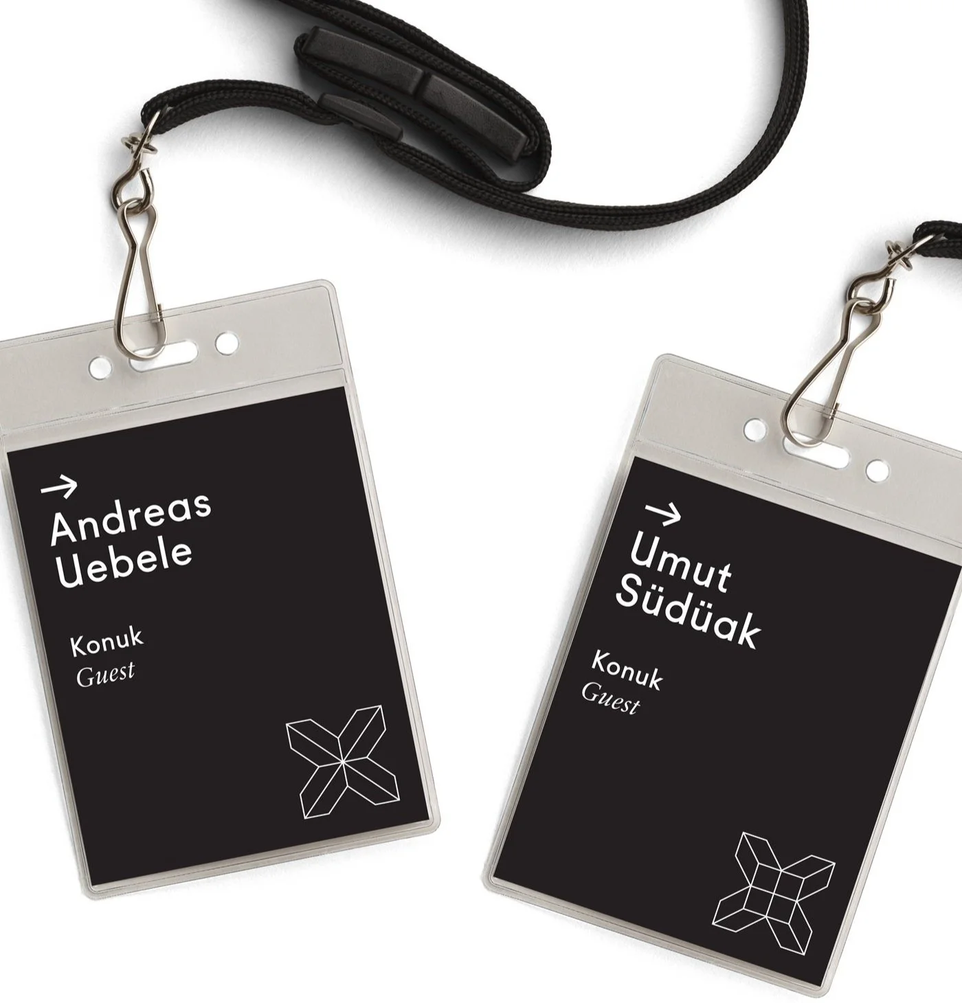
Best Practice Name Badge Placement Rules
Placement is one of the most overlooked parts of name badge etiquette. You can have a beautifully designed badge, but if it sits too low or flips around all day, it will not do its job.
Placement rules that work
- Keep the badge at upper stomach height. This keeps names within a natural line of sight so people do not feel like they are staring at someone’s chest.
- Use dual hole lanyards. Two attachment points stop the badge from spinning around and make your name readable from more angles.
- Provide adjustable lanyards. People come in different heights. Adjustable lanyards help you achieve consistent placement for everyone.
Placement mistakes to avoid
- Badges that hang too low. If someone has to bend down to read a name, the badge has already failed.
- Single hole lanyards. One attachment point almost guarantees the badge will flip backwards.
- No readability test. Always print one or two test badges and check them at several distances in typical event lighting.
Placement is a simple but powerful piece of conference name badge etiquette. Get it right and you remove a huge amount of social friction at networking events.
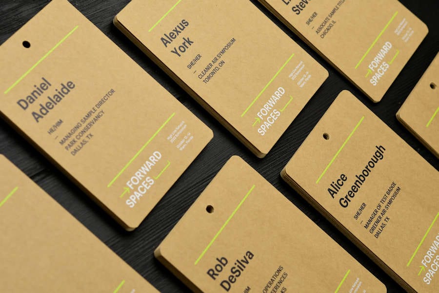
What Should Be on the Front of a Name Badge
The front of the badge carries the essentials of professional name badge etiquette. It is where you balance readability, brand, and clarity so people can recognise each other at a glance.

On the front, clarity comes first. A clean layout with a generous font size is far more effective than a busy design that looks clever on screen but fails in a crowded room.
First name as the clear hero
- Make the first name the largest element on the badge. This is the core of good networking name tag etiquette.
- As a starting point, aim for at least thirty eight to forty eight point for the first name. For very large rooms or exhibition halls, you can go higher.
Last name on a separate line
- Use a slightly smaller size and, where possible, place it on its own line beneath the first name.
Organisation and role
- Include the company name to give context for conversations. Job titles are optional and can sit beneath the name in a smaller, lighter weight font.
- Consider using a secondary colour for the organisation line so the eye returns to the name first.
Pronouns and accessibility fields
- Offering an optional pronoun field is a thoughtful addition to name badge etiquette and helps people feel seen.
- Keep this line subtle so it supports clarity without competing with the name.
Sponsor logos without chaos
- If sponsor logos must appear on the front, keep them contained in a single strip, usually at the bottom of the badge.
- Where possible, move sponsor logos to the back so the attendee stays at the centre of the design.
For a detailed breakdown of layout, spacing, and type hierarchy, explore our deep dive on badge anatomy in
the anatomy of a perfect name tag guide
.

What Goes on the Back of a Name Badge
The back of the badge is often wasted space. With considered name badge etiquette, it becomes a compact information hub and a sustainability touchpoint.
QR code for event information
- Link to the agenda, event app, venue map, or session feedback form.
- Short, clear labels such as “Scan for today’s schedule” work better than generic “Scan me” copy.
Sponsor and partner recognition
- Move sponsor logos to the back wherever possible. This keeps the front clean and preserves networking clarity while still giving partners visibility.
End of life instructions
- Include a simple “What to do with this badge after the event” note and, if helpful, a QR code that links to your sustainability or recycling page.
- For organisers focused on eco friendly materials, the
Sustainable Event Alliance
provides guidance on compostable and recyclable event products.
Sustainability is part of modern conference name badge etiquette. Choosing biodegradable,
recyclable paper
or
plantable seed paper
and then explaining end of life clearly shows you are serious about your impact.
Golden Rules for Professional Name Badge Etiquette
Whatever your event type, there are a few non negotiables that keep your badges useful, inclusive, and on brand.
- Keep it simple and readable. Names must be legible from several metres away in real event conditions.
- Prioritise high contrast. Dark text on a pale background or white text on a deep, solid colour. Avoid text over busy images.
- Make the attendee the hero. Logos support the experience but should never overpower the name.
- Build sustainability in from the start. Choose recyclable or plantable materials, then design around them.
- Test before you commit. Print a handful of samples and walk the room with them. This is the quiet secret of excellent conference name badge etiquette.
Best Practice Design Tips for Name Badges
Design rules exist to make your networking name tag etiquette easier to follow. Good design does not need to be complicated. It needs to be consistent.
Typography that works in the real world
- Choose clean, sans serif typefaces such as Verdana, Arial, Helvetica, Lato, Open Sans or Montserrat.
- Use one typeface with two weights rather than several typefaces competing for attention.
- Keep first names large and bold, then step down clearly to surnames, organisations, and roles.
Badge sizes that balance comfort and clarity
In Australia, A6 and A7 are common badge sizes that work well for most professional events.
- A6 badge size (approximately one hundred and five by one hundred and forty eight millimetres) suits conferences where you need space for names, roles, logos, and QR codes.
- A7 badge size (approximately seventy four by one hundred and five millimetres) is perfect for simpler layouts with a strong focus on the attendee name.
For very large venues or exhibition halls, some organisers choose slightly larger custom sizes so first names can be set even bigger. The principles of professional name badge etiquette stay the same. Names must be easy to read without effort.
💣 Design mistakes to avoid
- Text over photographs or heavy patterns. It might look clever on screen but becomes unreadable in a busy room.
- Very thin or decorative fonts. These vanish at distance and under dim lighting.
- Complex layouts with no hierarchy. If you have to scan around the badge to find the name, the layout is working against you.
- Too many sponsor logos on the front. Keep them grouped and, if possible, moved to the back.
- Glossy plastic holders. Shiny surfaces create glare under event lighting and make badges harder to read.
For layout inspiration, you can also explore our visual guide The Definitive Lookbook of Event Name Tag Ideas .
Accessibility and Inclusive Name Badge Etiquette
Thoughtful name badge etiquette makes events easier to navigate for everyone, including people with visual, cognitive, or mobility needs.
- Use clear, high contrast colour combinations. Avoid pale text on pale backgrounds and colour combinations that are difficult for colour blind attendees.
- Choose fonts that support readability. Stable, sans serif fonts with generous spacing are easier to read for many people, including those with dyslexia.
- Consider eye height. Badge placement should work for people who are seated or using mobility aids, not only for those standing.
- Offer optional pronouns. A small, clearly labelled space for pronouns helps attendees avoid awkward introductions and shows your event is inclusive by design.
- Avoid very small secondary text. Role lines, company names, and QR labels still need to be readable in real conditions.
Sustainability in Name Badge Etiquette
Modern professional name badge etiquette is not just about looks and networking. It is also about what happens to badges when the event ends.
A quick guide to sustainable badge materials
- Single use plastic holders and synthetic lanyards. Durable, but high impact and difficult to recycle at scale. Best avoided where possible.
- Recycled paper badges. Widely recyclable in paper streams, especially when uncoated. A strong default choice for many events.
- Plantable seed paper badges. Turn a potential waste item into a small gift. Attendees take them home, plant them, and grow flowers.
- Biodegradable cotton or paper based lanyards. These provide a comfortable, lower impact alternative to polyester.
Whatever you choose, communicate end of life clearly on signage or on the back of the badge so guests know exactly what to do.
If you would like your event badges to look good, work hard, and leave a lighter footprint, explore our plantable seed paper name badges and lanyards or our recycled paper name badge options .
The Psychology Behind Name Badges and Why They Matter
Behind all the design rules, name badge etiquette is really about human behaviour. A good badge supports confidence and connection.
- Badges signal belonging. Wearing a badge shows you are part of the group, even if you arrive alone.
- Badges remove awkwardness. Clear names reduce the worry of forgetting who someone is or how to pronounce their name.
- Badges reinforce brand identity. Attendees literally wear the event brand all day. Quality materials and thoughtful design quietly reflect your standards.
When you treat conference name badge etiquette as part of the overall experience design, you help people feel more at ease and more willing to approach each other.
Networking Etiquette Tips to Match Your Name Badges
Even the best designed badges need good human etiquette around them. These simple principles keep networking professional and comfortable.
Prepare before you arrive
- Review the attendee list if you have access and note a few people you would like to meet.
- Set one or two clear objectives, such as learning about a specific topic or meeting peers from another industry.
- Arrive with open body language and a warm, simple introduction that includes your name and organisation.
Use your badge and respect others
- Wear your badge where people can see it without effort. This respects the time they spend learning names.
- Glance at badges to support conversations, but avoid staring. Good networking name tag etiquette keeps eye contact at the centre of the interaction.
Be present in conversations
- Listen more than you speak. Ask open questions rather than delivering a monologue.
- Be mindful of time. Move on gracefully so others can join the conversation.
Follow up after the event
- Send a short, specific message within a few days. Mention where you met and one topic you discussed so people can place you quickly.
Pre Print Checklist for Confident Name Badge Etiquette
Before you sign off on artwork or hit print, run through this quick checklist. It turns theory into practical quality control.
- Print at least two test badges on the actual material you plan to use.
- Check first name readability from several metres away in realistic lighting.
- Confirm that first name, last name, and organisation hierarchy is clear at a glance.
- Review colour contrast and avoid text over images or busy backgrounds.
- Test lanyard length and placement on people of different heights.
- Confirm sponsor logos are placed thoughtfully, ideally on the back.
- Decide on and clearly display end of life instructions for the badge and lanyard.
- Ask one person who was not involved in the design to try reading and wearing the badge and listen to their feedback.
Get Name Badge Etiquette Right and Make Networking Effortless
When you combine thoughtful name badge etiquette with clear design, inclusive details, and sustainable materials, you do far more than make people look professional. You create events where conversations start easily, networking feels less intimidating, and your brand leaves a positive impression long after people have gone home.
If you would like support bringing this to life, Terra Tag can handle the lot. We design and produce eco friendly badges and lanyards, then deliver them fully assembled and alphabetised so your registration desk runs smoothly from the first guest to the last.
Explore our sustainable conference name badges and lanyards or visit our Name Tag Tools page for free editable templates you can use right away.