Proven Badge Typography for Clear, Confident Readability at 3 Metres
If you want people to connect naturally at events, badge typography is where the magic starts. Your name needs to be visible from three metres without squinting, craning, or awkward moments of guesswork. This guide gives you the exact font sizes, layout rules, accessibility pointers, and design tricks that make conference badges wonderfully easy to read in real life.
It has been written for Australian events, with principles that travel well anywhere in the world.
The quick outcome summary
- Name 36 to 38 pt for clear readability at three metres.
- Job title and organisation 24 to 30 pt for balanced hierarchy.
- Extras pronouns or location 20 pt minimum.
- Legible badge fonts Verdana, Arial, Helvetica, Roboto.
- Font size readability improves dramatically with high contrast.
- Accessibility typography needs a minimum contrast ratio of 4.5 to 1.
Who this guide helps
A quick way to know you are in the right place.
- Event organisers who want clean, confident conference badge design.
- Executive assistants who were volunteered to sort the name tags.
- Brand or graphic designers balancing typography with strict brand rules.
- Sustainability and accessibility leads ensuring inclusive, responsible choices.
- Anyone worried about squinting at strangers in a crowded foyer.
If you want badge typography that simply works, you are in the right place.
Why readability matters
Readable badges reduce social friction. When names are visible from three metres, people can greet others naturally instead of getting uncomfortably close. Clear type speeds up networking, improves inclusivity, and makes your event feel thoughtfully designed.
Cognitive ease in plain language
Our brains process familiar shapes quickly. Simple letterforms, generous spacing, and high contrast lighten the mental load. It is not only about fonts. It is about how effortlessly someone can recognise a name while everything else is moving around them.
How distance affects font size readability
Font size readability is tied directly to viewing distance. A practical version of signage rules for events is easy to remember.
Quick formula in human terms
For every metre of distance, allow about twelve points of type.
Three metres works out to roughly 36 pt for the primary name line.
This is why the first name sits at 36 to 38 pt. It may feel large on screen, yet it feels perfect in a busy conference foyer.
If you are interested in the science behind distance and text size, these simple guides are helpful:
Conference badge design made visible
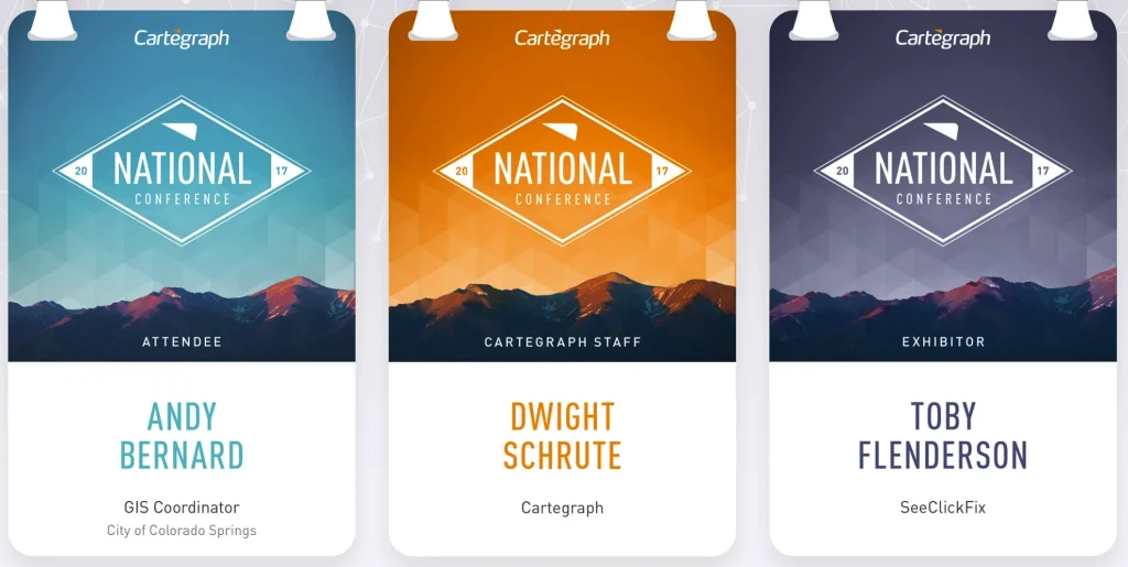
The layout below shows the ideal relationship between badge typography, white space, sponsor placement, and useful extras.
What this layout teaches:
- The front of the badge is for humans.
- The back carries everything else.
- Sponsors stay tidy and scaled.
- White space becomes a design feature, not wasted space.
- The name gets the largest, clearest zone.
This is conference badge design that respects how people actually interact.
Badge typography font sizes that work
Primary name
Use 36 to 38 pt for events where attendees view each other across foyer spaces and breakout rooms.
Secondary details
Set job title and organisation between 24 and 30 pt. This supports context without competing with the name.
Optional extras
Pronouns, location, or table number should be 20 pt at minimum. Once type drops below 18 pt it becomes decoration rather than usable information.
Scale changes for event size
Large events
Use fewer text lines and larger type. Prioritise fast scanning in noisy, dynamic spaces.
Smaller events
More detail is possible as long as minimum sizes for badge typography are respected.
Legible badge fonts that work at a glance
Readable, friendly, accessible. The best fonts for conference badge design are deliberately simple.
Best sans serif choices
Verdana, Arial, Helvetica and Roboto are excellent legible badge fonts. They have wide counters, generous spacing, and clear shapes that stay sharp at distance, even on recycled paper.
Serif fonts
Serif faces can look elegant in long form text. For attendee names that need to be read at speed, they are less helpful because decorative strokes blur and thin parts of letters vanish under busy lighting.
Very condensed or thin weights
Avoid very condensed or ultra light weights for the main name line. They may pass brand checks yet fail real humans who are trying to read names while also juggling coffee and a conference satchel.
When brand font rules are rigid
Plenty of teams must follow strict brand guidelines. These ideas keep everyone happy:
- Use the brand font for headings or event titles only.
- Match it with a more legible badge font for names and guest details.
- Keep the strongest brand expression on the back of the badge unless it must appear on the front.
- Make the brand proud by keeping its presence clean and consistent rather than overpowering.
Accessible typography that includes everyone
Accessibility typography goes beyond good design. It ensures every attendee can participate without strain.
- Contrast aim for a minimum ratio of 4.5 to 1 for normal text. Avoid pale colours on white badges.
- Line height keep line spacing at around one point four times the font size so letters do not crowd.
- Colour blindness avoid relying on red and green contrasts for important information.
- Neurodiversity clean, uncluttered layouts reduce social effort and decision fatigue.
- Readable badge fonts choose faces with open shapes and avoid ultra thin weights.
For deeper reading on typography accessibility and visual clarity, here are trusted resources:
Accessible conference badge design is kinder for everyone, not only people with diagnosed vision or processing differences.
Conference badge design layout for clarity
Name as the hero
Give the first name the most visual weight. Space is generosity. The more room you give the main name line, the more confident interactions feel.
Sponsor logos
Place one sponsor on the front only when required. All other sponsors sit neatly on the back of the badge, sized consistently. This keeps badge typography clean while still delivering value for partners.
White space strategy
Leave at least one third of the badge free from text or logos. White space makes names easier to find and gives the eye a resting point.
QR code placement
Keep the QR code on the back of the badge. Place it in the centre or lower third so it is easy to scan without covering the guest name.
Two layout recipes to reuse
Large conference layout
- Name set at 38 pt.
- Organisation at 26 pt.
- Pronouns at 20 pt.
- Main sponsor logo at the bottom right corner.
- QR code and agenda on the back of the badge.
Workshop or small event layout
- Name at 36 pt.
- Job title at 24 pt.
- Organisation at 24 pt.
- Optional tagline under the event name.
- Agenda or schedule printed on the back.
Materials that support clean readable typography
Some eco sounding materials can ruin print clarity by causing ink bleed, glare, or fuzzy edges. That is not helpful when you are chasing crisp badge typography.
- rPET and PET plastics can blur ink and create glare under strong lighting.
- Bamboo laminates often use adhesives that smudge delicate text.
- Tyvek and vinyl resist ink absorption and reduce contrast.
- Hidden plastic films in paper create glossy patches that distort letters and block recycling.
Recycled paper or seed paper produces crisp edges and naturally high contrast. Better for legibility and better for waste reduction at the end of the event.
💣 Common badge typography mistakes to avoid
- Font sizes that vanish beyond arm length.
- Overcrowding the badge with every possible detail.
- Low contrast colour palettes that look pretty but fail real humans.
- Misaligned text or inconsistent type hierarchy.
- Poor print substrates that cause feathering or blur.
If you remove these mistakes, your badge typography will already outperform most events.
How Terra Tag designs for clarity and comfort
Every Terra Tag badge is made with thoughtful conference badge design in mind.
- Clean, legible typography on recycled paper or seed paper.
- Simple sans serif families chosen for clarity.
- High contrast printing for improved font size readability.
- Clear hierarchy built into every template.
- QR and sponsor elements placed on the back wherever possible.
- Measurable CO₂ savings compared with plastic badges and lanyards.
When your badges are easier to read, your guests feel more at ease and your event team looks incredibly organised.
Plantable and recycled options
Terra Tag creates eco friendly conference badges on recycled or seed paper with biodegradable cotton lanyards. Every order includes a simple end of life plan and a CO₂ estimate.