Name Badge Font Size: Readability Rules for Conference Badges
Updated 7 June 2026
Name badge font size determines whether an attendee’s name is readable at three metres or not. Set the first name too small and the badge fails before the event starts. This guide gives you exact font sizes by badge dimension, hierarchy rules for every line of text, typeface guidance, and contrast requirements — drawn from producing more than 130,000 conference name badges across Australia.
Font size rules at a glance
These are the core name badge font size rules. All sizes are in points (pt) at actual print size.
- First name on A7 (74×105mm / 3×4 inch): 32–38pt. 38pt is the target. 32pt is the minimum — below this, readability fails at distance.
- First name on A6 (105×148mm / 4×6 inch): 32–48pt. The larger format supports a bigger first name where content allows.
- Last name: 8–10pt smaller than the first name, at Medium or Semi Bold weight.
- Job title and organisation: 14–18pt at Regular or Medium weight.
- Best fonts for conference badges: DM Sans, Inter, Roboto, Open Sans, Lato.
- Minimum contrast ratio: 4.5 to 1 for all name text.
Why name badge font size matters
A conference name badge has one job: help people recognise each other quickly. When the first name is large enough to read at two to three metres, people can greet each other naturally, without stepping into uncomfortable proximity to read the text. When it is too small, the badge becomes a social obstacle rather than a networking tool.
Name badge readability is not a design preference. It is the functional purpose of the badge.
How to choose the right font size for a name badge
Font size for name badges scales with viewing distance. A practical rule: allow 12 points of type for every metre of viewing distance. At three metres — typical in a conference foyer or breakout room — that works out to 36pt. This is why the first name target on A7 is 38pt, with 32pt as the minimum the design must hold.
The sizes feel large on screen. They are correct on a printed badge in a room full of people.
First name font size by badge size
A7 (74×105mm / 3×4 inch) — the standard conference badge size:
- Target: 38pt Bold or Extra Bold
- Minimum: 32pt — the point at which readability starts to break
- If a name does not fit at 32pt, shorten secondary content or move to A6
A6 (105×148mm / 4×6 inch) — the large format badge:
- Range: 32–48pt Bold or Extra Bold
- The additional space supports larger names and more content without crowding
Do not scale the first name below 32pt to fit other content. If something has to give, it is not the name.
Last name font size
The last name sits 8–10pt smaller than the first name at Medium or Semi Bold weight. The first name should appear 1.5 to 2 times larger than the last name visually. This maintains the hierarchy that makes the badge readable at a glance while keeping the full name legible.
Job title and organisation font size
Job title and organisation answer the second question — who is this person and who are they with — once the name is already recognised. They must not compete visually with the name.
- Use 14–18pt at Regular or Medium weight
- Default order: job title first, then organisation
- If these two lines exceed two lines of text, edit them down or move to A6
At 14–18pt, supporting content sits clearly below the name in visual weight. It is readable without distracting from the primary recognition task.
Best font for a conference badge
The best fonts for conference name badges share the same characteristics: open letterforms, clear stroke contrast, and consistent weight across all letters. These properties hold at distance, under event lighting, and on paper.
Recommended conference name tag fonts: DM Sans, Inter, Roboto, Open Sans, Lato.
Each of these has wide counters — the open space inside letters like ‘o’, ‘e’, and ‘c’ — that keeps letterforms distinct at small sizes and distance.
Fonts to avoid
Serif fonts: Decorative strokes blur under event lighting and thin stroke variations lose legibility at distance. Serif faces are not the best font choice for conference badges.
Condensed or ultra-light weights: Narrow letterforms and thin strokes do not carry across a room. The first name needs Bold or Extra Bold weight. Job title and organisation use Regular or Medium.
When brand guidelines require a specific font
Many events must follow strict brand typography. Apply the brand font to the event title or headings only. Use one of the recommended fonts above for attendee names and supporting text. Keep the strongest brand expression in the event identity area of the badge, clear of the name zone. See the conference name badge design system for the full zone layout.
How to make name badges readable — contrast and spacing rules
Font size alone does not determine whether a name badge is readable. Contrast and line spacing work alongside size to keep text clear.
- Contrast: minimum 4.5 to 1 ratio for all name text. Dark text on a white or near-white badge is the most reliable combination across all lighting conditions.
- Line height: approximately 1.4 times the font size. Lines that sit too close crowd the letterforms and slow recognition.
- Colour blindness: approximately 1 in 12 men have some form of colour vision deficiency. Avoid relying on red and green contrasts for information that must be distinguishable. Test with Coblis before printing.
- Clear space: leave at least one third of the badge front free from text and logos. Clear space around the name isolates it and makes it easier to find at a glance.
For further reading on contrast standards:
Two badge layout references
These layouts apply the name badge font size rules above to the two most common conference badge formats.
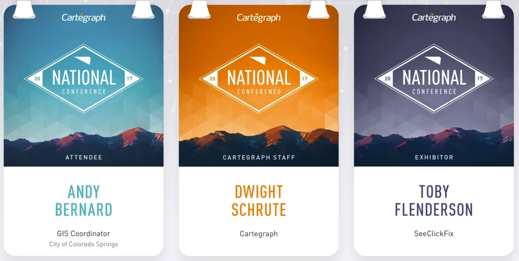
Large conference — A7 (74×105mm / 3×4 inch)
- First name: 38pt Bold or Extra Bold
- Last name: 28–30pt Medium or Semi Bold
- Job title: 14–16pt Regular
- Organisation: 14–16pt Regular
- One sponsor logo at the base, clear of the name zone
- QR code and schedule on the back
Workshop or smaller event — A7 or A6
- First name: 32–38pt Bold or Extra Bold
- Last name: 22–28pt Medium or Semi Bold
- Job title: 14–18pt Regular
- Organisation: 14–18pt Regular
- Optional event tagline at small scale in the event identity zone
- Agenda or schedule on the back
Common font size mistakes on conference badges
- First name below 32pt — the badge fails at distance regardless of font choice
- Job title or organisation font size approaching the weight of the first name
- Thin or condensed weights on the first name that lose legibility under lighting
- Low contrast text on coloured backgrounds that reads well on screen but fails in a room
- Overcrowding the front with content that reduces the first name below 32pt
- Print materials that cause feathering or blurred edges, undermining even correct font sizes
Print materials and name badge font size performance
The substrate affects how font sizes perform in practice. Some materials introduce ink bleed, glare, or fuzzy edges that reduce effective readability even at correct point sizes.
- rPET and PET plastics create glare under strong lighting and can blur fine text
- Bamboo laminates often use adhesives that smudge edges on smaller type
- Tyvek and vinyl resist ink absorption and reduce contrast
- Hidden plastic films in paper create glossy patches that distort letterforms
Recycled paper and seed paper produce crisp edges and naturally high contrast. Correct font sizes perform as intended. For further information on badge materials, see conference name badges.
How Terra Tag applies these font size rules
Terra Tag is an Australian sustainable event products company. Every Terra Tag badge applies the same font size and hierarchy rules described in this guide.
- First name at 32–38pt on A7, 32–48pt on A6 — always the dominant element
- Last name 8–10pt smaller, at Medium or Semi Bold
- Job title and organisation at 14–18pt Regular, visually subordinate to the name
- Clear sans serif typefaces that hold at distance on recycled paper
- High contrast printing with dark text on light stock
Terra Tag has produced more than 130,000 conference name badges across corporate, government, university, and research events in Australia. The name badge font size rules in this guide come from that production experience.
For the complete badge design framework — including the 4-layer design system, badge size decisions, layout zones, and pre-print checklist — see the conference name badge design system.
For ready-to-use badge layouts, see free conference name badge templates.