How to Nail Conference Name Badge Design (Without Tanking Your Cred)
Contents
- 1) The name badge design essentials the golden trio
- 2) Layout and readability no awkward squinting
- 3) Typography tips fonts, sizes and hierarchy
- 4) Branding and logos balancing event and sponsors
- 5) Creative badge ideas beyond the basics
- 6) Tech integration QR codes, NFC and more
- 7) Accessibility and inclusivity in name badge design
- 8) Materials and sustainability eco friendly badges
- 9) Lanyards and holders comfort, safety and reuse
- 10) Printing and finishing quality that lasts
- 11) Final checks and badge design checklist
If you are short on time and just want name badge design highlights, you can also read our shorter overview and browse our name tag tools for templates and practical resources.
Good conference name badge design is not just a graphic design exercise. It is the quiet little workhorse that helps people spot each other, remember names and start conversations without the awkward squinting routine.
This guide walks through the full picture of event name badge design. From hierarchy and layout to accessibility, materials and eco impact, it brings together design practice, event experience and sustainability so that your badges look sharp and actually work in a crowded room.
We will move from the basics into more advanced touches like QR codes and tech features, then finish with a practical name badge design checklist you can use for every event.
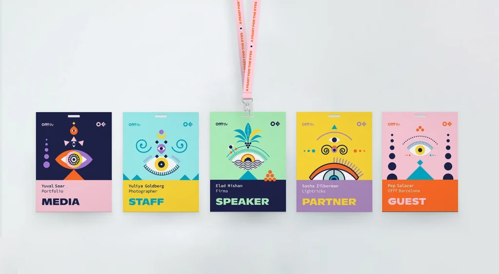
1) The name badge design essentials the golden trio
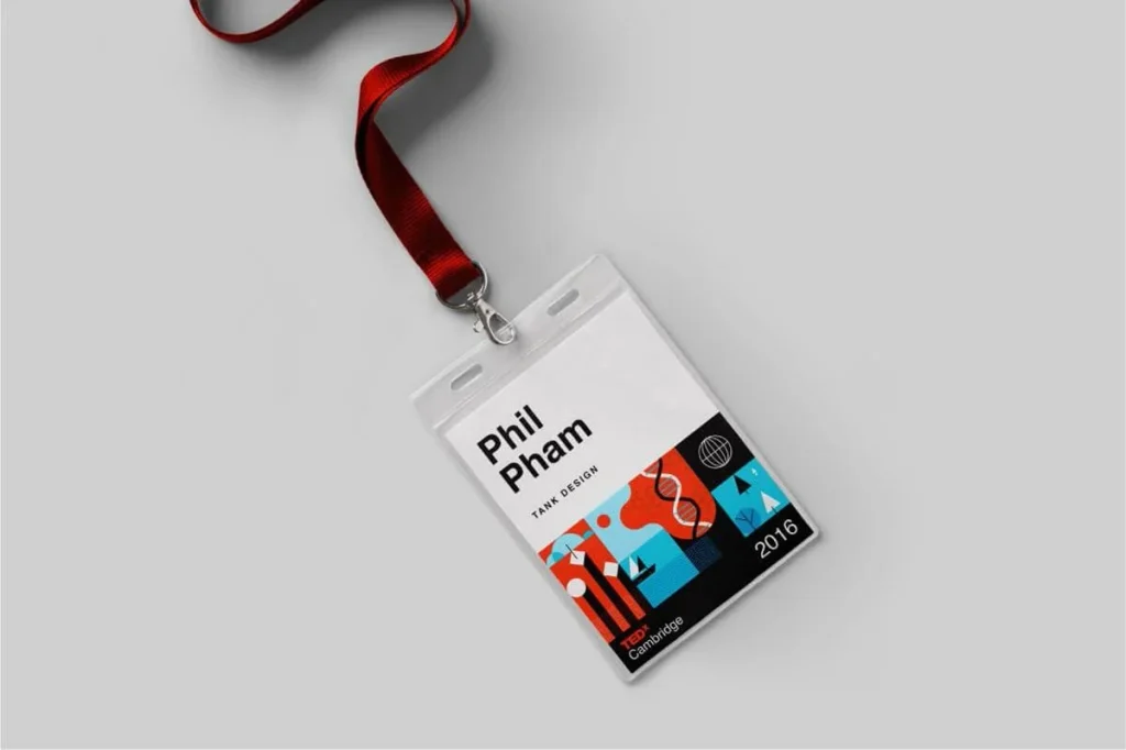
Every strong conference name badge design is built around three core elements. Think of them as the golden trio.
- Attendee name
- Affiliation company, organisation or role
- Event identity event name or logo
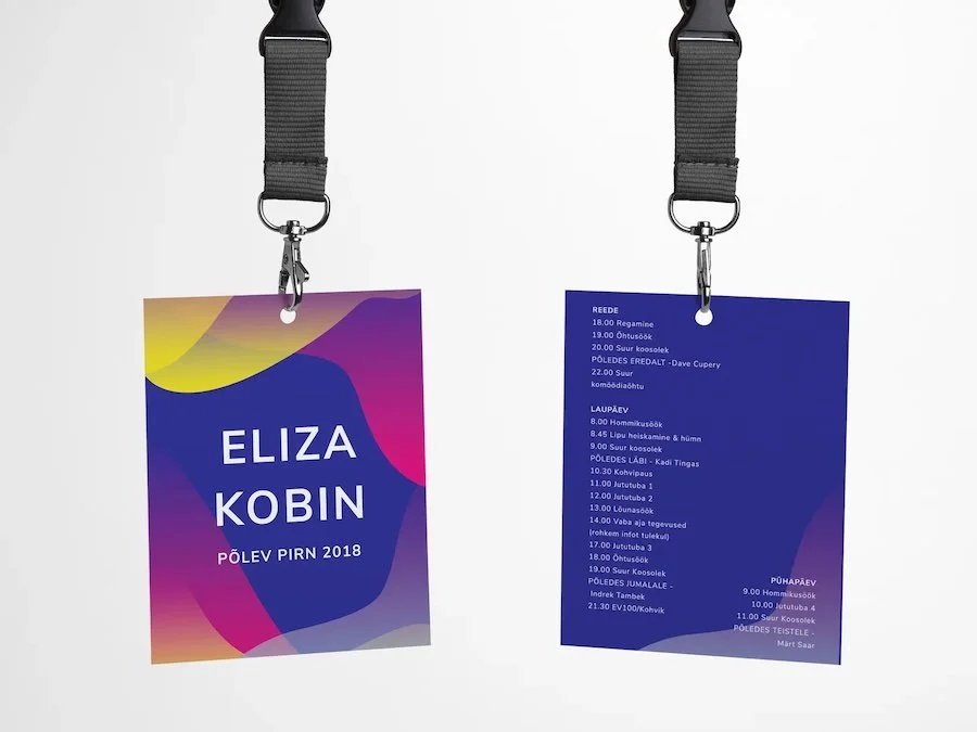
Attendee name
The first name should do the heavy lifting. Give it generous size and weight so it carries across the room. Surname can sit beneath or beside it in a smaller size if you are short on room, but the first name is what people scan for in conversation.
Role or organisation
This is the context layer. It helps people make sense of who they are talking to. Keep this line short, in a smaller point size, and resist the temptation to include half the job description. If the title and company together feel long, consider trimming to company only or using a logo to reduce text.
Event identity
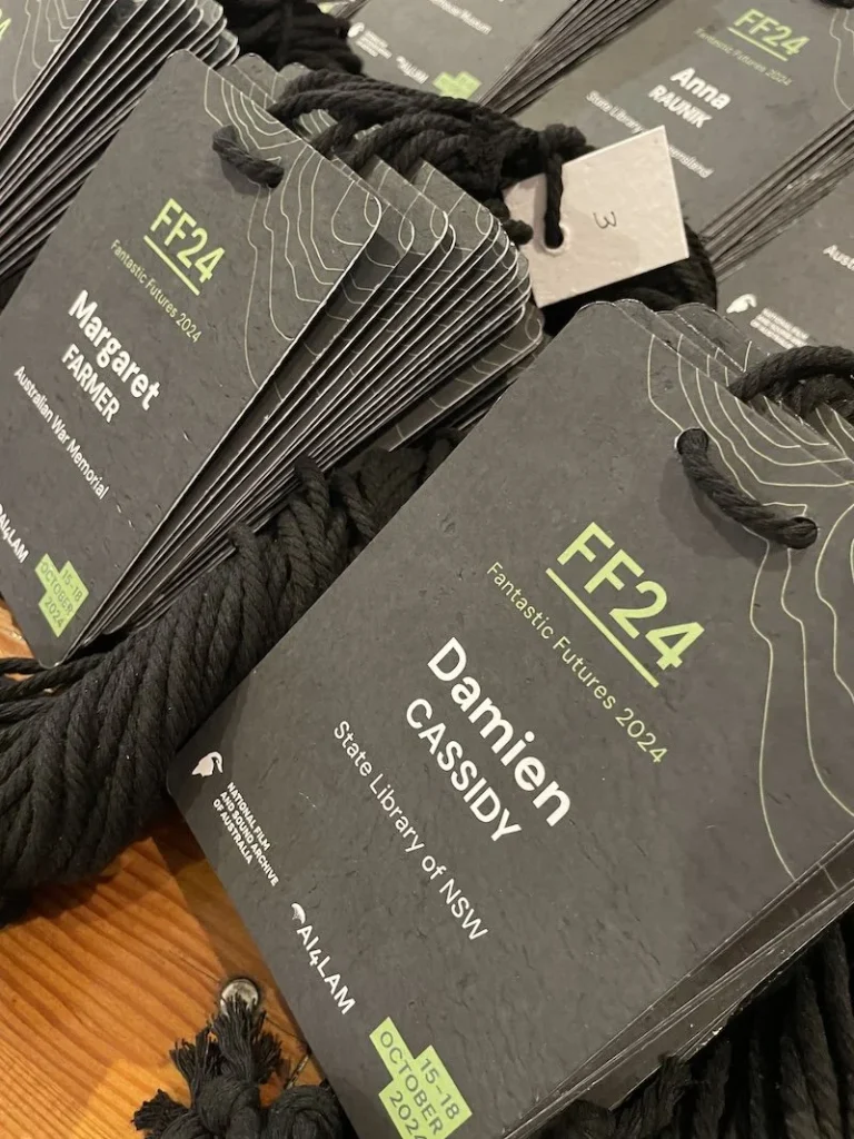
The event name or logo finishes the trio. It ties everything back to the gathering, helps in photos and makes the badge a neat keepsake. It does not need to shout. It can sit at the top or bottom line of the name badge design at a smaller size, supporting the attendee name rather than competing with it.
When the golden trio is clear and well spaced your badges become friction free. People can read them in seconds, orient themselves socially and move into the conversation instead of fumbling through silent guesswork.
2) Layout and readability no awkward squinting
A beautiful badge that nobody can read is just small wall art. Layout is about making sure information lands in the right order at the right size, from a realistic distance.
Badge size and orientation
Common conference sizes such as A7 and A6 are popular in name badge design for good reason. A7 is compact for short events, while A6 gives extra room for schedules on the back or larger names on the front. Whatever size you choose, print a physical prototype and stand a few metres away. If you cannot read the first name comfortably, it needs more scale or less clutter.
Information hierarchy
The eye should travel through the badge in a clear sequence.
- Name at the top or high on the badge, with first name as the hero
- Role or organisation in a secondary position under the name
- Event and sponsor branding in supporting positions at the top or bottom
White space and margins
Empty space is not wasted space. Generous margins around the text block keep the name badge design from feeling crowded and stop names from sliding too close to the edge. Clean alignment centre for the main name line with left or centre for supporting text usually feels calm and professional.
Distance legibility
As a rule of thumb you want the first name to be readable from at least three metres. That normally means a very large point size relative to the badge. It can feel extreme when you are designing on screen, but out in a conference foyer it feels just right.
Flip proof design
Badges that constantly flip to a blank back are a special form of event torture. You can reduce this by printing key details on both sides or pairing the badge with two lanyard clips instead of one so it stays facing forward.
Get the layout right and people stop thinking about the badge entirely. They just read, recognise and connect.
3) Typography tips fonts, sizes and hierarchy
Type is where many badges win or lose. You want fonts that behave well at small sizes and in less than ideal lighting.
Use clean sans serif fonts for names
Fonts such as Arial, Helvetica, Open Sans or Verdana are workhorses. They are designed for clarity and remain readable when printed small or viewed at an angle. Decorative scripts or curly display fonts are charming for invitations but brutal on name badge design in terms of readability.
Be generous with size
Set the attendee first name as large as you can within the available space and design the rest of the badge around that decision. Surnames can be smaller. Job titles and companies can drop to a much smaller size because they are supporting information. Nothing on the badge should slide into tiny fine print, particularly for older eyes.
Use weight and colour for hierarchy
Bold weight on the name with regular weight on supporting lines does a lot of the work. You can introduce a softer grey for job titles or secondary data to push the name forward. Italics are harder to read at small sizes, so keep them for small accents if at all in your name badge design.
Case choices
Mixed case names are easier for the brain to recognise than long strings of capitals because each word has a distinct shape. If you like the look of all capitals for names, keep the letter spacing open and stay with a very clear sans serif so legibility is preserved.
Avoid text crowding
It is better to include less information than to squash everything into one tiny canvas. If you find yourself stacking title, department, company, pronouns, city and a quote onto one side of the badge it is time to edit. Prioritise what helps people connect in real time and move the rest to the back or to another channel.
Brand colours with caution
Event colours are great for borders, bars and accents. For text, high contrast is the priority. Dark text on a light background or light text on a genuinely dark ground will always be easier to read than mid tone on mid tone, no matter how on brand that teal on teal may be.
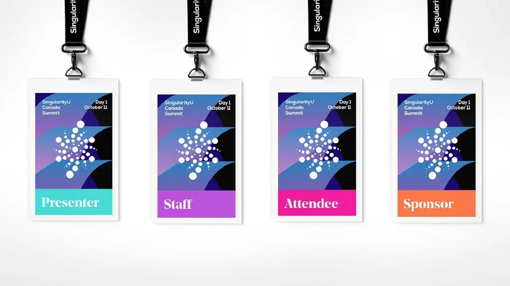
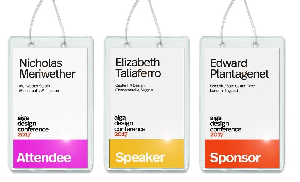
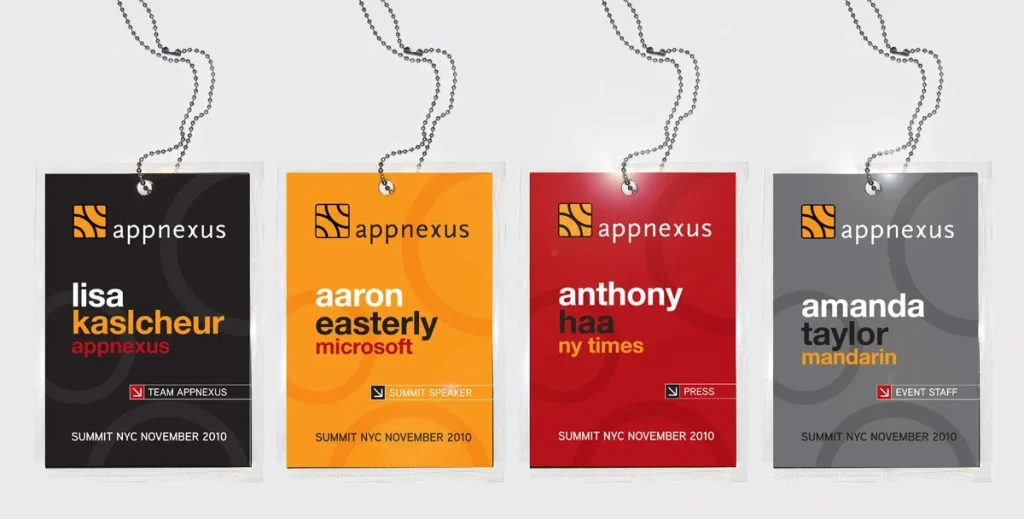
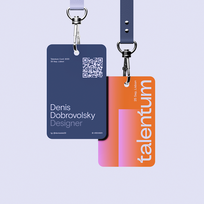
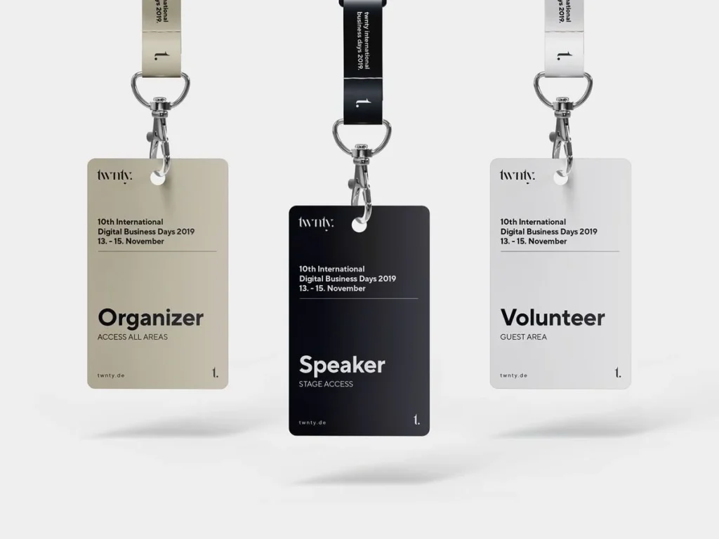
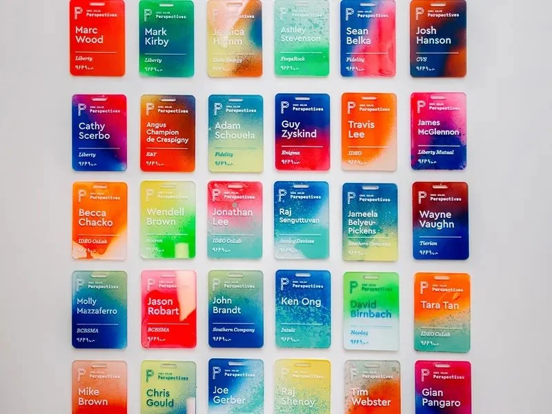
4) Branding and logos balancing event and sponsors
Badges often become a tug of war between logos and legibility. Your job is to make sure the person wearing the badge still feels like the main act.
Event branding as the frame, not the feature
Place the event logo or word mark at the top or bottom edge and keep it to a modest size. It should clearly identify the event without upstaging the attendee name. Think of it as the stage set, not the performer.
Managing sponsor logos
When sponsors need a presence on the badge, group them in a single strip or block rather than scattering logos into every spare corner. A neat row of small logos along the base or on the back of the badge usually satisfies everyone without cluttering the primary reading zone.
Quality and spacing
Use high resolution artwork so logos print cleanly. Give each logo enough clear space so it does not crash into text or other marks. Respect brand guidelines where possible, especially required backgrounds, while still protecting overall readability.
Use both sides
The back of the badge is valuable real estate. If you are tight on space, shift sponsor content or secondary branding there and reserve the front for the attendee name, role and any key icons or codes.
When you strike the right balance the badge quietly carries event identity and sponsor visibility while still feeling like it belongs first and foremost to the person wearing it.
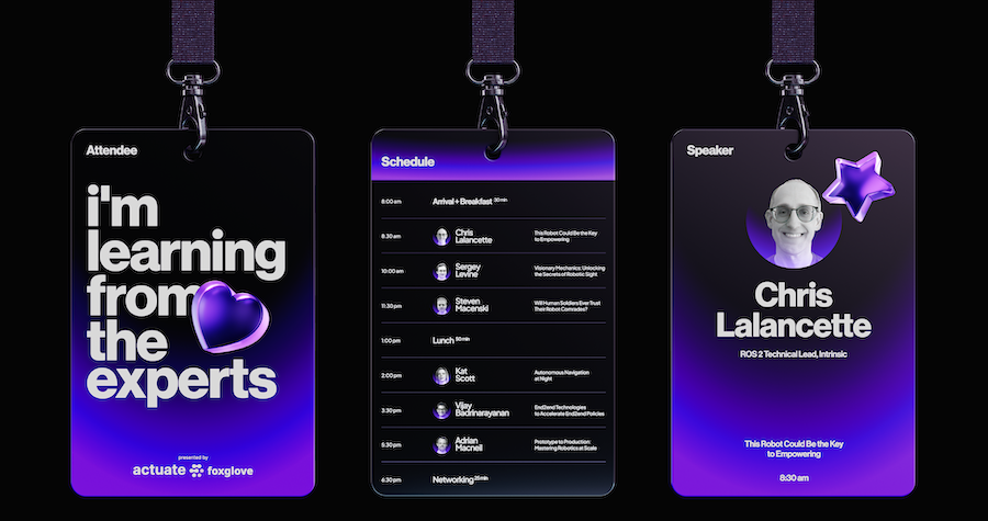
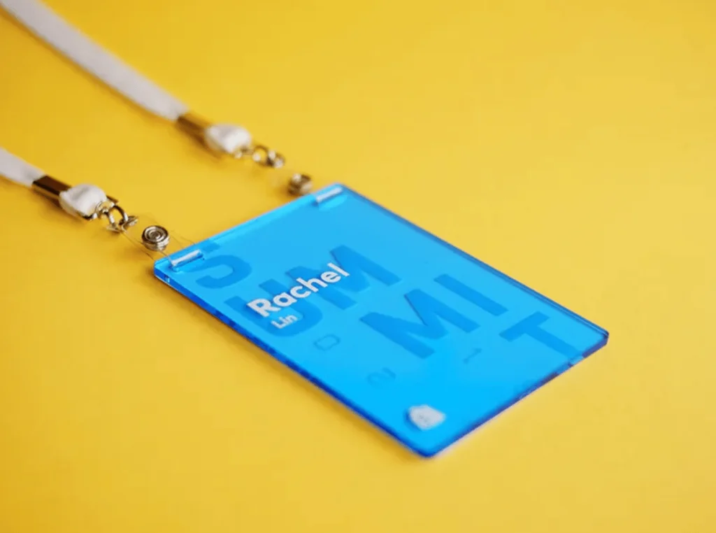
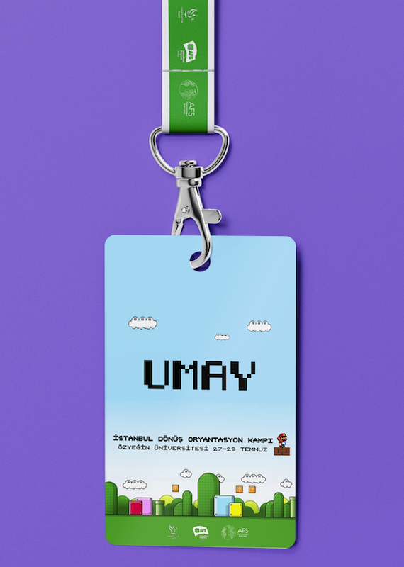
5) Creative badge ideas beyond the basics
Once the fundamentals are working you can start to have fun. Small creative touches can turn name badge design into charming conversation starters.
Interesting shapes and die cuts
You are not limited to rectangles. Die cut badges can echo the theme of the event, as long as you leave a clear horizontal zone for text and a sturdy area for the lanyard hole. The aim is charm, not chaos.
Graphics and illustration
Light patterns, icons or illustration can bring personality to your name badge design without competing with the name. Environmental events can use very subtle leaf or landscape motifs. Tech events might lean into circuit patterns or geometric shapes. Keep artwork soft in tone and away from the main text block.
Use the back properly
The reverse side is perfect for useful information. You can include a mini agenda, venue map, contact details, Wi Fi instructions or a short code of conduct. Some teams print icebreaker prompts or fun facts, which gives people something to talk about while waiting for coffee.
Personalisation and interaction
For smaller events you can include attendee photos, home city, or lines such as ask me about followed by a topic. You can also leave space for stickers, stamps or small icons that attendees earn or choose during the event. The badge becomes a little record of their experience rather than a throwaway tag.
None of this should reduce readability. Think of creativity as adding texture and warmth around a very clear core of name, role and affiliation.
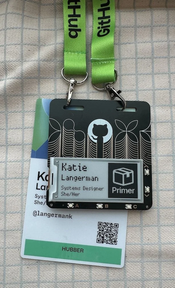
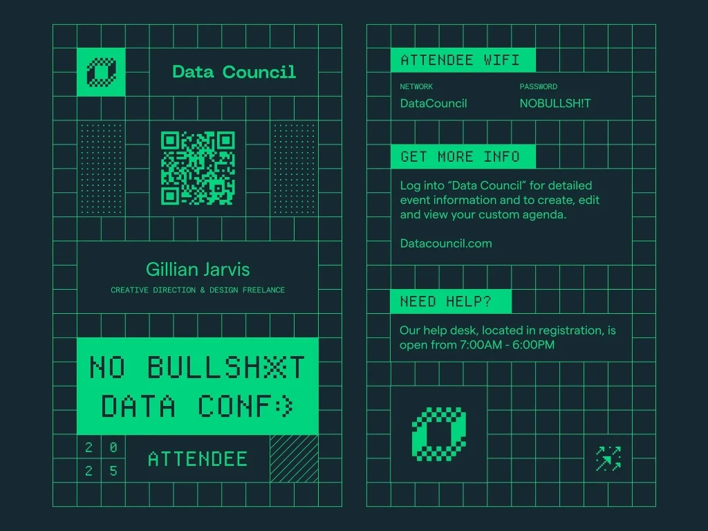
6) Tech integration QR codes, NFC and more
Badges have quietly become tiny tech surfaces. Used well, they connect people to deeper information without cluttering the name badge design.
QR codes for fast access
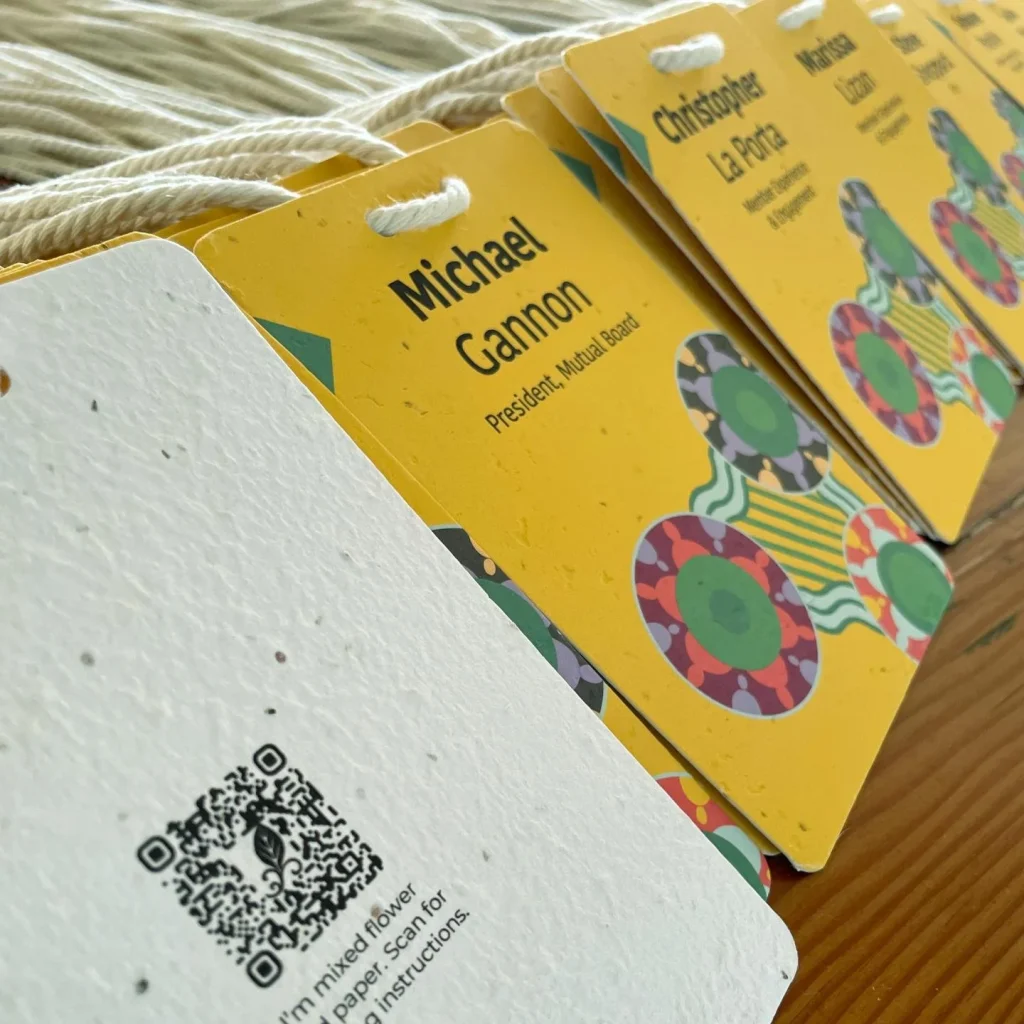
QR codes are simple, cheap and flexible. You can link to programmes, session details, feedback forms, event apps, planting instructions or sponsor offers. Keep the code small but scannable and place it away from the main name area, usually in a corner or on the back.
Always test the code from a printed badge under realistic lighting before sign off.
NFC and smart badges
Near field communication chips embedded in badges can support tap to check in, contact sharing or access control. They are powerful but need more planning, hardware and budget. If you go this route, keep a low tech backup path available as well in case something fails on the day.
Clear micro copy
If you include any tech feature, add a short instruction close by so people know what to do. For example scan for schedule or tap for contact. Explicit prompts reduce confusion and increase actual use.
Privacy and data
Be transparent with attendees about what data is captured when codes or chips are scanned and how it will be used. Clear expectations build trust and reduce surprises at the registration desk.
7) Accessibility and inclusivity in name badge design
Truly good badge design works for everyone in the room, not just those with sharp eyesight and no access needs.
Large, clear text
We have already talked about size, and it matters even more from an accessibility point of view. Generous type sizes, simple sans serif fonts and strong contrast in name badge design really help people with low vision and also make life easier for everyone else. Learn more: Accessible Events Checklist from the Australian Human Rights Commission
Pronouns and preferred names
Adding space for pronouns or preferred names can make your event more welcoming. Ideally your registration form collects the name for badge field separately so that the wording printed reflects what each person actually uses day to day.
Pronunciation help
Short phonetic cues beneath names can reduce anxiety for both the wearer and the person saying the name. This is especially helpful at global or multilingual events.
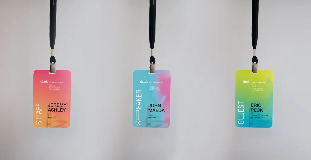
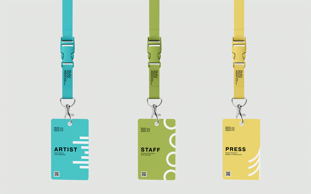
Colour contrast and coding
Use combinations that pass basic contrast checks and avoid relying only on colour to signal roles. Pair colour coded bars with clear labels such as speaker, staff or sponsor so that people who are colour blind can still read the information.
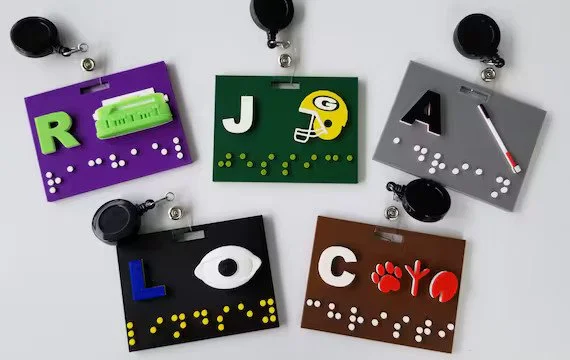
Braille and tactile options
For events where you know attendees who read braille will be present, you can add braille labels with first names or use tactile embossing so that badges can be identified by touch. Position these so they do not cover printed content.
Multiple attachment options
Not everyone finds lanyards comfortable or practical. Provide alternatives such as clips or magnets and be mindful of pacemaker safety when you offer magnetic fittings.
Ask in advance
Include a simple question in registration for badge related adjustments people might need. It signals care and gives you time to plan before event week chaos sets in.
8) Materials and sustainability eco friendly badges
Traditional badges often end their life in a bin bag headed straight for landfill. The materials you choose can shift that story completely.
Choose sustainable substrates
Recycled paper, quality card and plantable seed paper reduce plastic load and give badges a second life. At Terra Tag we use handmade seed and recycled stocks so badges can be planted, composted or recycled instead of sitting around for centuries.
Skip plastic holders where possible
Printing directly onto sturdy card or seed paper removes the need for a separate plastic sleeve. Where you still need holders, look for reusable or compostable options and set up a collection point at the end of the event.
Thoughtful printing choices
Plant based inks, digital print for small runs and local printers all help reduce environmental impact. Design with sensible margins so you do not waste stock and avoid lamination coatings that block recycling.
Lanyards that match your values
Recycled fibres, organic cotton and other plant based materials bring lanyards in line with the rest of your sustainability commitments. Fully biodegradable lanyards with non metal fittings mean the whole badge system can break down naturally at the end of its life.
Plan for end of life
Make it easy for guests to hand badges back for reuse, composting or recycling. Clear signage, collection boxes and simple instructions go a long way. When you explain the why as well as the how people are more likely to cooperate.
When your name badge design and materials are aligned, the name tag becomes a tiny but visible proof point that you take your environmental impact seriously.
9) Lanyards and holders comfort, safety and reuse
The attachment might feel secondary until a lanyard scratches a neck all day or a badge keeps flipping your beautiful name badge design backwards. It deserves as much thought as the card itself.
Comfortable materials
Soft plant based fibres sit more comfortably on skin for long events. Wider lanyards spread weight and feel more stable than very thin ones, especially once you add heavier cards or multiple items.
Attachment types
Bulldog clips, swivel hooks and rings all have their place. Two clip lanyards are excellent for wider badges because they reduce flipping. Whatever you choose should be intuitive to use so that check in does not turn into a puzzle.
Safety features
Breakaway clasps that release under pressure are a sensible default, particularly in venues with machinery or crowded floors. Many organisations now require them as standard practice.
Badges with and without holders
Some events rely on plastic sleeves so they can reuse them over years while swapping the inserts. Others move to direct print on sturdy stock with no holder at all. There is no single right answer, but it is wise to consider the total waste footprint and what happens to each component after the event.
Clips, pins and stickers
For shorter sessions or groups who dislike wearing lanyards, magnetic or pinned badges can be more comfortable. Stick on name labels are best kept for informal gatherings as they tend to peel off and feel less polished.
10) Printing and finishing quality that lasts
Production is where your careful name badge design either sings or falls apart. A thoughtful file that is printed poorly will still look average in the hand.
High resolution artwork
Logos and graphics should be supplied at print ready resolution so you do not see fuzzy edges. Vector files are ideal. Keep an eye on any photos you include, especially if they are small portraits.
Colour accuracy
If sponsor or event colours are critical, talk to your printer about colour management up front. Request printed proofs where the stakes are high. Remember that different papers shift colours, especially off white or kraft stocks.
Paper weight and durability
Use stock with enough body to stay flat and feel substantial. Many conference badges sit in the postcard to thick card range. Special materials such as seed paper need extra testing so you know how they feed through the press and how they behave with lanyard holes.
Bleeds, trims and edges
Set proper bleed if colour runs to the edge and include trim marks when you send artwork. For very large runs professional cutting equipment is worth the investment to avoid uneven edges.
Variable data and proofing
Personalised badges usually come from a mail merge or template system. Always run proofing passes over the guest data so names and titles are spelled correctly and fit the design. Print samples for the longest names to see how they behave in real life.
On site versus pre print
Printing everything in advance gives you more stock and finish options. On site printing offers more flexibility for late registrations but is often simpler in design and colour. Many events now use a hybrid of the two.
Finishing and kitting
Think through the final steps. Alphabetical sorting, attaching lanyards and boxing or hanging badges ready for collection can save enormous time on the day. A small final quality check is worth the effort before hundreds of badges head out the door.
11) Final checks and name badge design checklist
Name badge design involves many moving parts and it is easy to miss something small that has a big impact on the day. Use this checklist as a final sweep before you sign off.
- Readability and layout can people read first names from a few metres away without effort
- Contrast and colours is there strong contrast between text and background and clear labelling where colour is used for coding
- Inclusivity have you considered pronouns, preferred names, pronunciation help and any known access needs
- Size and format does the badge comfortably hold the content you need and hang in a stable, readable position
- Materials are you using recycled, plant based or otherwise sustainable materials wherever possible
- Branding is event and sponsor branding visible without overwhelming the attendee name
- Creativity and theme does the badge reflect the character of the event in a way that still feels clear and professional
- Technology have you tested QR codes or other features on a printed badge, under realistic conditions
- Attachment and assembly are lanyards or clips comfortable, safe and ready for fast distribution
- Printing and quality are edges clean, colours consistent and data accurate, especially for names and titles
- End of life plan do you have a simple process for reuse, composting or recycling badges and lanyards after the event
Before the boxes go out the door, create one complete sample set with lanyard attached and ask someone to wear it. Stand back, read it, tug on it, and imagine handing that badge to a keynote speaker. If you feel proud of your name badge design in that moment you are ready.
If you would like a simple print out for your own workflow, you can also download our name badge design checklist as a PDF and use it to mark each item off as you go.
Thoughtful name badge design sounds small, yet it shapes how people see each other, how easy it is to connect and how your event feels as a whole. When a badge is clear, inclusive and planet kind it quietly does a lot of heavy lifting for you.