
Conference badge readability guide
Name Tag Font Size: Readability Rules for Conference Badges
Learn the name tag font size principles that help attendees recognise each other quickly, whether your event uses the term name tag or name badge.
130k+
Badges
Produced
Trusted by global organisations to connect their people





Updated 22 July 2026
If attendees need to step closer to read a conference badge, the design has already failed.
A conference badge has one primary job: help people recognise one another quickly. In North America, the same item is often called a name tag, but the readability problem is exactly the same. When a name is too small, crowded or competing with logos and other information, recognition becomes slower and conversations become harder to start.
As a practical starting point, Terra Tag recommends a 38 point first name, with 32 points as the practical minimum, and 14 to 18 point type for job titles and organisation names. If you are deciding on name tag font size or comparing font size for name tag layouts, these Production Standards provide a reliable starting point. They have been developed through designing and producing more than 130,000 conference badges.
Throughout this guide, published accessibility guidance is clearly distinguished from Terra Tag Production Standards based on real world conference badge production.
Section 1
Name tag font sizes for conference badges at a glance
If you’re looking for a quick answer on name tag font size for conference badges, start here.
These Terra Tag Production Standards are practical starting points rather than universal rules. Final font sizes will depend on the typeface, badge layout and available space, and the same guidance applies when teams search for the right event name tag font size.
| Badge size | First name | Last name | Supporting information |
|---|---|---|---|
| All recommended badge sizes | 38 pt (32 pt minimum) | Typically 8 to 10 points smaller than the first name | 14 to 18 pt |
Terra Tag begins with the same typography hierarchy on A6 and A7 badges. If you need help choosing between formats, see our conference badge size guide. The additional space on an A6 badge is generally used for white space, longer names or supporting information rather than significantly larger type.
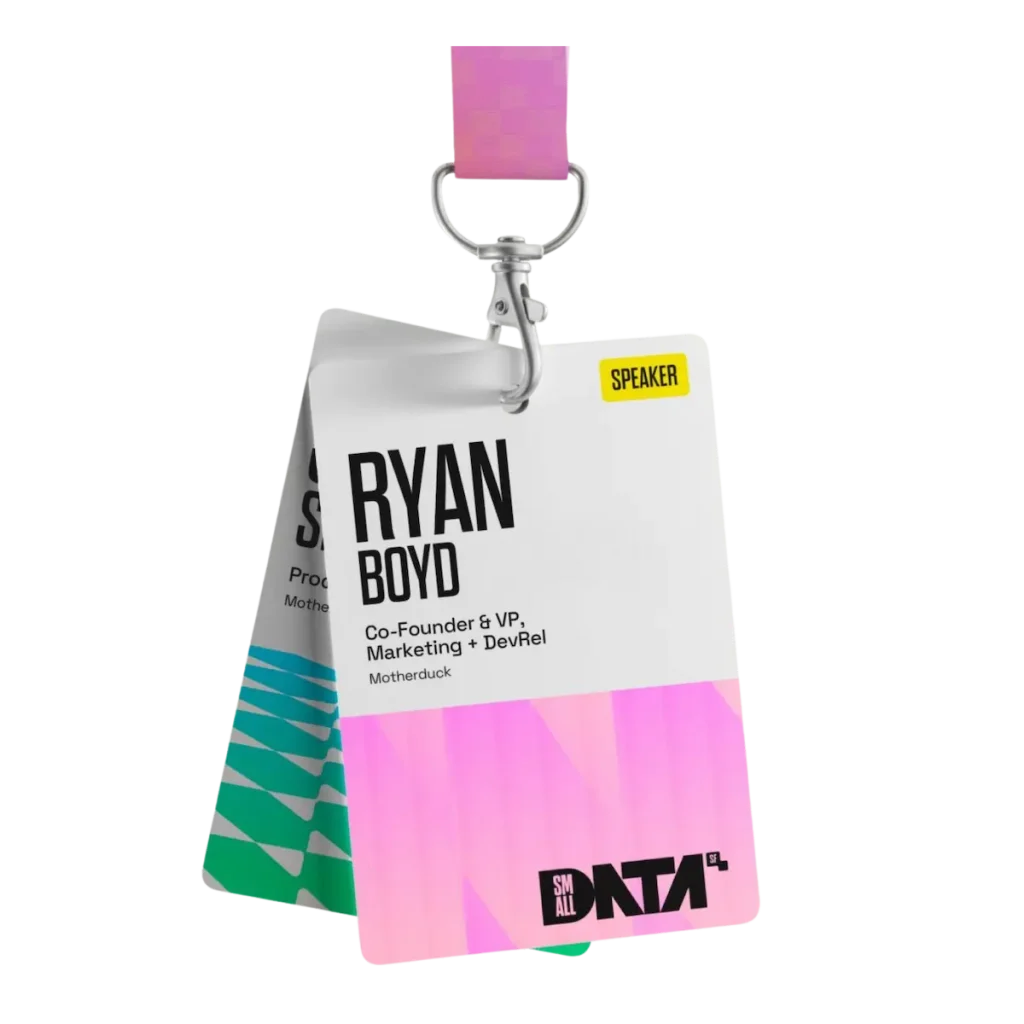
Success: the attendee name remains legible at conversation distance.
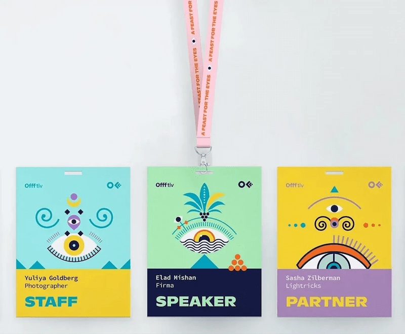
Failure: the attendee name loses prominence and readability breaks down.
Terra Tag Production Standard: Font hierarchy
Terra Tag starts with the attendee’s first name:
- First name: 38 pt, Bold or Extra Bold
- Surname: approximately 8 to 10 points smaller than the first name, typically 28 to 30 pt
- Job title: 14 to 18 pt
- Organisation: 14 to 18 pt
The first name should be recognised first. The surname confirms identity, while the job title and organisation provide context.
Why 32 points is the practical minimum
The recommended 32 point minimum is Terra Tag’s practical production threshold, not a design rule or accessibility standard. Exceptionally long names may need to be set slightly smaller, but these should remain genuine edge cases.
If most names fall below 32 points, the layout is probably too crowded, the badge is too small or too much information is competing for space. Review the layout and hierarchy before reducing attendee names further.
Always judge typography on the printed badge
Conference badges are designed to be worn, not viewed on a monitor. Type that appears oversized on screen often looks appropriate once printed, placed in its holder and viewed at normal conversation distance.
Before approving artwork, print a sample at actual size and check whether the attendee’s name is immediately recognisable. If you need a practical workflow for output, see our guide to printing name tags for events.
Key takeaway
Start with a 38 point first name, use 32 points as the practical minimum, set supporting information at 14 to 18 points, and test the badge at actual printed size.
Recognition First Badge Design System
Build better conference badges with the complete design frameworkTM
Badge content is just one part of good badge design. The Recognition First Badge Design SystemTM brings together hierarchy, typography, badge sizes, layouts, accessibility, print production, and workflow into one practical framework for designing conference name badges that work.
Explore the Design SystemSection 2
Choosing the best font for name tags and name badges
There isn’t a single best font for conference badges. Readability depends on the design of the typeface, its size, weight, spacing, viewing distance and the conditions in which it is read.
If you’re comparing a name tag font, name badge font or name tag font style, choose a typeface that helps attendees recognise names quickly and comfortably by asking five practical questions.
01Can someone recognise the attendee’s name at conversation distance?
Someone should be able to recognise the attendee’s name while walking, talking and moving around a venue, without stepping closer or concentrating.
Print the badge at actual size, place it in its holder or pocket and view it from normal conversation distance. If you need to squint, move closer or consciously work to read the name, increase the font size or choose a different typeface.
02Does the typeface remain clear at smaller sizes?
Job titles, organisation names and supporting information are smaller than attendee names, so the typeface must remain clear across several sizes. Look for fonts that:
- distinguish characters such as I, l, 1, O and 0
- retain clarity without fine details disappearing
- avoid very narrow or condensed letterforms
- reproduce clearly in print
03Does the font family provide enough flexibility?
A font family with several weights creates hierarchy without requiring multiple typefaces. For example:
- Bold or Extra Bold for the first name
- Medium or Semi Bold for the surname
- Regular or Medium for the job title and organisation
Different weights within one family usually produce a cleaner result than combining unrelated fonts.
04Will everyone be able to edit the artwork?
Conference badge artwork may be edited by organisers, marketing teams, designers, printers or volunteers.
Choose a widely available typeface to reduce missing fonts, unexpected substitutions and layout changes when the artwork is opened on another computer.
05Should attendee names be bold?
Yes. Terra Tag recommends Bold or Extra Bold for first names so they dominate the badge. Use a lighter weight for surnames and reduce the emphasis of job titles and organisation names further. Font weight usually creates a clearer hierarchy than additional typefaces.
Published research has not consistently shown that sans serif typefaces are inherently more readable than serif typefaces. The design of the individual font matters more than the presence or absence of serifs.
Terra Tag’s recommended fonts
Terra Tag generally recommends widely available sans serif typefaces that remain clear at conference badge sizes and reproduce consistently across design and print workflows. For teams asking what is a good font for name tags or looking for the best font for name badges, practicality matters more than novelty.
| Typeface | Why Terra Tag recommends it |
|---|---|
| Inter | Excellent range of weights with consistently clear letterforms. |
| DM Sans | Clean, modern proportions that remain readable at badge sizes. |
| Open Sans | Designed for high readability across print and digital. |
| Roboto | Neutral proportions with clear character distinction. |
| Lato | Friendly appearance with good readability at smaller sizes. |
| Arial | Widely available and reliable when compatibility matters most. |
Font selection checklist
- The attendee’s name is easy to recognise from normal conversation distance.
- The attendee’s name stands out before every other element.
- The typeface remains clear at smaller sizes.
- Similar characters, such as I, l, 1, O and 0, are easy to distinguish.
- The font family includes enough weights to create hierarchy.
- Everyone who needs to edit the artwork can access the font.
Key takeaway
There is no single best font for conference badges. The best font for name tags or name badges is one that remains clear in print, includes enough weights to create hierarchy and allows names to be recognised effortlessly at normal conversation distance.
Section 3
How to format attendee names
Names are personal. Preserving a person’s preferred spelling, punctuation and capitalisation respects their identity while also giving other attendees the letter shapes they naturally expect to recognise.
Use the attendee’s preferred name
Where possible, print each attendee’s name exactly as it appears in the guest list. This includes:
- capitalisation
- spaces
- hyphens
- apostrophes
- accents and diacritical marks
- preferred first names
- culturally appropriate name order
Avoid automatically changing names such as McDonald, de Silva, van der Meer, O’Connor or al Khalifa into a standard title case format.
Avoid assuming that a shortened name should be replaced with a formal name. If someone registers as Kate, Sam or Ben, that’s generally how they expect to be recognised throughout the event.
Before merging your guest list, review it for data entry errors rather than relying on software to automatically correct names.
Make the name easy to recognise
Should attendee names be written in ALL CAPS?
Generally, no. Published accessibility guidance recommends using all capitals sparingly because it can reduce readability for some readers and removes the varied letter shapes that help people recognise words quickly.
While a person’s name is much shorter than a paragraph, the same principle still applies. Mixed case is usually easier to recognise and looks more natural on a conference badge.
Reserve ALL CAPS for short labels such as SPEAKER, STAFF, VOLUNTEER and EXHIBITOR. These function as status labels rather than personal names and are less affected by the reduced readability associated with longer blocks of capitalised text.
Should names be italicised?
Avoid using italics for attendee names, job titles and organisation names. Italics change the shape of letters and can make smaller text appear narrower or more difficult to read, particularly when viewed at conversation distance.
Government accessibility guidance also recommends using italics sparingly because they can reduce readability for some people. If italics are used at all, reserve them for short decorative elements or optional event messaging rather than information required for attendee recognition.
Should you adjust letter spacing?
Usually not. Increasing letter spacing can make short labels appear more refined, but it also makes names occupy more space.
Reducing letter spacing may allow a long name to fit, but excessive compression makes individual letters harder to distinguish. For attendee names, keep letter spacing close to the typeface’s default setting. Small adjustments may improve visual balance, but tracking should never become the primary solution for fitting long names.
If a name genuinely does not fit, reducing the font size slightly will usually produce a better result than aggressively compressing the letter spacing.
Keep formatting consistent across the guest list
Although attendees read one badge at a time, inconsistencies become surprisingly noticeable across an event. Maintaining consistent formatting helps the badge set look professional and makes information easier to scan.
Before producing badges, check for:
- names entered entirely in capitals
- names entered entirely in lowercase
- inconsistent job title capitalisation
- duplicated spaces
- missing punctuation or accents
- inconsistent organisation names
- accidental spaces before or after text
Consistency does not mean forcing every attendee into the same naming convention. It means correcting obvious data entry errors while preserving each person’s name accurately and respectfully.
Key takeaway
Preserve each attendee’s preferred name formatting wherever practical. Avoid ALL CAPS and italics for names, keep letter spacing close to the typeface’s default settings, and correct only genuine data entry errors before production.
Recognition First Badge Design SystemTM
See the design system put into practice
The Recognition First Badge Design SystemTM explains the principles behind readable conference badges. Our free Canva badge templates apply those principles using proven layouts, making it easy to customise a professional badge for your event.
Explore the free badge templatesSection 4
Designing for long names
Every conference badge has a fixed amount of space, but every attendee’s name is a different length. Rather than designing every badge around the longest name in the guest list, design for the majority of attendees and apply consistent adjustments to the occasional edge case.
Start by protecting the attendee’s name
When space becomes limited, the attendee’s name should remain the highest priority. Many designers immediately reduce the name to make everything fit. In practice, that should be one of the last adjustments you make. Supporting information should adapt before the attendee’s name.
For example, you can:
- Remove unnecessary white space.
- Allow the job title to wrap.
- Allow the organisation to wrap.
- Reduce supporting information.
- Reduce the attendee’s name only when necessary.
These adjustments preserve recognition while maintaining a balanced layout.
When should you reduce the attendee’s name?
Eventually, some names simply exceed the available space. When that happens, reduce the attendee’s name only as much as necessary for it to fit comfortably within the badge.
Avoid redesigning the badge or compressing the letter spacing to solve a problem that affects only one or two attendees. A well designed conference badge should require only minor adjustments for genuine edge cases.
Terra Tag Production Standard: Long names
| Situation | Recommended approach |
|---|---|
| Very long first or last name | Reduce the name only as much as necessary for it to fit. If the name is hyphenated, consider wrapping it over two lines before making it significantly smaller. |
| Very long job title | Allow the job title to wrap over two lines, then reduce the font size if required. Supporting information should adapt before the attendee’s name. |
| Long organisation name | Allow the organisation to wrap naturally. Reduce its size only if required to maintain the overall hierarchy. |
| Strange characters after exporting to CSV | Always review the CSV before merging. Exporting from Excel or other spreadsheet software can occasionally introduce incorrect character encoding, particularly for accents and other special characters. Correct these before producing badges. |
A good conference badge isn’t one where every name is exactly the same size. It’s one where every attendee can be recognised quickly.
Key takeaway
Design for the majority of attendees, not the longest name in the guest list. Protect the attendee’s name wherever possible, allow supporting information to adapt first, and apply consistent rules when genuine edge cases occur.
Section 5
The Recognition TestTM
A conference badge has one purpose above all others: helping people recognise each other. Before approving artwork, perform one final check.
The Recognition TestTM asks a simple question: Can someone recognise the attendee’s name naturally, at normal conversation distance, without making extra effort?
If the answer is yes, the badge is probably ready to print. If the answer is no, the problem is rarely solved by making everything smaller. Instead, review the badge hierarchy, typography and information density.
How to perform the Recognition TestTM
- Print a badge at actual size.
- Place it in the badge holder or pocket that will be used at the event.
- Hold or wear the badge as it will appear during the conference.
- Ask someone who hasn’t seen the badge before to read the attendee’s name from normal conversation distance.
- If they hesitate before recognising the attendee’s name, your badge has failed the Recognition TestTM. The goal isn’t that people can eventually read the badge. It’s that they recognise the name immediately.
The test should feel effortless. If someone has to work to read the name, attendees at your event will experience the same difficulty.
If the badge fails the Recognition TestTM
Most readability problems come back to one of four issues.
- The attendee’s name is too small. The attendee’s name should dominate the visual hierarchy. If supporting information appears equally important, recognition becomes slower.
- Too much information competes for attention. Sponsors, event branding, QR codes, pronouns, social handles and decorative graphics all compete for limited space. Every additional element reduces the prominence of the attendee’s name. Ask whether each item genuinely helps people recognise one another. If not, consider removing it.
- The typography lacks hierarchy. When every text element is the same size or weight, readers have no obvious starting point. Good badge typography guides the eye naturally: attendee’s name, job title, organisation, supporting information.
- The layout is too crowded. White space is not wasted space. It separates information, improves scanning and helps the attendee’s name stand out. If the badge feels crowded, simplifying the layout often improves readability more than reducing font sizes.
Terra Tag Production Guide: Recognition problems
| If this happens… | Try this first |
|---|---|
| People move closer to read the badge | Increase the attendee’s name before changing anything else. |
| Everything feels cramped | Remove unnecessary content or increase white space before reducing font sizes. |
| Job title dominates the badge | Reduce supporting text and restore emphasis to the attendee’s name. |
| The badge looks balanced on screen but feels difficult to read when printed | Judge the printed badge, not the digital preview. Printed size is the only test that matters. |
Recognition comes before decoration
Conference badges are not posters. They’re functional tools that help people connect. An attractive badge that slows recognition has not achieved its primary purpose. Once the attendee’s name is immediately recognisable, you can refine the branding, colours and visual style with confidence.
Key takeaway
Always print and test one badge before approving artwork. If someone cannot recognise the attendee’s name instantly at normal conversation distance, improve the hierarchy before sending the full badge set to print.
Section 6
Why you can trust these recommendations
Many recommendations in this guide, including establishing visual hierarchy, avoiding unnecessary capitals and testing printed output, are supported by recognised accessibility and typography guidance published by organisations including the Australian Government Style Manual, GOV.UK, Stanford University, Harvard University and Google.
Published accessibility and typography guidance
Although conference badges are a specialised application, the principles of readable typography are well established. Recognised guidance from organisations including the Australian Government Style Manual, the UK Government, Stanford University, Harvard University and Google consistently recommends:
- establishing a clear visual hierarchy
- choosing readable typefaces
- using sentence case rather than relying on ALL CAPS for readability
- using italics sparingly
- testing designs in realistic viewing conditions rather than relying solely on on screen previews
These principles provide the foundation for readable conference badge typography and are reflected throughout this guide.
Terra Tag production standards
Published guidance explains how readable typography works. It doesn’t explain how those principles perform across thousands of real conference guest lists. Terra Tag’s Production Standards have been developed through designing and producing more than 130,000 conference badges containing thousands of different names, job titles, organisations and badge layouts. That experience has helped refine practical production decisions where published conference badge guidance is limited.
Why both matter
Published guidance explains the principles of readable typography. Production experience demonstrates how those principles perform when applied to thousands of conference badges with varying layouts, names, organisations and event requirements. Together, they provide practical guidance that is both evidence informed and tested in real production environments.
Key takeaway
This guide combines recognised accessibility and typography guidance with Terra Tag’s production experience from more than 130,000 conference badges. Published sources provide the underlying principles, while Terra Tag’s production standards show how those principles are applied in real conference badge design.
References
- GOV.UK. Publishing accessible documents. https://www.gov.uk/guidance/publishing-accessible-documents
- Stanford University Digital Accessibility. Typography. https://uit.stanford.edu/accessibility/learn-about/typography
- Harvard University Digital Accessibility Services. Typography. https://accessibility.huit.harvard.edu/typography
- APA Style. Accessible Typography. https://apastyle.apa.org/style-grammar-guidelines/paper-format/accessibility/typography
- MIT Readability. https://web.mit.edu/6.813/www/sp16/classes/17-typography/
Section 7
Frequently asked questions
What is the best font size for a conference name tag?
There isn’t a single font size that suits every badge design, but Terra Tag’s production standard is to begin with a 38 point first name, treat 32 points as the practical minimum, and use 14 to 18 points for job titles and organisation names. These are practical starting points rather than fixed rules. If you are looking for the best font size for name tags, the final choice will still depend on the typeface, available space and the amount of supporting information included. The same guidance also works for conference name badges. Always print a sample badge at actual size before approving artwork.
What is the best font for conference name tags?
The best font is one that remains easy to read when printed at badge size. Terra Tag generally recommends modern sans serif typefaces such as Inter, DM Sans, Open Sans, Roboto, Lato and Arial because they provide excellent readability, multiple font weights and broad compatibility across design platforms. If you are comparing the best font for name tags, the best font for name badges or simply a good font for name tags, a well designed font used at an appropriate size matters more than choosing a fashionable typeface.
Should conference badges use ALL CAPS?
Generally, no. Sentence case is usually easier to read because it preserves the distinct shapes of letters and words. ALL CAPS can reduce readability and should normally be reserved for short labels such as SPEAKER, STAFF or VOLUNTEER, rather than attendee names.
Should job titles be the same size as attendee names?
No. The attendee’s name should always be the most prominent element on the badge. Job titles and organisation names provide context, but they should remain secondary within the visual hierarchy. If space becomes limited, allow supporting information to wrap onto additional lines or reduce its font size before reducing the attendee’s name.
What should I do if an attendee has a very long name?
Don’t redesign the entire badge. Instead, adjust only the affected badge. Reduce the attendee’s name only as much as necessary for it to fit comfortably. If the first name is hyphenated, consider wrapping it over two lines before making it significantly smaller. The goal is to preserve recognition while accommodating the occasional edge case.
Can I use more than one font on a conference badge?
You can, but it’s rarely necessary. Most professional conference badges use a single font family with different font weights to create hierarchy. This produces a cleaner, more consistent design while making the attendee’s name easier to recognise. If you choose multiple typefaces, ensure they complement one another and don’t compete for attention.
How do I know if my conference badge is readable?
Print a sample badge at actual size, place it in the badge holder or pocket that will be used at the event, and view it from normal conversation distance. If someone can recognise the attendee’s name immediately without moving closer or concentrating, the badge has passed the Recognition TestTM. If recognition feels difficult, review the hierarchy before sending the badges to print.
What’s the biggest mistake people make when designing conference badges?
Treating every piece of information as equally important. A conference badge exists to help people recognise people, not logos, sponsors or event branding. Make the attendee’s name the most prominent element, then use typography and layout to provide supporting context without competing for attention.
