Recognition First Badge Design SystemTM
Conference Name Tag Design System
The design rules and production workflow for conference name tags that work in real rooms, under real event conditions.
130k+
Badges
Produced
Trusted by global organisations to connect their people
Updated 6 June 2026
A conference name tag has one job: help people recognise each other quickly and start conversations easily.
The Recognition First Badge Design SystemTM gives you the framework to make that happen. It covers hierarchy, readability, badge sizing, front and back decisions, QR placement, sponsor management, and the production workflow for generating complete badge sets from a guest list.
Our free Recognition First Badge Templates put these principles into practice through ready to customise Canva layouts.
Work through the Design System in order to create conference badges that are readable, practical, and production ready.
Under time pressure? Start with Section 3, the layer system, and Section 6, the recognition test. Those two sections cover the decisions that affect every badge.
Recognition First Badge Templates
Put the design system into practice
Choose from free Canva badge templates built using the Recognition First Badge Design SystemTM. Compare sizes and proven layouts, then customise your chosen template in Canva.
Explore the free badge templatesWhat is a conference name tag design system?
A conference name tag design system is a structured framework for arranging badge content so an attendee’s name can be recognised instantly, at a distance, in a busy room. It defines what belongs on the front, in what order, at what size, and under what conditions — so readability holds regardless of how much content an event requires.
The Recognition First Badge Design SystemTM is Terra Tag’s conference name tag design system. It comes from producing more than 130,000 name badges for corporate, government, university, and research events across Australia. Every decision in it — layout, size, hierarchy — serves one goal: names that are easy to read in real rooms, under real event conditions. The result is badges that look intentional, not improvised, regardless of who designed them.
Section 1
Why conference name tag design fails
If people have to step closer to read a first name, the badge has already failed.
Conference name tag design fails in predictable ways. The same three mistakes appear across events of every size.
The first is treating event badge design as a visual task. Layouts get approved because they look polished on screen. But a badge is not viewed on screen. It is read in seconds, in motion, at distance. When design decisions ignore that reality, readability breaks before the event starts.
The second is pressure. Sponsors want visibility. Branding wants prominence. Organisers keep adding information. Without a system to control it, every element competes for the same space. The name loses ground.
The third is weak hierarchy. When everything sits at the same visual weight, nothing leads. The badge looks complete but answers the wrong question first.
A badge can look considered and still fail. The only test that matters is whether a stranger can read your attendee’s first name in under five seconds, from three metres away.
Success: legible at 3 metres
Failure: readability breaks at 0.5 metres
Section 2
Readable at a glance. Useful in a crowd.
A conference name tag exists to answer one question: who am I speaking to?
It answers that instantly. While walking. At distance. Under different lighting. Mid-conversation.
If the name takes effort to read, the badge has already failed. Readability is not a design preference. It is the entire point.
That is why the first name is the dominant element. Everything else on the badge exists to support it: the logo, the organisation, the job title.
Designing a conference badge means working through these decisions in order. The six principles below govern every one of them.
What to do
Choose badge size: A7 or 3×4 for most events, A6 or 4×6 when more content is required
Set the first name as the dominant element, minimum 32pt
Apply a clear sans serif typeface at Bold or Extra Bold weight
Keep context — job title and organisation — visually subordinate at 14–18pt
Contain branding so it does not enter the recognition area
Run the 5 Second Recognition Test at actual print size before approving
Core principles for readable event name tags
01
Visual Hierarchy
The first name is the largest element on the badge. Everything else sits below it.
02
The 3 Metre Rule
The first name reads clearly from 2 to 3 metres. If it does not, increase the font size.
03
Leave Breathing Space
Clear space around the name isolates it from everything else. Breathing room is part of the design.

04
No Competition
Branding and graphics support the name. If your eye goes to the logo first, the hierarchy is wrong.

05
Supporting Elements
Every supporting element sits below the name in visual weight: title, organisation, and graphics.
06
Adaptive Scaling
If content crowds the name, move to a larger badge size. The name size never shrinks to make room.
Section 3
The conference name tag design system
Every conference name tag carries the same content: a name, some context, event identity, and occasionally something functional. The problem is not what goes on the badge. It is what happens when none of it is controlled.
Without structure, every element competes. Branding pushes. Titles expand. The name — the only thing that actually starts a conversation — loses ground.
The Recognition First Badge Design SystemTM uses the Terra Tag Four Layer Hierarchy to organise conference name tag content into four defined layers, each with a single role. When those roles hold, the badge stays readable. When they blur, recognition breaks.
The system is built from analysis of more than 130,000 badges across corporate, government, and event contexts. Work through it in order and the hierarchy stays intact regardless of layout, size, or branding.
The system flexes. The hierarchy does not.
Placement can change. Proportions cannot.
Logos move. QR codes shift. Event identity can sit at the top, the side, or share space with other elements. That flexibility is expected and designed for.
What does not change is dominance. The first name stays readable at a glance, regardless of where everything else sits. Get the proportions right and the layout can flex as far as the event requires.
Layer 1 — Dominant
Recognition. Drives Conversation
People scan for names before anything else. At a conference, the first name starts the conversation – read mid-step, at distance, under varied lighting.
If it cannot be read instantly, the interaction slows. The first name carries the badge. Everything else supports it.
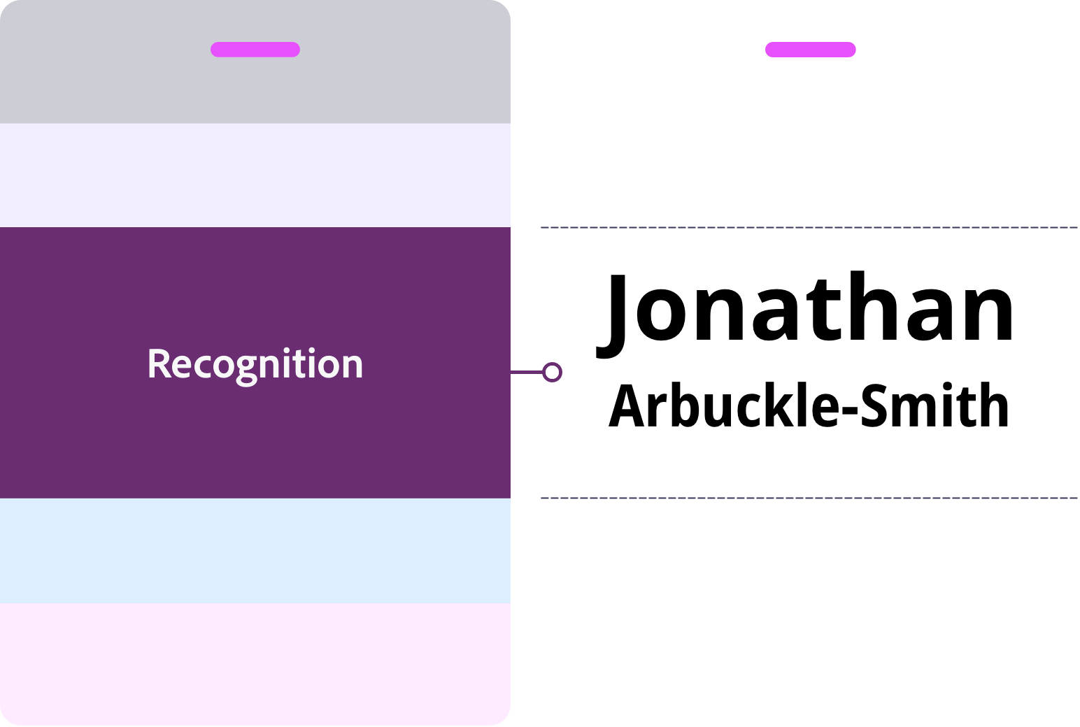
What goes here
- First name
- Last name
What to do
Set the first name 1.5–2× larger than the last name — Bold or Extra Bold
Last name: Medium or Semi Bold. 8 to 10pt smaller font size than first name
A7 or 3×4: 32–38pt | A6: 32–48pt
32pt is the floor. If the name won’t fit, reduce secondary content or move to a larger badge size
Keep clear space around the name. Nothing crowds it
Use a clear sans serif typeface
Layer 2 — Supporting
Context. Supports recognition
Context answers the second question once a name is recognised: who is this person and who are they with?
This is the layer most often overloaded. Titles lengthen. Extra details creep in. The name loses space. Recognition slows.
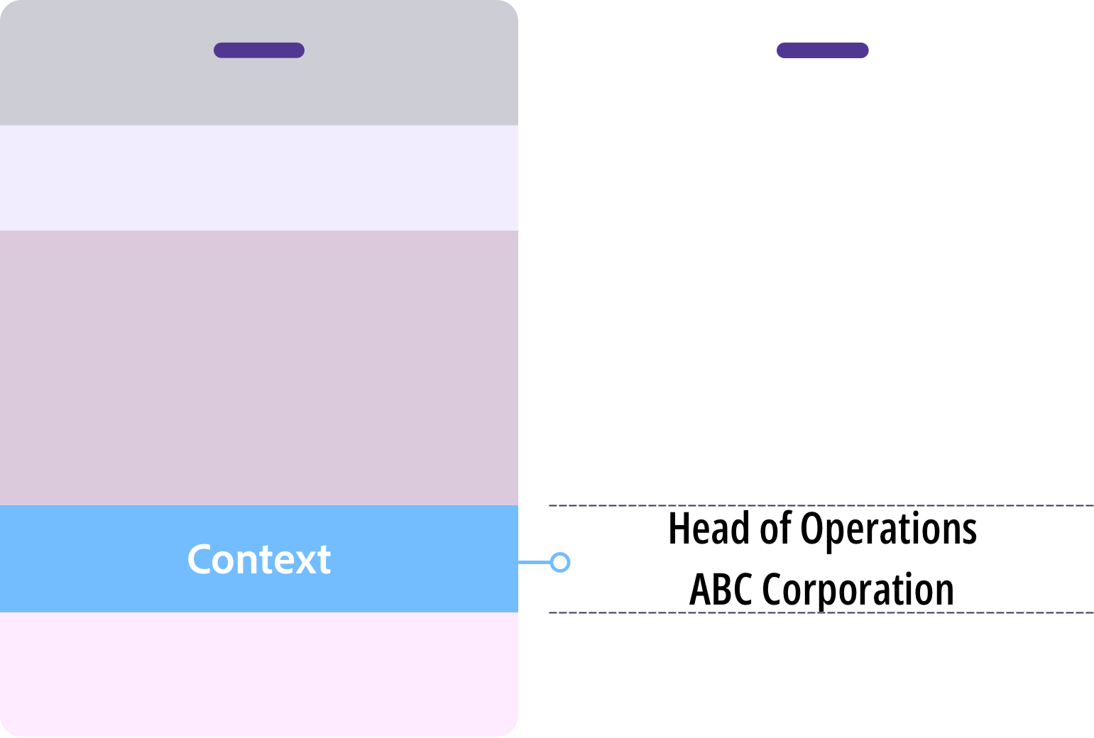
What goes here
- Job title
- Organisation
- Pronouns (optional)
What to do
Keep context visually lighter than the name. Use 14–18pt at Regular or Medium weight.
Default order: job title, then organisation. Reverse only when the organisation is the primary identifier
If context exceeds two lines, edit it down or move to a larger badge size
No department names, social handles, or membership tiers. Context is not a profile
Layer 3 — Framing
Event identity. Frames the event
Event identity tells people where they are. It anchors the badge to the event and the organisation behind it.
Branding can be bold and expressive. But its role is fixed. It frames the badge. It does not lead it.
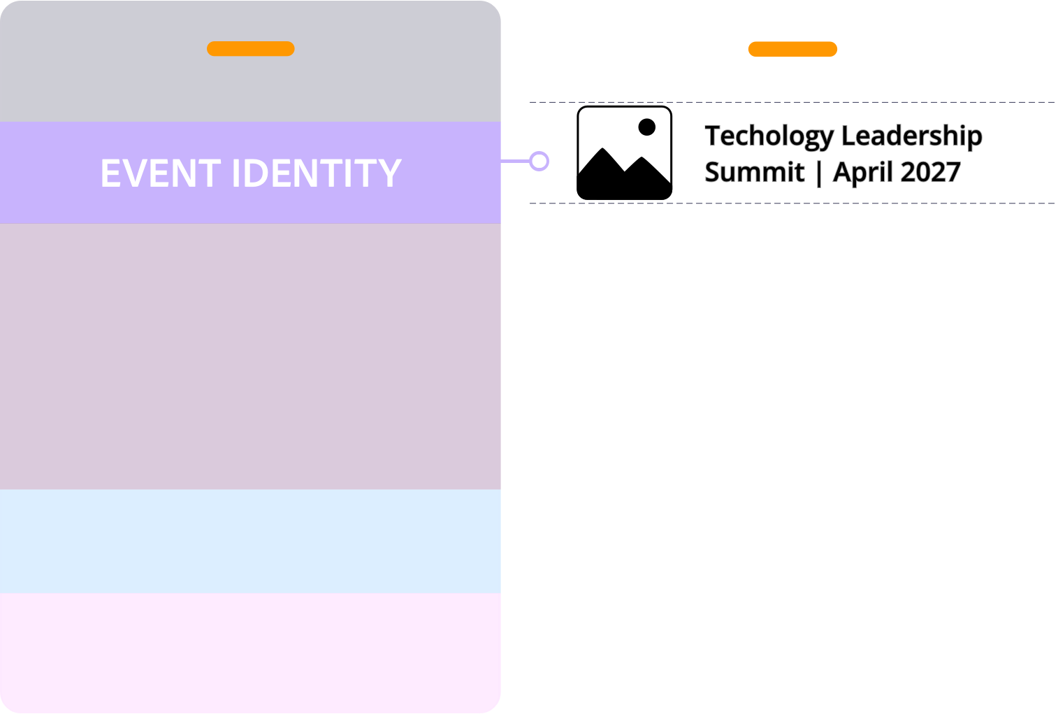
What goes here
- Host logo
- Event name
- Date
- Tagline or theme
- Brand colours and graphics
What to do
Keep event identity within its zone, clear of the recognition area
If your eye goes to the logo before the name, scale it back
Test background and colour contrast against the name text. If the name is hard to read at a glance, adjust until it is
Layer 4 — Utility
Utility. Adds function
Utility adds function to the badge: access, connection, event requirements. Not every badge needs it.
When it is there, it stays visually quiet. This is always the lowest priority layer.
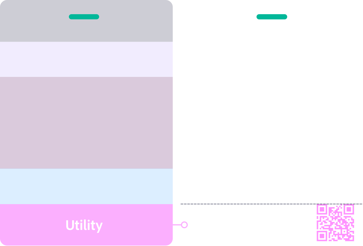
What goes here
- QR codes
- Sponsor logos
- WiFi access
What to do
QR codes: minimum 2×2cm, 6mm clear space on all sides. Link to something the attendee will actually use
One sponsor logo maximum on A7. If more are required, move to A6 or use the back
Sponsor logos are smaller than the host logo
Stay clear of the dead zone created by lanyard holes or clips
Section 4
Conference name tag size guide
Badge size determines how much content the front can carry before readability starts to break. Start with A7 or 3×4. Move to A6 or 4×6 when the content requires it.
A7 and 3×4 | Built for recognition
Networking events, workshops, standard conferences, minimal content, simple layouts
A6 and 4×6 | Built for more content
Agendas, venue maps, multiple sponsor logos, or any event requiring more front content without crowding the name
The inclusion standard:
A name is an identity, not a space constraint. Design for 38pt. That is the target. 32pt is the minimum — the point at which readability starts to break. A small number of long or unusual names may sit slightly below 32pt; that is acceptable. What is not acceptable is a layout where most names are forced below the minimum. If that is happening, the badge is too small or the layout is too crowded.
When to move to a bigger badge
Start small (A7 or 3×4). Size up when any of these apply:
- Most first names on the list need to drop below 32pt to fit
- The first name is not readable from 2 to 3 metres
- Context runs to more than three lines
- More than one sponsor logo is required on the front
- White space around the name is being squeezed
- Something other than the name is drawing the eye first
Know where your lanyard attaches before you start designing. It determines which area at the top of the badge to keep clear.
What is the standard size for a conference badge?
No single global standard applies to conference name tag size. Most fall between A7 (74×105mm / 3×4 inch) and A6 (105×148mm / 4×6 inch). In Australia and the UK, A7 is the most common choice for standard conferences. A6 suits events that need more front content. In North America, 3×4 inch and 4×6 inch are the equivalent formats. For a networking or corporate conference, A7 or 3×4 inch covers most situations well. For a full breakdown of badge sizes, dimensions, and decision criteria, see the Conference Badge Size Guide.
Section 5
Six rules that keep names readable at three metres
A conference name tag is read in seconds. Often in motion. Often at distance. Readability is not a design preference. It is the only thing that matters.
Rule 01
Protect the first name
Keep the area behind the first name clear of patterns, images, and graphics. Anything competing with the text slows recognition.
Rule 02
Use strong contrast
The first name needs strong contrast against the background. Black on white is the benchmark. Check contrast before you print.
Rule 03
Use a sans serif font
Use a clear sans serif typeface. Recommended options: DM Sans, Inter, Roboto, Open Sans, Lato. Serif fonts lose legibility at distances over 1.5 metres.
Rule 04
Use Title Case
Title case preserves word shape and speeds recognition. All caps removes word shape and slows scanning at distance. Use all caps only where size, weight, and spacing fully compensate.
Rule 05
Use sufficient font weight
First name: Bold or Extra Bold. Supporting text: Regular or Medium. Thin and light fonts lose legibility at distance. Stroke weight needs to carry the name across a room.
Rule 06
No italics
Italics reduce legibility at distance. Keep all name text upright.
Section 6
The 5 second badge recognition test
Check your badge before it goes to print
Every badge will be worn in a room full of people. If the first name is not readable at a glance, that is visible to everyone.
In producing more than 130,000 conference name tags, the most common feedback after print is: “I wish I had made the first name bigger.”
This test catches it before you print. Run it on your design before it goes to production.
The Recognition Test
Print your layout
Tape it to a wall
Step back three metres
If the first name does not read instantly, increase the size, remove competing elements, or improve contrast and test again.

Section 7
What information goes on the back of a conference name tag
The front identifies the person. The back supports the attendee. Any content that is not essential to instant recognition belongs on the back.
Content that works well on the back: QR codes, event instructions, agenda or programme details, venue navigation, WiFi details, sponsor logos, location maps, and disposal or recycling information.
A7 and 3×4
Keep the back simple. Two QR codes maximum, grouped sponsor logos by tier, and a disposal instruction at the base.
A6 and 4×6
The additional space suits agendas, maps, and event information laid out in clearly labelled sections.
Section 8
Conference name tag layout designs
Choose your layout based on what the front needs to carry, not on visual preference. Each pattern applies the same badge design best practices differently: recognition first, everything else in support.
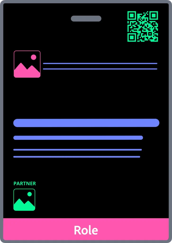
Centre Recognition
Left Aligned Recognition
Brand Header
Role Band
A6 Extended Information
Accessibility note: use more than colour to communicate status. Roughly 1 in 12 men have some form of colour vision deficiency. Test your badge design with a tool like Coblis before you print.
For conference name badge ideas and layout inspiration, see the event name tag ideas article. To see these layouts applied in practice, compare sizes and choose the right option on the free conference name tag templates for Canva page.
Section 9
Conference name tag pre-print checklist
Run through this before every print. Any no is a prompt to adjust before the badges go to production.
Recognition
- Is the first name the largest element?
- Can it be read instantly from 2 to 3 metres?
- Does everything else support the name?
If any answer is no, go back to Layer 1 and increase the first name size or remove competing elements.
Hierarchy
- Does event identity stay out of the recognition zone?
- Does context support without crowding?
- Is there clear space around the name?
If any answer is no, review the layer system and reassign content to its correct zone.
Content and size
- Does the content fit comfortably at the chosen badge size?
- Has anything crowded moved to A6?
- Does the back carry what the front cannot?
If the front is crowded, move to A6 before printing. The name size holds regardless.
Production
- Is the lanyard attachment position confirmed and designed around?
- Has the 5 Second Recognition Test been passed?
- Does the badge work for the wearer, not just the event?
If the recognition test has not been run, run it now. Print one badge, tape it to a wall, step back three metres.
Section 10
Design is step two. Production is the problem.
Designing one conference name tag is straightforward. Producing hundreds accurately under deadline pressure is where event name tag workflows fail.
A conference badge printing system has to solve: guest list data, merge fields, inconsistent spreadsheets, long names, late registrations, front and back layouts, event name tag printing, and reprints. Conference name badge software or a structured workflow is the only reliable way to manage this at scale.
A badge template designs one badge. A production system manages the workflow required to produce hundreds accurately.
Templates do not solve: guest list merges, late changes, print layouts, long names, scaling, or reprints. Many look acceptable in thumbnails but collapse once real production constraints appear.
If you currently make conference badges in Microsoft Word, the workflow limitations become clear as the event gets larger. See how to create name badges in Word for a comparison of what Word handles well and where it breaks down.
Badge template vs conference badge production system
| Badge template | Conference badge production system |
|---|---|
| Designs one badge | Produces entire badge sets |
| Manual data entry | Guest list merge workflow |
| Manual print layouts | Automated print layouts |
| Difficult late changes | Reprint only what changed |
| Screen focused | Print and production focused |
| Single static file | Repeatable operational workflow |
Why Canva is not a production system
Canva is a design tool. It is useful for creating a single badge layout. It does not solve the production problem.
| Canva | Conference Name Badge Design Kit |
|---|---|
| Design tool only | Complete production system |
| Manual badge creation | Guest list merge automation |
| No print layout workflow | Automated print layout generation |
| No readability system | 4-layer design system built in |
| Subscription or per-design cost | One-time purchase — no subscription, no per-badge fee |
| No production training | Step-by-step production workflow included |
| Files held in Canva platform | All files owned by buyer |
The design problem and the production problem are different. Canva solves the first. It does not address the second.
The Conference Name Badge Design Kit — Production at scale
The Conference Name Badge Design Kit is a Google Slides-based conference badge production system built on the design principles in this guide.
Tested performance:
- 112 A7 name badges processed through the full layout workflow in 8 minutes 38 seconds
- 560 badges merged in 32 seconds
- A7 and A6 physically print-tested at actual badge size — passed
- 100 badges per batch (recommended limit for production stability)
The Kit includes recognition-first badge templates, guest merge workflow, automated print layout workflow, front and back production workflows, and step-by-step production training. It supports home, office, and commercial conference name badge printing.
Launching August 2026.
Terra Tag has produced more than 130,000 conference name tags using the same operational principles the Kit teaches.
Free template vs Kit — when each applies:
Use a free template when: you are producing fewer than 20 badges, all names will be entered manually, and no guest list merge is required.
Use the Conference Name Badge Design Kit when: you have a guest list in a spreadsheet, you need print-ready layouts generated automatically, you want the design system built into the templates, or you need a repeatable workflow for future events.
DIY printing vs print bureau:
Print in-house when: you have access to a colour laser or inkjet printer, batch sizes are under 200, and margins for error are acceptable.
Use a print bureau when: badge quality needs to be highest, paper stock must be heavier than standard office stock, or the event is high-stakes.
The Kit includes separate workflow paths for both. Both use the same templates and the same merge process.
Coming August 2026
The Conference Name Badge Design Kit
A complete Google Slides badge production system. Recognition-first templates, guest list merge automation, automated print layout generation, and step-by-step production training. Built on the design principles in this guide. No paid software required.
Section 11
Conference name tag design FAQs
What is a conference name tag design system?
A conference name tag design system is a structured framework for arranging badge content — name, context, event identity, and utility — in a defined hierarchy so the attendee’s name is always readable at a distance. Terra Tag’s Recognition First Badge Design SystemTM organises content into four layers: Event Identity, Recognition, Context, and Extensions.
What information goes on a conference name tag?
At a minimum: first name, last name, and organisation. Job title, QR codes, and sponsor logos can be added if they do not reduce readability. All supporting content must remain visually subordinate to the first name.
What font size should names be on conference name tags?
The minimum first name size is 32pt. A7 badges (74×105mm / 3×4 inch): use 32 to 38pt. A6 badges (105×148mm / 4×6 inch): use 32 to 48pt. If a name does not fit at 32pt, reduce secondary content or move to a larger badge size. Do not scale the name down.
What size should a conference name tag be?
Use A7 (74×105mm / 3×4 inch) for most standard events focused on identification. Move to A6 (105×148mm / 4×6 inch) when additional content — schedules, maps, multiple sponsors, or front QR codes — is required without compromising readability.
What is the best conference badge layout?
The layout that makes the first name the dominant element. All other content — context, event identity, and utility — must sit in structured layers that support recognition rather than compete with it.
Should a conference name tag include a QR code?
A QR code adds value when it links to something the attendee will actually use — a LinkedIn profile, vCard, or schedule. Minimum size is 2 × 2cm with 6mm clear space on all sides. On A7 badges, QR codes usually work better on the back. On A6, front placement is acceptable if the recognition zone is fully protected.
Can you include sponsor logos on a conference name tag?
One small sponsor logo can work on A7. For two or more logos, move to A6 or use the back. The host logo must always dominate. If a sponsor logo draws attention before the attendee’s name, it is too large.
What is the difference between a conference name tag and a conference name badge?
The terms mean the same thing. “Name tag” is more common in North America. “Name badge” is more common in Australia and the UK. Both refer to the wearable identification used at conferences and events.
What is the easiest way to make conference badges for 200 people?
The easiest reliable method is a structured production workflow: a badge template, a guest list in a spreadsheet, and an automated merge that generates print-ready layouts. The Conference Name Badge Design Kit does this using Google Slides and Google Sheets — 560 badges merged in 32 seconds, 112 A7 badge layouts generated in 8 minutes 38 seconds. Launching August 2026.
Can I make conference badges in Google Slides?
Yes. Google Slides works well for conference badge production when paired with Google Sheets for guest data and a structured print workflow. The Conference Name Badge Design Kit is built entirely on Google Slides and Google Sheets. No paid software required.
How can I make conference badges without Canva?
Google Slides is a free alternative to Canva for conference badge production. Unlike Canva, Google Slides supports automated Google Slides workflow for guest list merges and automated print layout generation. The Conference Name Badge Design Kit uses this workflow to produce complete badge sets from a spreadsheet.
How long does it take to produce 100 conference badges?
Using the Conference Name Badge Design Kit’s workflow: 112 A7 badges were processed through the full layout workflow in 8 minutes 38 seconds. Merge time: 560 badges merged in 32 seconds. Production is run in batches of up to 100 badges for stability and quality control.
Why do conference badge templates fail at production?
Templates solve layout only. They do not solve guest list merges, print layouts, long names, reprints, scaling, or late registrations. A badge template gives you somewhere to type a name. A conference badge production system gives you a repeatable workflow to produce an entire event’s worth of badges accurately.
What is a conference badge production system?
A conference badge production system is an end-to-end workflow for designing badges, merging guest data from a spreadsheet, generating print-ready layouts, handling late changes, printing batches, and reprinting only what changed. The Conference Name Badge Design Kit is a Google Slides-based conference badge production system that applies the design rules in this guide to a complete production workflow.
Should a conference name tag include a job title and organisation?
Yes, as supporting context. Job title and organisation help attendees understand who they are speaking with, but both must remain visually subordinate to the first name. Use 14 to 18pt at Regular or Medium weight. Never let context approach the visual weight of the name.
What is the Conference Name Badge Design Kit?
The Conference Name Badge Design Kit is a Google Slides-based conference badge production system. It includes recognition-first badge templates, a guest list merge workflow, automated print layout generation using Google Apps Script, front and back badge production workflows, and step-by-step training. It runs on Google Slides and Google Sheets — no paid software required. Launching August 2026.
Is there a Google Slides conference badge template?
Yes. The Conference Name Badge Design Kit includes Google Slides badge templates in five layout patterns — Centre Recognition, Left Aligned, Brand Header, Role Band, and A6 Extended Information. Each template is designed with the 4-layer hierarchy built in and is connected to the guest merge and print layout workflow. Launching August 2026.
How do I merge a guest list into conference badges?
Prepare your guest list in Google Sheets with columns for first name, last name, organisation, and any additional fields. The Conference Name Badge Design Kit’s merge workflow reads the sheet, populates each badge template with the corresponding guest data, and generates a complete badge set — 560 badges merged in 32 seconds. Launching August 2026.
How do I automate name badge printing?
Name badge printing can be automated using Google Apps Script connected to a Google Slides badge template and a Google Sheets guest list. The Conference Name Badge Design Kit includes this automation — the script reads the guest list, populates badge templates, and generates print-ready layouts automatically, covering both DIY and commercial print paths. Launching August 2026.
What is the best conference badge template for non-designers?
The best conference badge template for a non-designer is one with the information hierarchy already decided — where the first name dominates, secondary content is proportioned correctly, and branding sits in a contained zone. The Conference Name Badge Design Kit’s templates are designed to these specifications so the design decisions are built in. Non-designers choose a layout pattern and enter their event details — the hierarchy is already correct. Launching August 2026.
What is the best free way to make name badges for an event?
For a small event with fewer than 20 attendees, a free conference badge template opened in Google Slides is the simplest approach — enter names manually and print on card stock. For events above 20 attendees, a merge workflow is the better approach.
How can I make conference badges without paying per badge?
Use a one-time purchase production system rather than a per-badge SaaS tool. The Conference Name Badge Design Kit is a one-time purchase with no subscription and no per-badge fee — launching August 2026.
About
About Terra Tag
Terra Tag is an Australian sustainable event products company. We make eco-friendly conference name badges and lanyards for conferences and events — recycled paper, seed paper, and biodegradable options — and have produced more than 130,000 conference badges for corporate, government, education, research, and not-for-profit events.
The Conference Name Badge Design Kit turns those operational principles into a reusable production workflow for teams producing their own event name tags. Launching August 2026.
A conference name tag is one of the smallest things at an event. It is also one of the most interacted with. People glance at badges hundreds of times across a conference day while deciding who to approach and who they have met before. When conference name tags work well, nobody notices. People simply connect more easily.