Conference Name Badge Design System for Readability and Layout
The Science of Connection:
A 4-Layer System for Conference Badge Design
A name badge is read in seconds. Often in motion. Often at distance. This design system ensures it works when it matters.
If people cannot read the first name, the badge has failed. This system prevents that.
For anyone designing conference name badges, with or without a design background.
A clear system for layout, size, hierarchy, and placement you can apply immediately.
TABLE OF CONTENTS
SECTION 1 | INTRODUCTION
TRUSTED BY GLOBAL ORGANISATIONS TO CONNECT THEIR PEOPLE
130k+ Badges Produced
A badge has one job. Make a name readable instantly, at a distance, and in motion.
Conference name badge design is rarely the priority when organising an event. But it directly shapes how people connect.
When it fails, introductions stall. People hesitate. Conversations don’t start. And because every attendee wears one, the failure is visible across the entire event.
This system removes that risk. It is built on analysis of more than 130,000 badges produced by Terra Tag, and hundreds of real event layouts across every industry. It is a recognition first system for deciding what belongs on event name badges and what should be prioritised.
The Terra Tag 4 Layer Badge System turns conference name badge design into a set of structured decisions. Each layer solves a specific problem. Work through them in order, and common badge failures are resolved before print.
SECTION 02 | POINTS OF FAILURE
Why Conference Name Badge Design Fails
If people have to step closer to read a first name, the badge has already failed.
That failure is predictable. It comes from three consistent mistakes:
Design Over Function | Content Overload | Weak Hierarchy
Most conference badge design is treated as a visual task. Layouts are approved because they look good on screen. But badges are not viewed on screen. They are read in seconds, in motion, at distance. When design decisions ignore that reality, readability breaks.
The second failure comes from pressure. Sponsors. Branding. More information. Each request adds weight to the front of the badge. Without a system, every element competes. The name loses.
When these forces combine, the badge still looks considered. But it does not do its job. It does not support connection.
Success: Legible at 3 metres
Failure: Readability breaks at 0.5 meters
TECHNICAL AUDIT
These failure patterns are drawn from the production and review of more than 130,000 conference badges across corporate, government, university, and research events. Each layer of our system is designed to neutralise these specific errors and underpins every conference badge template we produce.
CONDITION_01 / SCALE
First Name Too Small
People hesitate. Introductions stall. Networking slows.
CONDITION_02 / DENSITY
Crowded Layouts
Increase cognitive load and reduce scan speed.
CONDITION_03 / PRIORITY
Branding Dominance
The guest becomes secondary to marketing.
CONDITION_04 / ARCHITECTURE
Poor Information Hierarchy
The badge answers the wrong question first.
SECTION 03 | CORE PRINCIPLES
What Makes a Conference Badge Easy to Read
(and Why Most Fail)
A conference name badge exists to answer one question: Who am I speaking to?
It must answer that instantly. While walking. At distance. Under different lighting. Mid-conversation.
If the name cannot be read without effort, the badge has failed. This is not a design preference. Conference badge readability is a functional requirement of conference badge design.
That is why the first name must be the dominant element on the badge.
Not the event logo
Not the organisation
Not the job title
The first name.
Everything else supports it.
HOW TO DESIGN READABLE CONFERENCE BADGES – CORE PRINCIPLES
01
VISUAL HIERARCHY
Size is Priority
The first name is always the largest element. If anything matches or exceeds it, recognition weakens.
02
LEGIBILITY THRESHOLD
The 3 Metre Rule
First names must be readable from 2 to 3 metres away. If not, the conference badge font size is too small.
03
SPATIAL ISOLATION
Leave Breathing Space
Space around the name is not optional. It isolates the name and improves scan speed. Give it breathing room.
04
ATTENTION ARBITRAGE
No Competition
Branding, sponsors, and graphics must not compete with the name. If they draw equal attention, the badge fails.
05
SUBORDINATE ARCHITECTURE
Supporting Elements
All secondary information must be in support of the name. If an element leads, the hierarchy is broken.
06
DYNAMIC RESPONSIVENESS
Adaptive Scaling
If content pressures the first name, move up in badge size. Do not buy space by shrinking the first name.
SECTION 04 | 4 LAYER CONFERENCE BADGE DESIGN SYSTEM
The Conference Name Badge Design System
A conference badge only works when information is controlled. Without structure, every element competes. The name loses.
The Terra Tag 4 Layer Badge System removes that risk. It organises all conference badge content into four defined layers. Each layer has a single role. When those roles are clear, the badge remains readable. When they are not, recognition breaks.
When the layers are structured correctly, the badge remains clear and readable. When they compete, recognition disappears.
Conference Name Badge Design Definition
Conference name badge design is the structured arrangement of badge content so the attendee’s name can be recognised instantly at a distance. It prioritises the first name, enforces clear hierarchy, and maintains readability under real event conditions such as movement and variable lighting.
How The System Layout Flexes Without Breaking Recognition
Placement can change. Proportions cannot.
The four layer system is not a template. It is a control mechanism.
Logos move. QR codes shift. Event identity may sit at the top, the side, or share space with other elements. That flexibility is expected.
What does not change is dominance. The first name must remain easy to read at a glance, regardless of layout.
If placement changes but proportions hold, recognition remains intact. If proportions shift, recognition breaks.
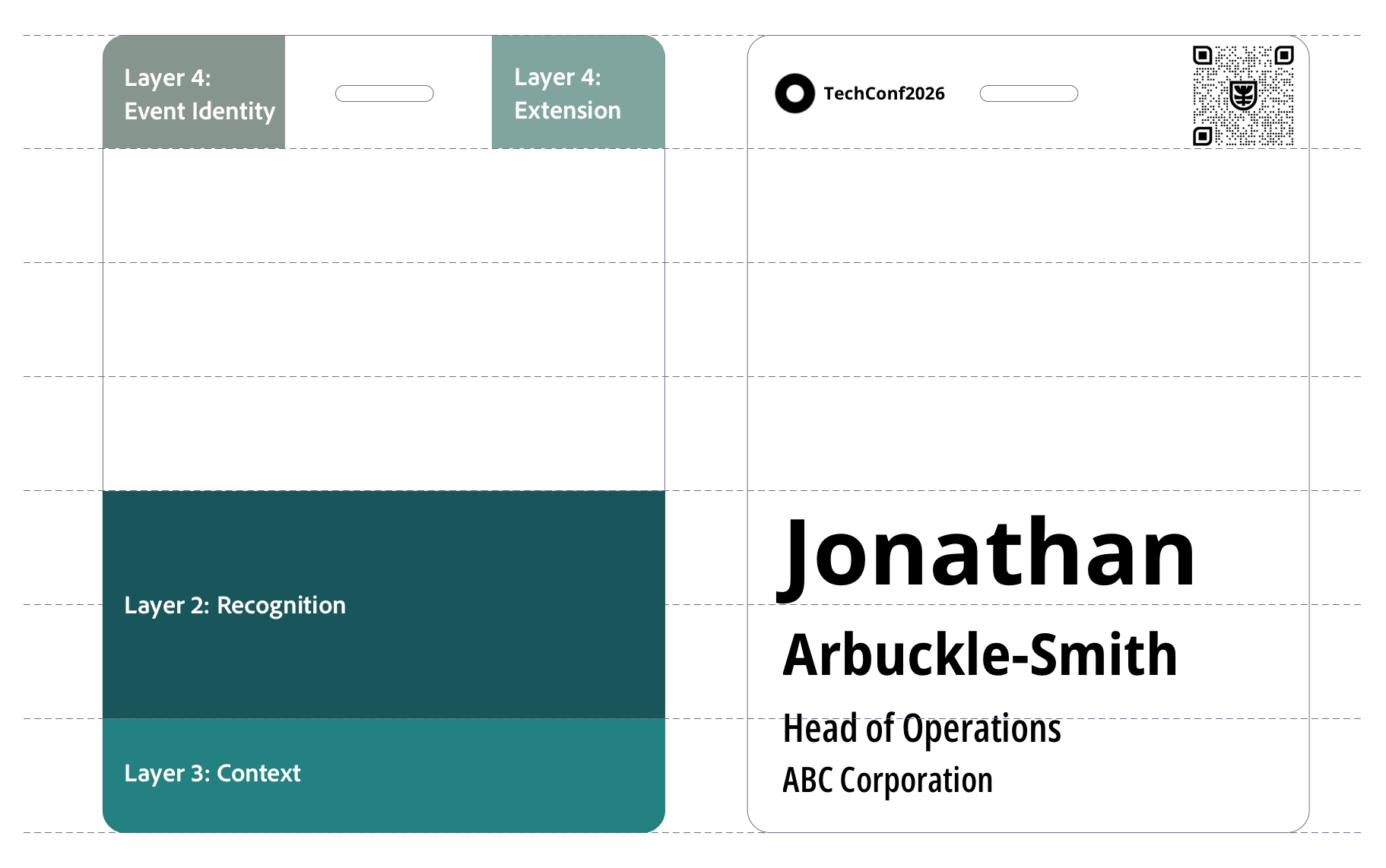
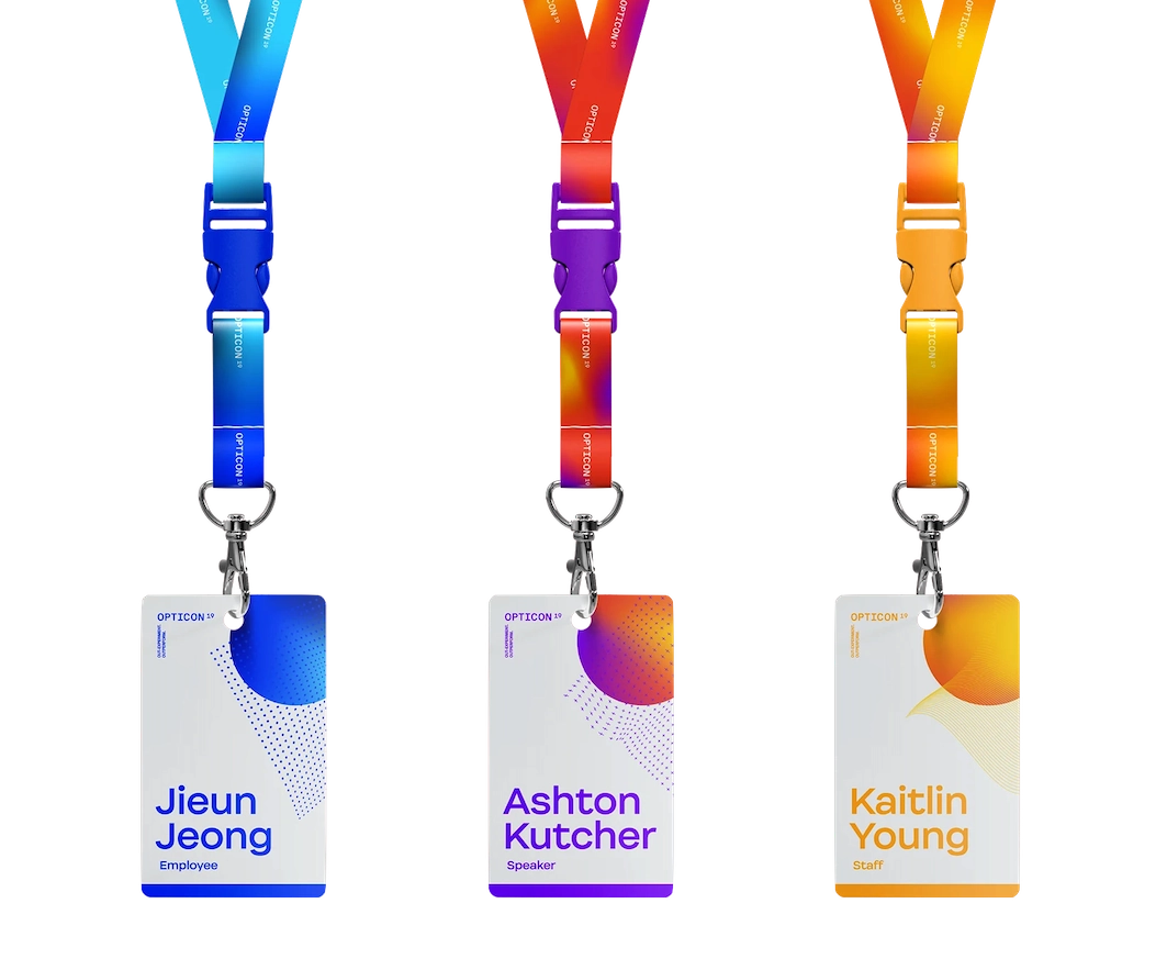
Layer 1: Event Identity | Frames the Event
Event Identity provides the stage; it must never take the spotlight.
Event identity tells people where they are. It anchors the badge to the event and the organisation behind it.
Branding can carry weight. It can be bold, visible, and expressive. But its role is fixed.
Event identity frames the badge. It does not lead it.
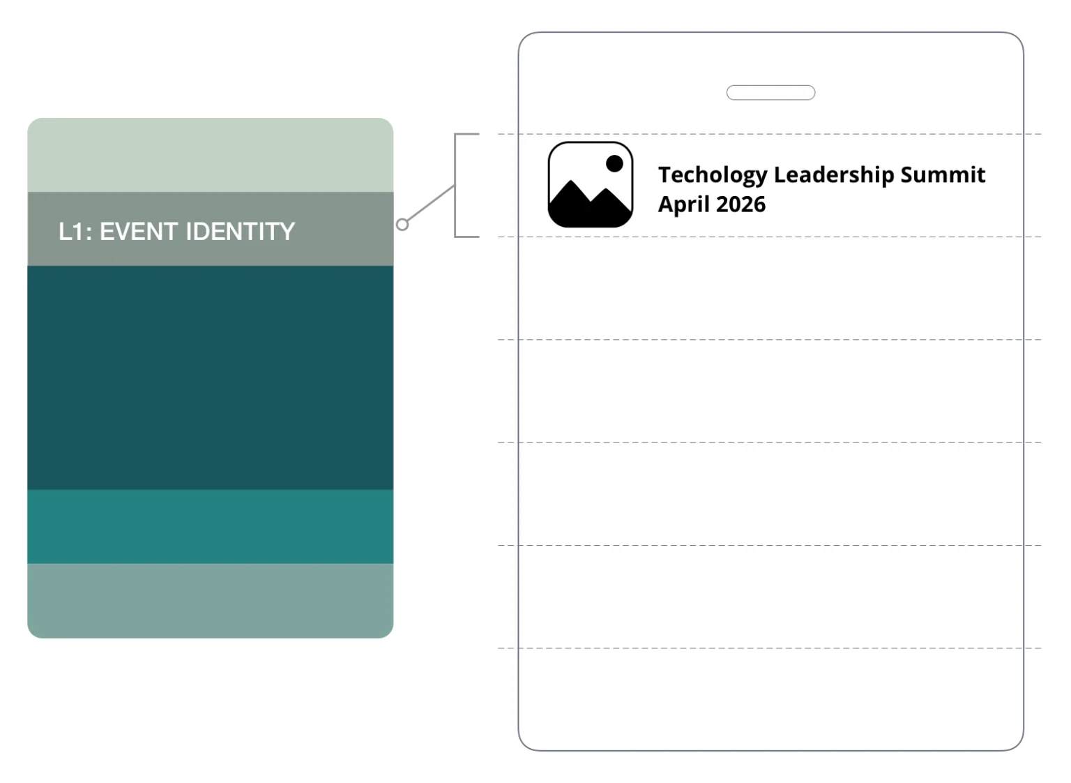
CORE ASSETS // LAYER 01
Host logo
Event name
Date
Tagline or theme
Brand colours, graphics, and imagery
HEURISTICS // LAYER 01
Keep it contained
- Event identity sits in a defined zone
- It must never enter the recognition area
Control the balance
- Branding can be prominent, but never dominant
- If it draws more attention than the name, the layout is wrong
Protect readability
- Backgrounds, colours, and imagery must not reduce contrast
- The name must remain easy to read at a glance
Layer 2: Recognition | Drives Conversation
The first name is the anchor of the encounter. If it fails, the badge is an ornament, not a tool.
People look for names.
At a conference, the first name is the fastest way to start a conversation. It is scanned across a room, mid-step, mid-sentence. If it cannot be read instantly, the interaction slows. If it requires effort, it often doesn’t happen.
The first name carries the badge. The last name supports it.
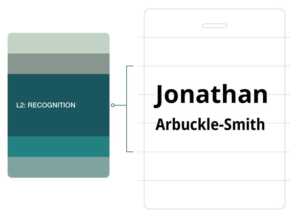
CORE ASSETS // LAYER 02
First name
Last name
HEURISTICS // LAYER 02
Make the first name dominant
- Set the first name 1.5 to 2× larger than the last name
- Use Bold or Extra Bold for the first name
- Use Regular or Medium for the last name
- Hairline fonts usually fail the 3 metre test
Design for distance – How big should names be on conference badges?
- The first name must be readable from 2 to 3 metres
- A7 badge: 32 to 38pt
- A6 badge: 32 to 48pt
- Keep the last name 8 to 10pt smaller
Use simple, readable typography
- Use a clear sans serif typeface
- First name on one line wherever possible
- Design for typical name lengths, not edge cases
Protect the recognition zone
- Maintain clear white space around the name
- Do not crowd the first name with other elements
When names don’t fit
Long names must adapt without breaking recognition
- Reduce size slightly before changing layout
- Allow the first name to wrap to two lines if needed
- Never tighten letter spacing to force a fit
Edge cases
- ALL CAPS
- Only use if size, weight, and spacing support readability
- All caps can work for short names, but it reduces word shape and should not be the default.
Layer 3: Context | Supports Recognition
Context supports the second question after recognition. Who is this person?
This is the layer most often overloaded.
Context answers the second question. What do they do, and who are they with? It supports the interaction once the name is recognised. It must never lead it.
Without control, context expands. Titles lengthen. Organisations compete. Extra details creep in.
The result is predictable. The name loses space. Recognition slows.
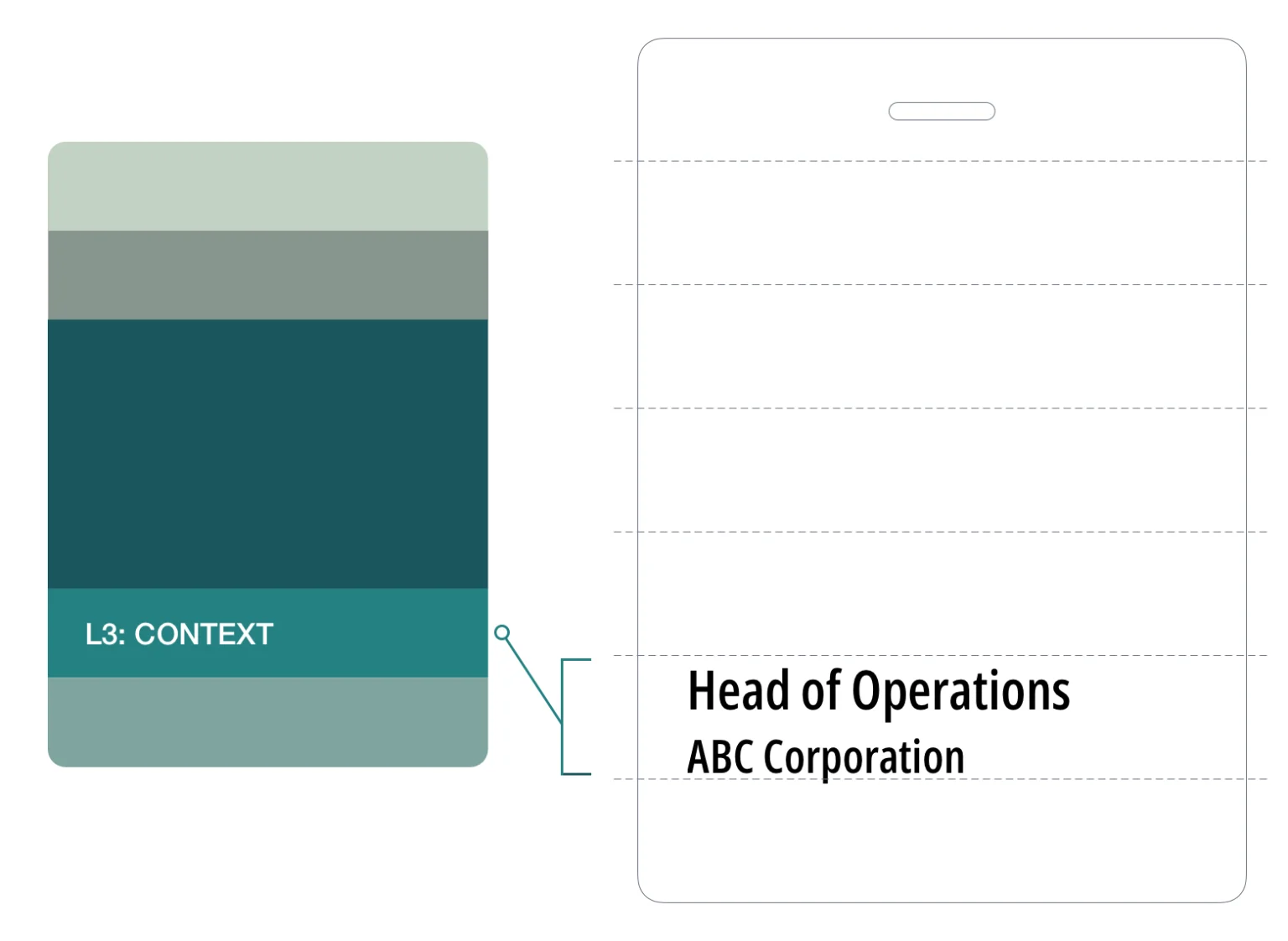
CORE ASSETS // LAYER 03
Job title
Organisation
Pronouns (optional)
HEURISTICS // LAYER 03
Keep it subordinate
- Context must not compete with the recognition zone
- It should appear visually lighter and smaller than the name
Set a clear order
- Default: job title, then organisation
- Reverse only when the organisation is the primary identifier
Control size and weight
- Typical size: 14 to 18pt on A7 and A6
- Use Regular, Medium, or Semibold
- Pronoun use smaller size and lighter weight than surrounding text
- Never approach the visual weight of the last name
Limit what you include
- Context is not a profile
- Do not include department names
- Do not include social handles
- Do not include membership tiers
Layer 4: Extensions | Adds Utility
Extension supports the event experience through function, not prominence.
Extensions add function to the badge.
They support access, connection, and event requirements. They do not define the badge.
This layer exists to serve the event. It must remain visually quiet.
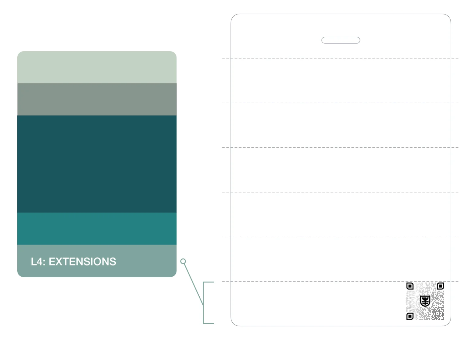
CORE ASSETS // LAYER 04
QR codes
Sponsor logos
Additional content forms
Note: Not all badges require extensions
Digital Integration (LI Profile/vCard)
The badge is the ‘Handshake’; the QR code is the ‘Follow-up.’ Instead of a generic link to the event website, use the QR code to bridge to a vCard or LinkedIn profile. This transforms the physical badge into a frictionless networking tool.
HEURISTICS // LAYER 04
Keep it subordinate
- Extensions must not compete with recognition or context
- This is always the lowest priority layer
Prioritise function
- QR codes serve the attendee and take priority within this layer
- Minimum size: 2 × 2cm
- Clear space: at least 6mm on all sides
Control sponsor presence
- Maximum one sponsor logo on the front of an A7 badge
- If more are required, move to A6
- The host logo must always dominate
- If a sponsor logo draws attention first, it is too large
- Reduce visual weight until it sits quietly
- If legibility is lost, move to the back
Respect physical constraints
- Placement is limited by lanyard hardware
- Avoid the dead zone created by holes or clips
- The bottom of the badge is the safest position
Manage sponsor requirements
- If front placement is required, keep the logo within the extension zone
- If they cannot sit without competing or losing legibility, move to A6
SECTION 5 | CONFERENCE NAME BADGE SIZE
Conference Badge Size Guide: A7 vs A6 for Event Name Badges
If the first name reduces in size, the badge is too small.
Conference badge size is a functional decision. It determines how much content a badge can carry without breaking recognition.
Use the decision tree below. It resolves the correct size based on content and hierarchy.
A7 EVENT BADGE | BULIT FOR RECOGNITION
A6 EVENT BADGE | BUILT FOR MORE CONTENT
Use A7 when the badge is focused on identifying the attendee.
SPECIFICATIONS // A7
First name
Last name
Job title
Organisation
Event identity
One optional extension element (QR code or sponsor logo)
Use A6 when additional content is required without impacting the first name.
SPECIFICATIONS // A6
Agendas or programme details
Venue maps
WiFi information
Multiple sponsor logos
Event instructions
THE INCLUSION STANDARD
A name is an identity, not a space constraint. Scaling is often necessary, but never drop below 32pt. If a name won’t fit at that size on an A7, A6 is the inclusive choice for equal visibility.
Badge size decision tree
Work through these three questions in order.
Is the badge primarily for identifying the attendee?
The badge includes first name, last name, job title, and organisation.
A7 recommendedMove to the next question.
Does the badge need more than the core identification content?
No additional elements beyond the standard content.
A7 recommendedExamples include a QR code, pronouns, accessibility icons, or one sponsor logo. These can work on A7, but may pressure the recognition zone depending on how much context is already present. If the recognition zone feels pressured, continue.
Does the badge need to carry event information, utility content, or multiple sponsors?
The badge does not need agendas, maps, WiFi details, instructions, schedules, or multiple sponsor logos.
A7 recommendedExamples include agenda or programme details, venue maps, WiFi information, instructions or schedules, or two or more sponsor logos.
A6 recommendedWhen to move from A7 to A6
Start with A7. Move to A6 if any of these happen:
- The first name drops below 32pt
- The first name cannot be read from 2–3 metres
- Context exceeds three lines
- More than one sponsor logo is required on the front
- White space around the name is reduced
- Visual elements draw attention before the name
SECTION 6 | DESIGN CONSTRAINTS
Conference Badge Hole Placement and Attachment Constraints
Confirm the lanyard attachment type first. Then design.
Every conference badge design is constrained by how it attaches.
Most conference badges use J hooks or alligator clips. These connect through a punched hole or slot at the top of the badge. The shape and position of that hole define the dead zone. This is the area you cannot safely design into. Get the attachment setup wrong and your layout will be blocked or cut off.
SINGLE HOLE OR SLOT
- Top centre punch
- Keep the centre clear
- Use left and right for content if needed
- Avoid logos, text, or lines running through the centre top
DUAL HOLES OR SLOTS
- Top left and right punch
- Keep both corners clear
- Use the centre for structured content
- Avoid Placing logos or text near the top corners
SECTION 7 | READABILITY RULES
Conference Badge Font Size and Readability Rules
A badge is read in seconds. Often in motion. Often at distance. Readability is not design preference. It is performance.
FONT READABILITY RULE 01
Protect First Name
No patterns, images, or graphics behind the first name.

Keep the first name visually clear
PRINCIPLE
Visual noise slows cognitive processing by 100ms or more.
FONT READABILITY RULE 02
Use Strong Contrast
The first name must stand out. Black on white is the benchmark.

Check contrast before print
PRINCIPLE
Low contrast delays recognition and increases cognitive load.
FONT READABILITY RULE 03
Use a sans serif font
Use sans serif where possible and avoid complex font forms.

Choose clean, simple letterforms
PRINCIPLE
Serifs create “visual blurring” at distances over 1.5 meters.
FONT READABILITY RULE 04
Use sentence case
Sentence case preserves word shape for faster recognition.

Use capitals only where needed
PRINCIPLE
Word shape drives reading speed. All caps removes this shape and slows scanning.
FONT READABILITY RULE 05
Use sufficient font weight
First name: Bold/Extra Bold.
Supporting: Regular/Medium.

Avoid thin or light fonts
PRINCIPLE
Stroke thickness must be at least 20% of the letter height for distance legibility.
FONT READABILITY RULE 06
No italics
Do not use italic text on badges.

Keep letterforms upright
PRINCIPLE
Italics distort the vertical axis and reduce letterform stability.
SOURCE: These rules are informed by accessibility standards, readability research, and Terra Tag production experience. Tools and standards used include WCAG 2.2 Contrast Minimum, Laws of UX and the WebAIM Contrast Checker.
SECTION 8 | RECOGNTION TEST
The 5 Second Badge Recognition Test
Check Your Badge Before it Goes to Print
Every badge will be worn in front of the room. Colleagues, speakers, sponsors, and guests will all see it. If the first name is not instantly readable, the badge will fail in public.
In our experience producing over 130,000 badges, the most common feedback we hear after print is: “I wish I had made the first name bigger.”
This test prevents it. Run it before every print. If the test fails, the badge has failed
The Recognition Test
FUNCTIONAL VALIDATION
- Print your layout
- Tape it to a wall
- Step back three metres
- If the first name is not instantly legible:
- Increase the size
- Remove competing elements
- Increase contrast


Design for distance.
Design for movement.
Design for recognition.
SECTION 9 | BACK OF BADGE CONTENT
What Information Goes on the Back of a Conference Badge
The back is for use, not decoration.
The front identifies the person. The back supports the attendee.
If it is not essential to instant recognition, it probably belongs on the back.
QR codes linking to content
Disposal/recycling instructions
Event instructions
Agenda or programme access
Venue navigation
WiFi details
Sponsor logos
Location map
Minimal Utility Back (A7)
Sponsor Grid
Event Information Back (A6)
USE FOR MINIMAL SUPPORT
USE FOR SPONSOR VISIBILITY
USE FOR CONTENT RICH BADGES
SECTION 10 | DESIGN LAYOUTS
Conference Badge Layout Designs and When to Use Them
Choose your layout based on content, not preference. Each pattern applies the same system differently.
Centre Recognition
USE WHEN PURPOSE IS TO IDENTIFY
(first name, last name, job description)
Content is consistent across all badges
Left Aligned Recognition
USE FOR VARIABLE CONTENT (EASIER TO SCAN)
Works well for: longer names, roles, organisations.
Use case: content length varies across attendees.
Brand Header
USE WHEN BRAND MUST LEAD
Best when a stronger event identity is required at the top without reducing name visibility
May use centre or left aligned layout.
Role Band
USE WHEN ATTENDEE ROLE MUST BE SEEN INSTANTLY
One word only: Volunteer, Speaker, Staff etc.
May use centre or left aligned layout.
Accessibility (Colour-Blindness)
Don’t rely on colour alone to communicate status. Roughly 1 in 12 men have some form of colour vision deficiency. If a ‘Speaker’ is green and ‘Staff’ is red, they may look identical to many. Use a tool like Coblis to see how your badge appears to those with colour-blindness.
A6 Extended Information
USE FOR CONTENT HEAVY BADGESS
Best for badges with added event information, utility content or support elements.
May use centre or left aligned layout.
SECTION 11 | CHECKLIST
Conference Badge Pre Print Checklist
Use this checklist before print. If any answer is no, fix the design.
01 Recognition
02 Hierarchy
03 Content and size
04 Production
SECTION 12 | FAQS
Conference Name Badge Design FAQs
What information goes on a conference badge?
Only include what helps attendees recognise and engage with each other. At a minimum, this is first name, last name, and organisation. Additional details such as job title, QR codes, or sponsors should only be included if they do not compromise readability.
What is the best conference badge layout?
The best conference badge layout prioritises recognition first. The attendee’s first name must dominate. All other elements sit in structured layers around it without competing for attention. Refer to our free conference badge templates or how to create a name badge template in Word.
Should a conference badge include a job title and organisation?
Yes, as supporting context. Job title and organisation help others understand who they are speaking to, but they must remain secondary to the attendee’s name.
Can you include sponsor logos on a conference badge?
You can, but they must be controlled. Sponsor logos should sit within a defined area and never compete with the attendee’s name. If multiple sponsors are required, move them to the back or increase badge size.
Should a conference badge include a QR code?
A QR code can add value when it supports the attendee experience, such as linking to schedules or profiles. It must be large enough to scan easily and positioned so it does not interfere with readability.
What size should a conference badge be?
Use A7 for simple identification and fast recognition. Move to A6 when additional information such as schedules, maps, or multiple sponsors is required without compromising readability. Refer to Terra Tag seed paper product page for examples.
What font size should names be on conference badges?
Names should be large enough to be read instantly at 2 to 3 metres. As a guide, first names should typically be at least 32 pt on A7 badges, increasing further where space allows.